est
#1
–

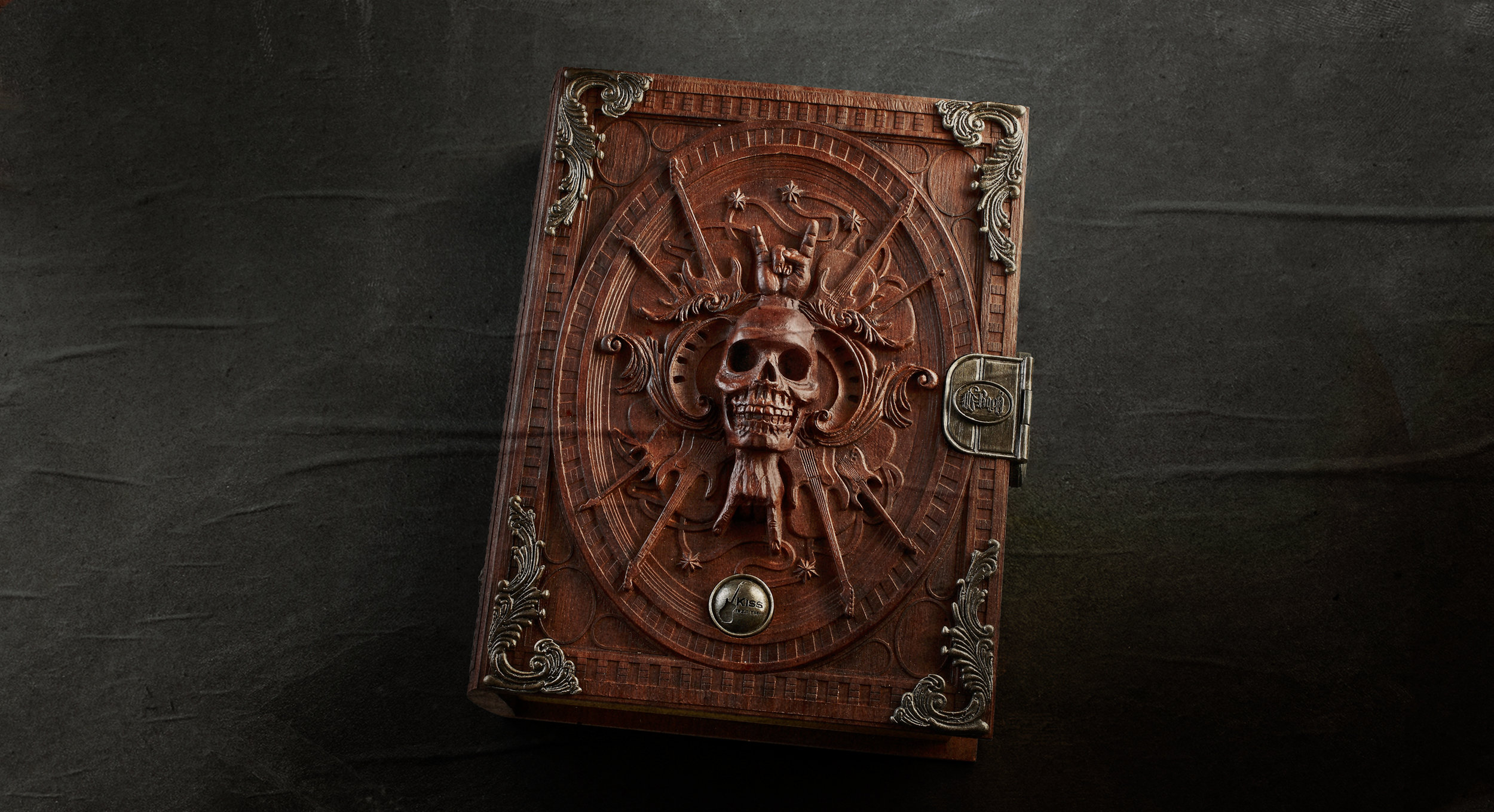
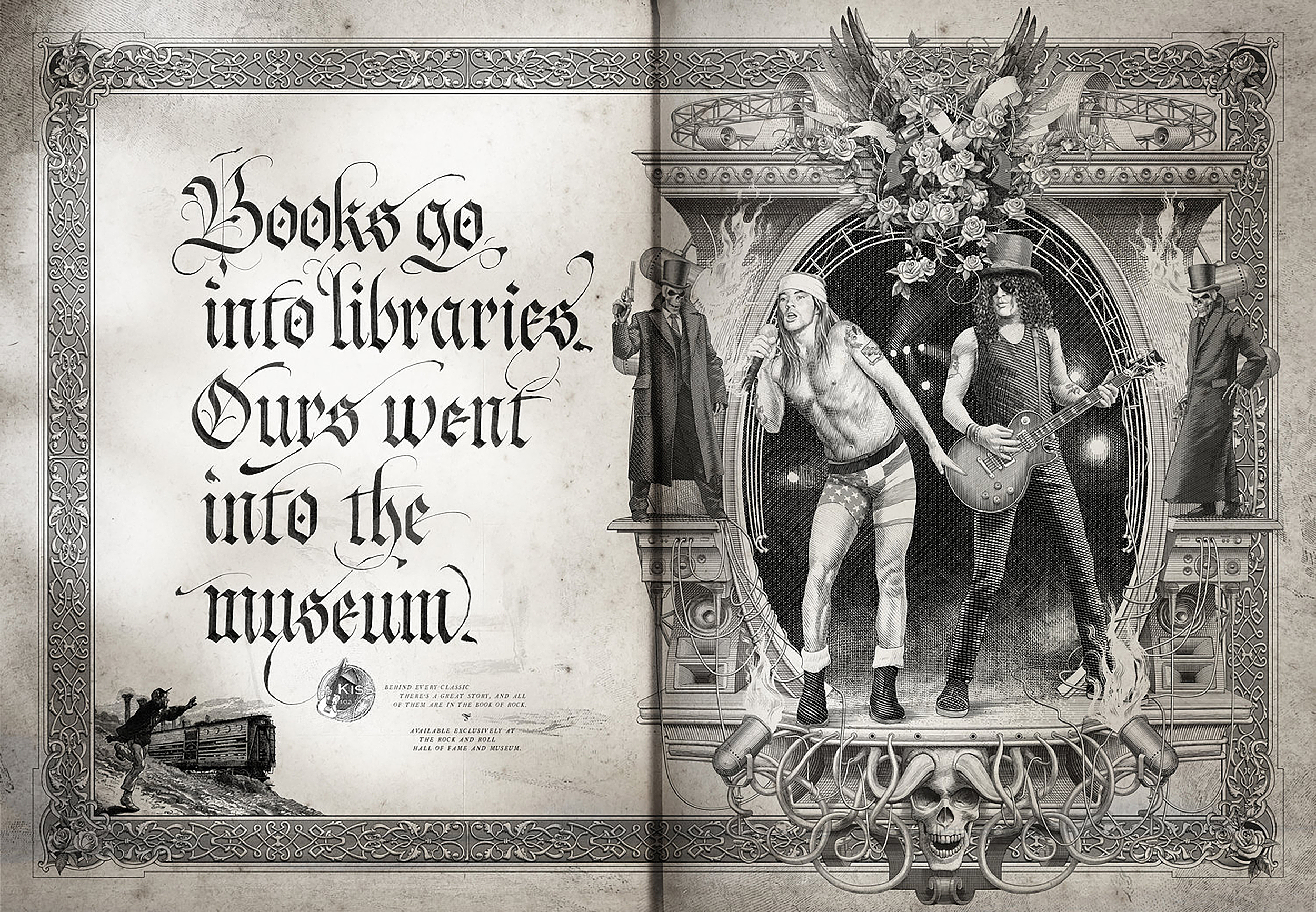
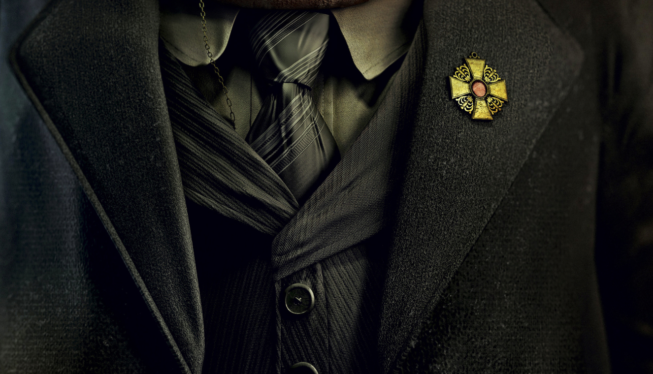
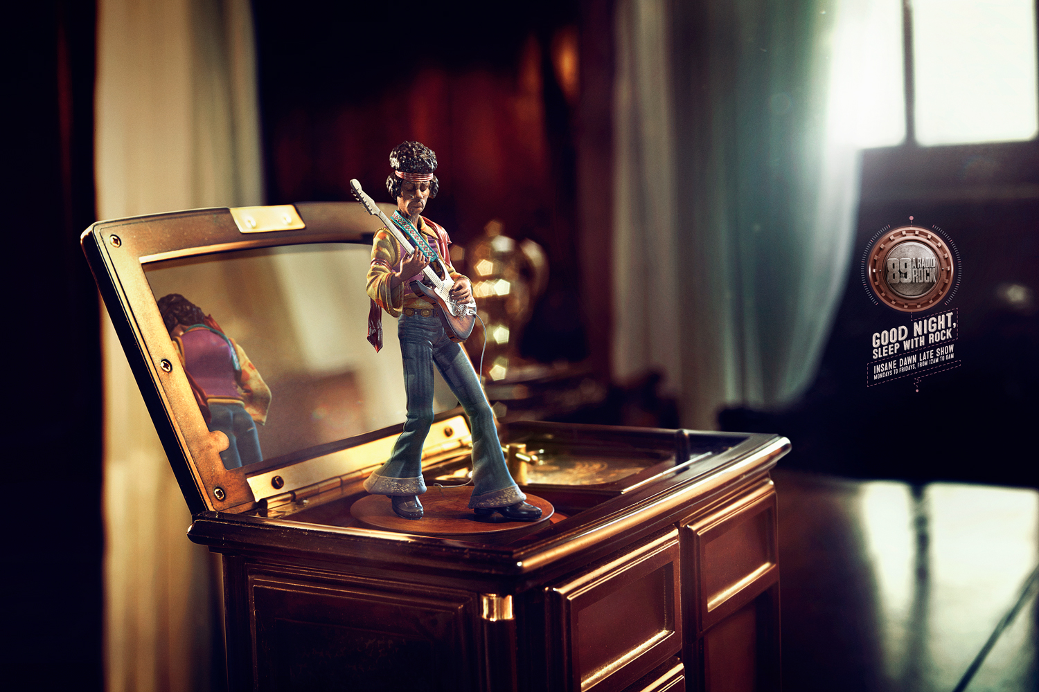
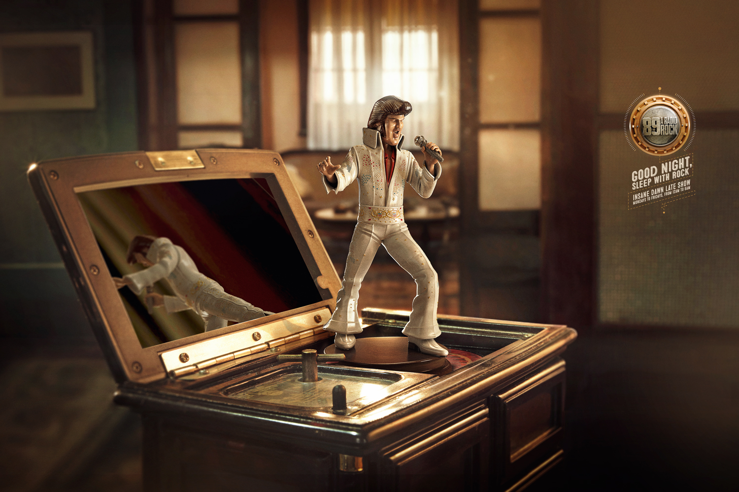
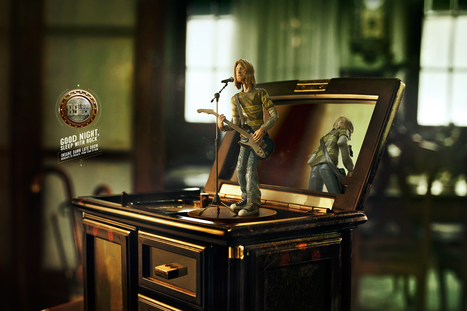
Kiss FM believes that rock is much more than a genre of music. It’s an entire culture, and it deserves to have its history preserved. And what better way to preserve history than in a book? But not just any old book.
The Book of Rock. A book with biographies and illustrations of each band, accompanied by a record player and 10 records featuring rock classics. But that’s not all. When the record is played, you can listen to a classic normally. When the OTHERSIDE setting is activated, the record will spin backwards and tell the story behind each song.
-
Creative team:
rafael gil ( art director/illustrator ) / bruno pereira ( copywriter ) / bernardo silveira ( art director/illustrator ) sleyman khodor ( copywriter ) / marcelo pignatari ( copywriter ) / sattu rodrigues ( illustrator )


Some stories
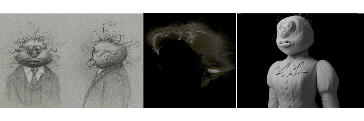
CRAFT
The original book, artisanally crafted in a painstaking procedure that took around 2 years to complete,from the development of the cover, which was hand-hewn in metal and wood, to the record player able to spin LPs backwards.
The illustrations were inspired by a medieval look. After a lengthy search, we found an artist able to reproduce, by hand, a style not easily found nowadays. Each detail and each patch of cross-hatching, from the bands themselves to the frames, down to the font, it was all drawn by hand.


-
The illustrations were made by my friend Sattu Rodrigues.
-
I made the illustrations below to complement the book.
-
The handmade typography was created by the talented Rodrigo Resende.
-
The book cover concept was made in 3d by me.
After that, the 3d process until the final wooden sculpture.


-
More details

-
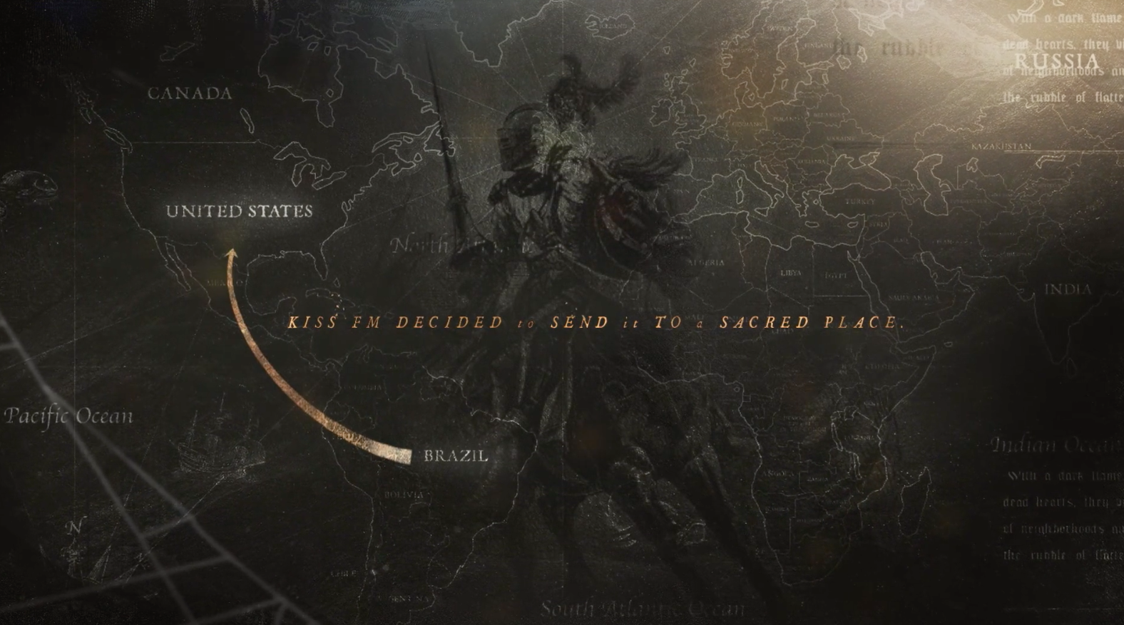
The book became a radio show on Kiss FM.


-
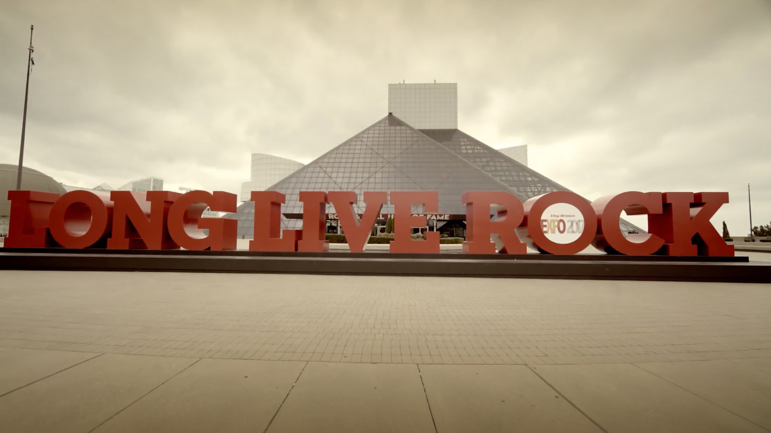
Today it’s on display at the Rock & Roll Hall of Fame Museum - Cleveland


est
#2
–

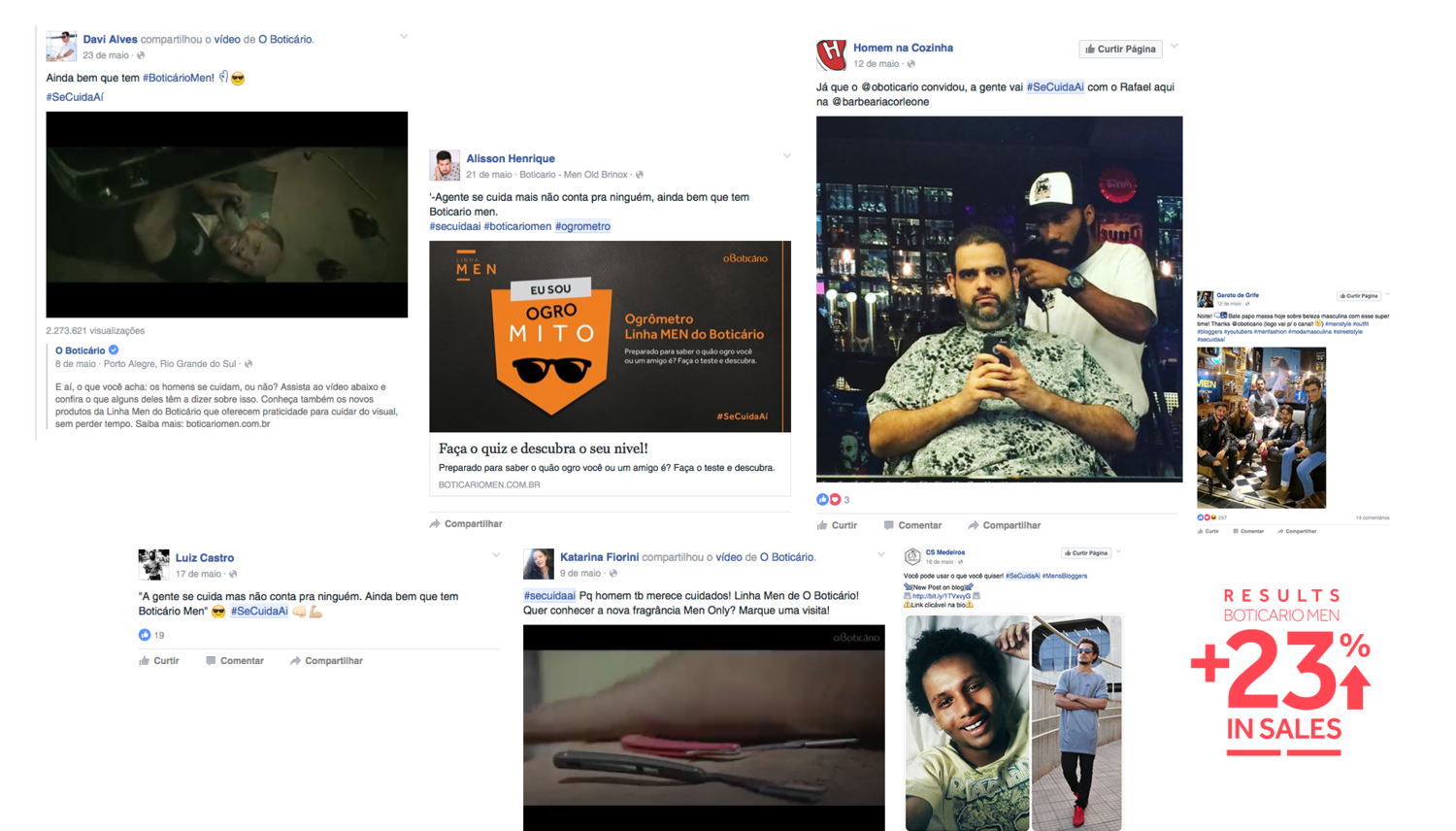
Campaign for O Boticário male product line.
For this campaign we based on the stereotype that men don’t like to admit that they care about the way they look, even though they do take care of their appearance, but hidden from their friends. On the concept of “for the you that there is in the ogre” we created a musical in which ogres give beauty tips for those men who are watching, ending with the chorus “we take care of ourselves but we do not tell anyone”.
-
Creative team:
rafael gil ( art director ) / rodrigo almeida ( copywriter ) / bruno pereira ( copywriter ) sleyman khodor ( copywriter )


digital
We even created an internet action (through a hot site) in which you can find out your inside ogre level and share the results on social networks.


CRAFT
I illustrated in different styles all of the packages that appeared in the ads.
Along with my friend and art director Eduardo Vares, created the campaign posters to be hung in barbers’ shop in Brazil.


est
#3
–

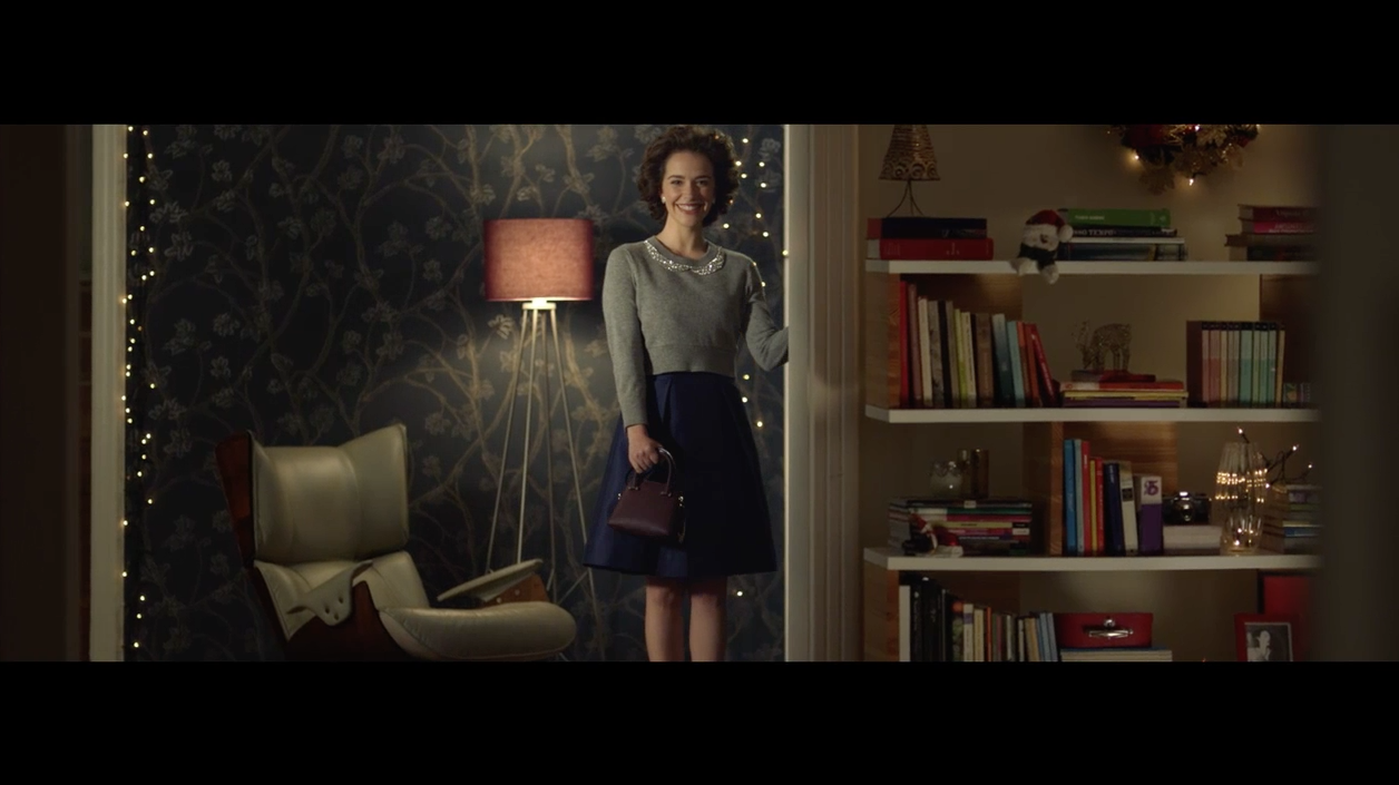
Christmas Campaign with the concept of “present in the best Christmas stories”.
-
Creative team:
rafael gil ( art director ) / rynaldo gondim ( copywriter )


CRAFT
I did the matte painting and the color correction on the whole film.
est
#4
–

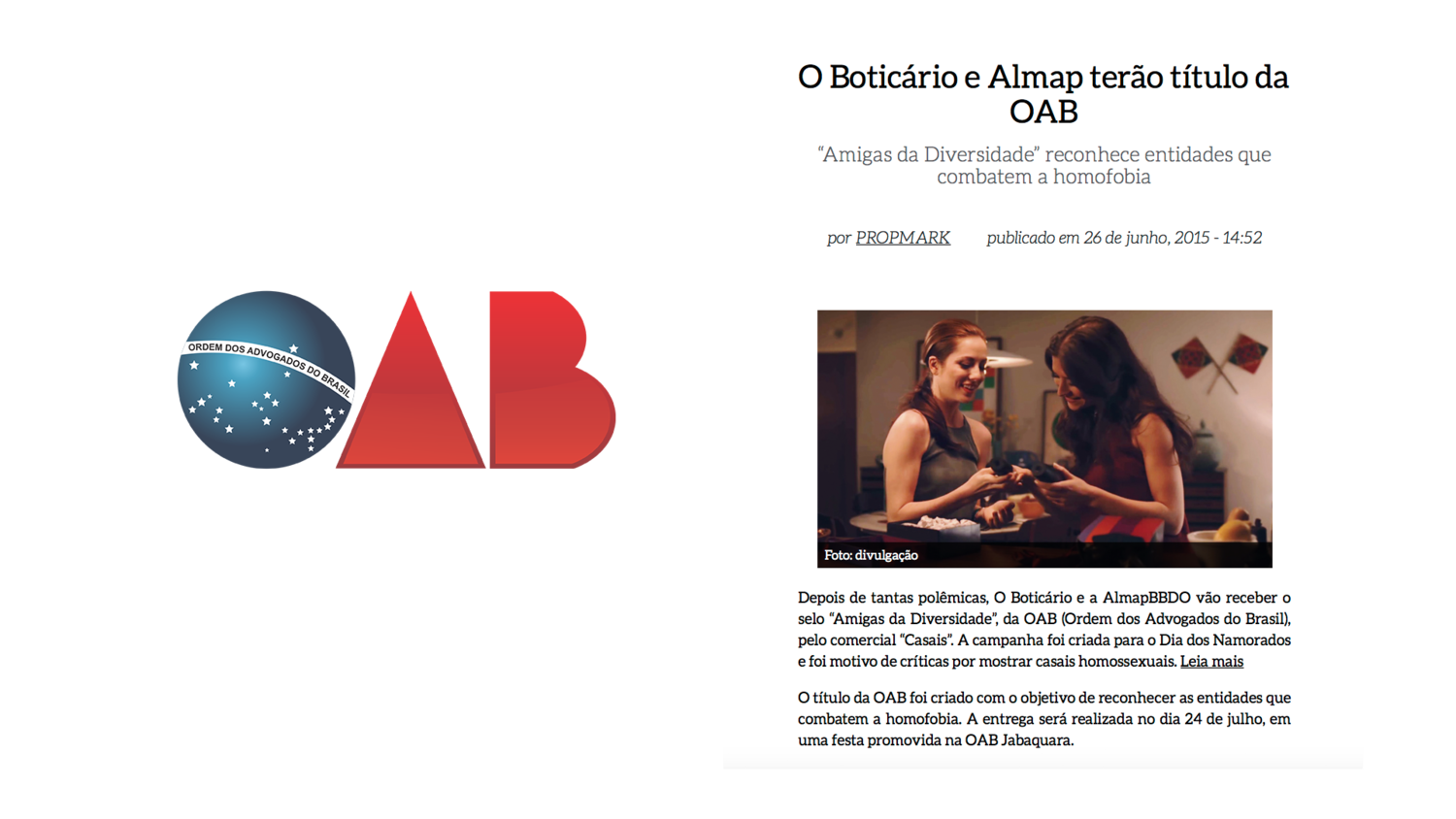
Brazil is a very conservative country and homosexuality is still seen with a lot of prejudice. That’s why O Boticário, one of Brazil’s leading beauty brands, decided to support the LGBT cause in its Valentines Day campaign. People used the campaign to talk about prejudice, LGBT rights and to push Brazil through a different and new way of thinking.
-
Creative team:
rafael gil ( art director ) / rodrigo almeida ( copywriter ) / sleyman khodor ( copywriter )


-
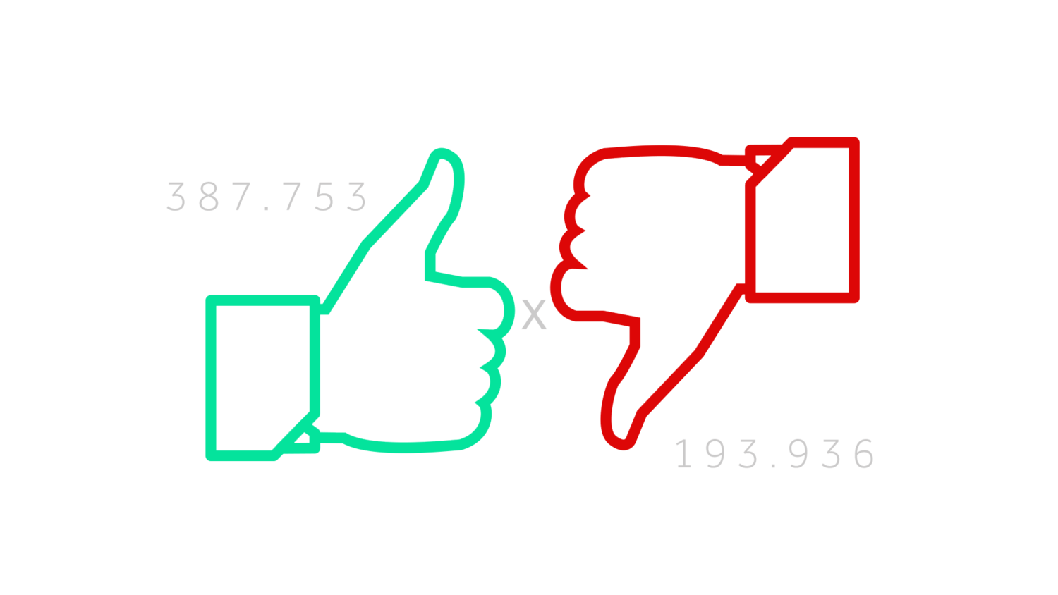
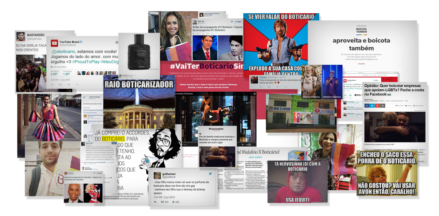
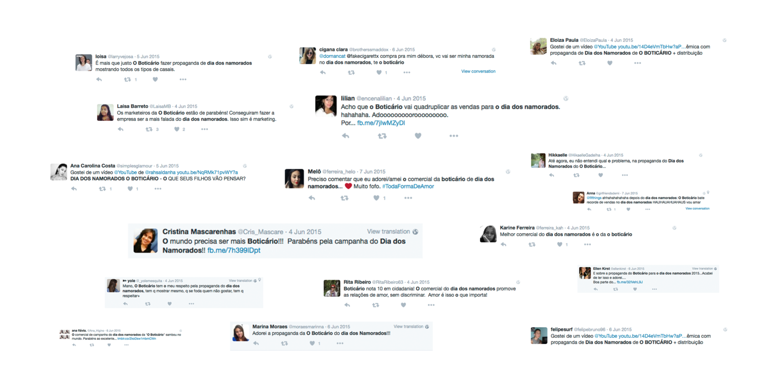
The campaign had intensive media coverage.
It has triggered a battle for likes versus dislikes on the YouTube film.


-
People engaged in social networks to support the campaign.
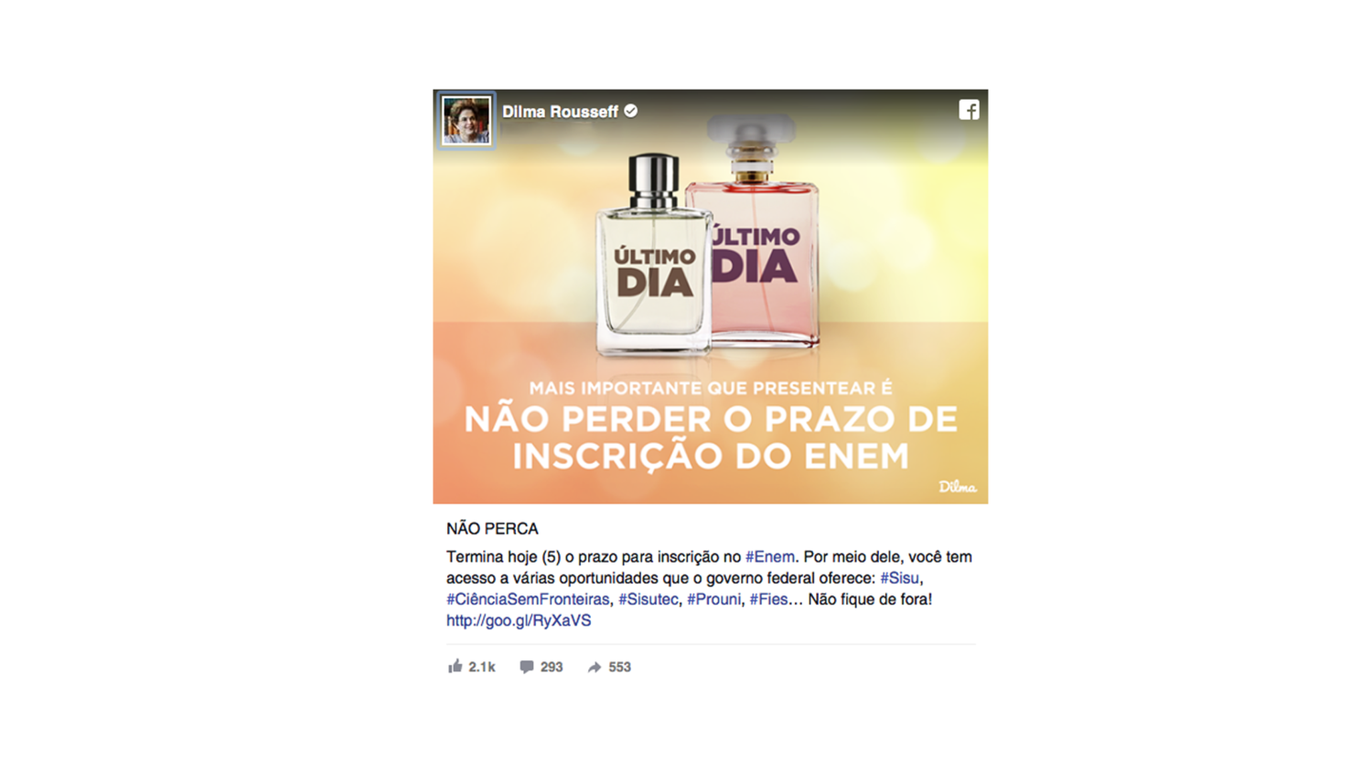
With a huge success, the campaign became a meme in Brazil.
The president of Brazil made her own meme.
We got to be the favorite brand and the second most remembered among the Brazilians.

est
#5
–

Other works that I developed for the Boticario.
-
Creative team:
rafael gil ( art director ) / rodrigo almeida ( copywriter ) / sleyman khodor ( copywriter )


craft
For Sniffers, I corrected the color of each of the film’s key frame, valuing the action and focal point in each scene. In addition to creating a color palette that unites the look of the entire film.
In Elysée, I created in cgi the mood of the bank setting in the film.

The Beautiful ex
-
A project in which I was able to contribute, along with my great friend Rodrigo Almeida (Monte).


est
#6
–

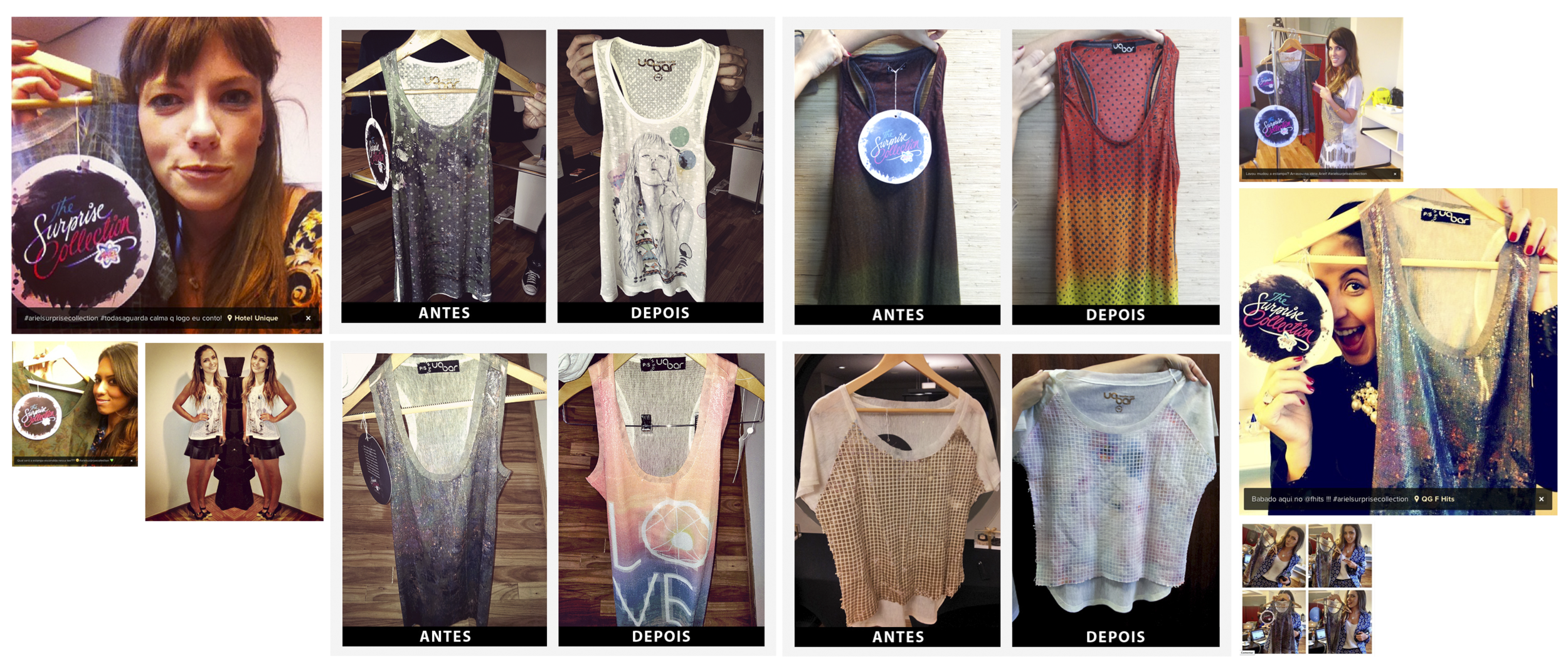
We have developed a line of exclusive clothes in which the real print was just revealed after the first wash with Ariel. Now this line is going to be launched in China and in Russia as well.
-
Creative team:
rafael gil ( art director ) / rodrigo damata ( copywriter ) / iron brito ( art director )


est
#7
–

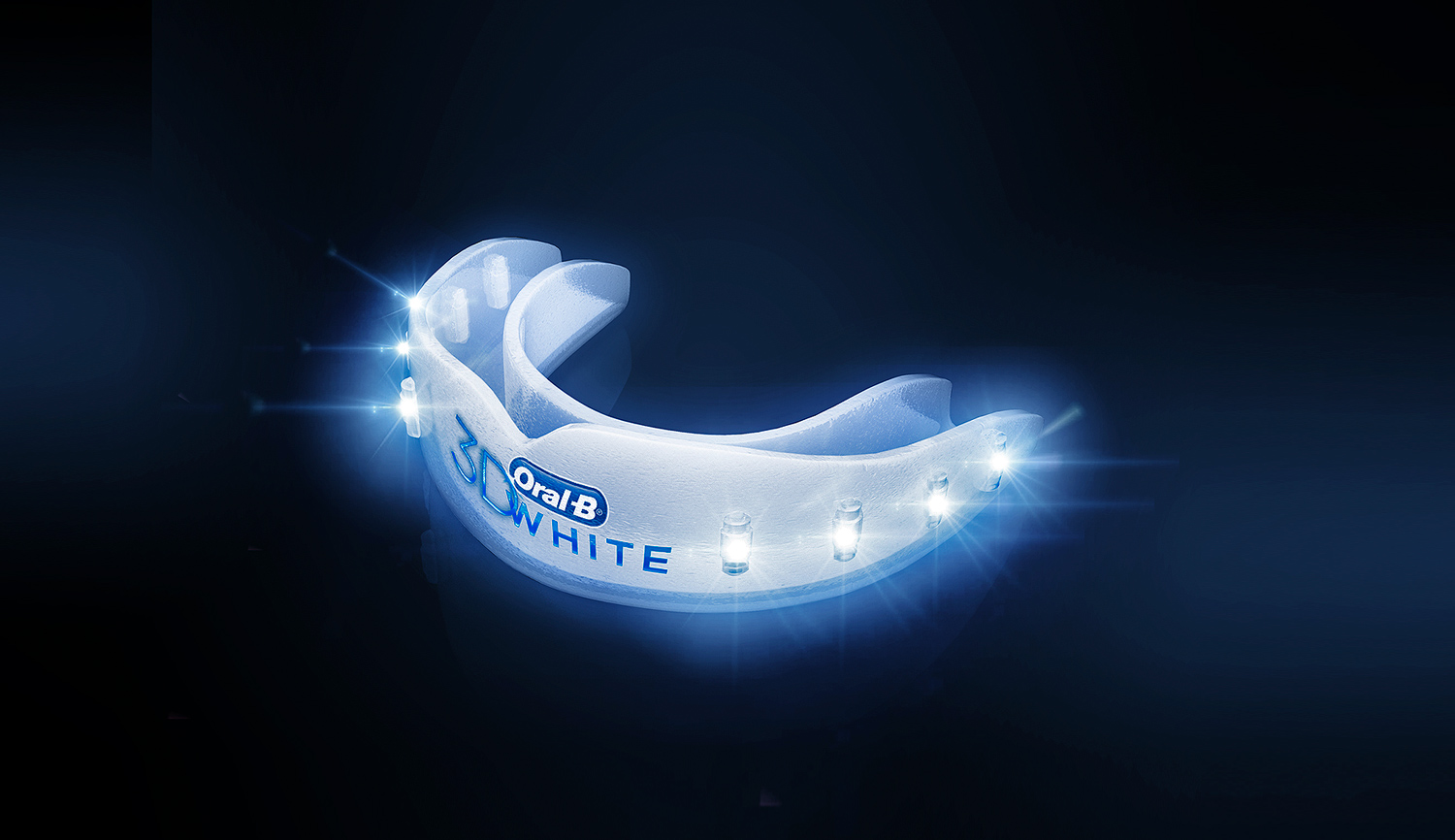
We created a fun action for the Oral B 3D White, a mouthwash with great whitening power, using the UFC champion Renan Barão. He entered the arena with a stunning white smile thanks to a LED mouth guard, and then we promoted the brand via Twitter. Retweets and other social media triggered as a result. About 30 million Brazilians watched our action on TV. It was also the theme of a variety of shows on TV in Brazil and worldwide.
-
Creative team:
rafael gil ( art director ) / rodrigo damata ( copywriter ) / iron brito ( art director )


est
#8
–

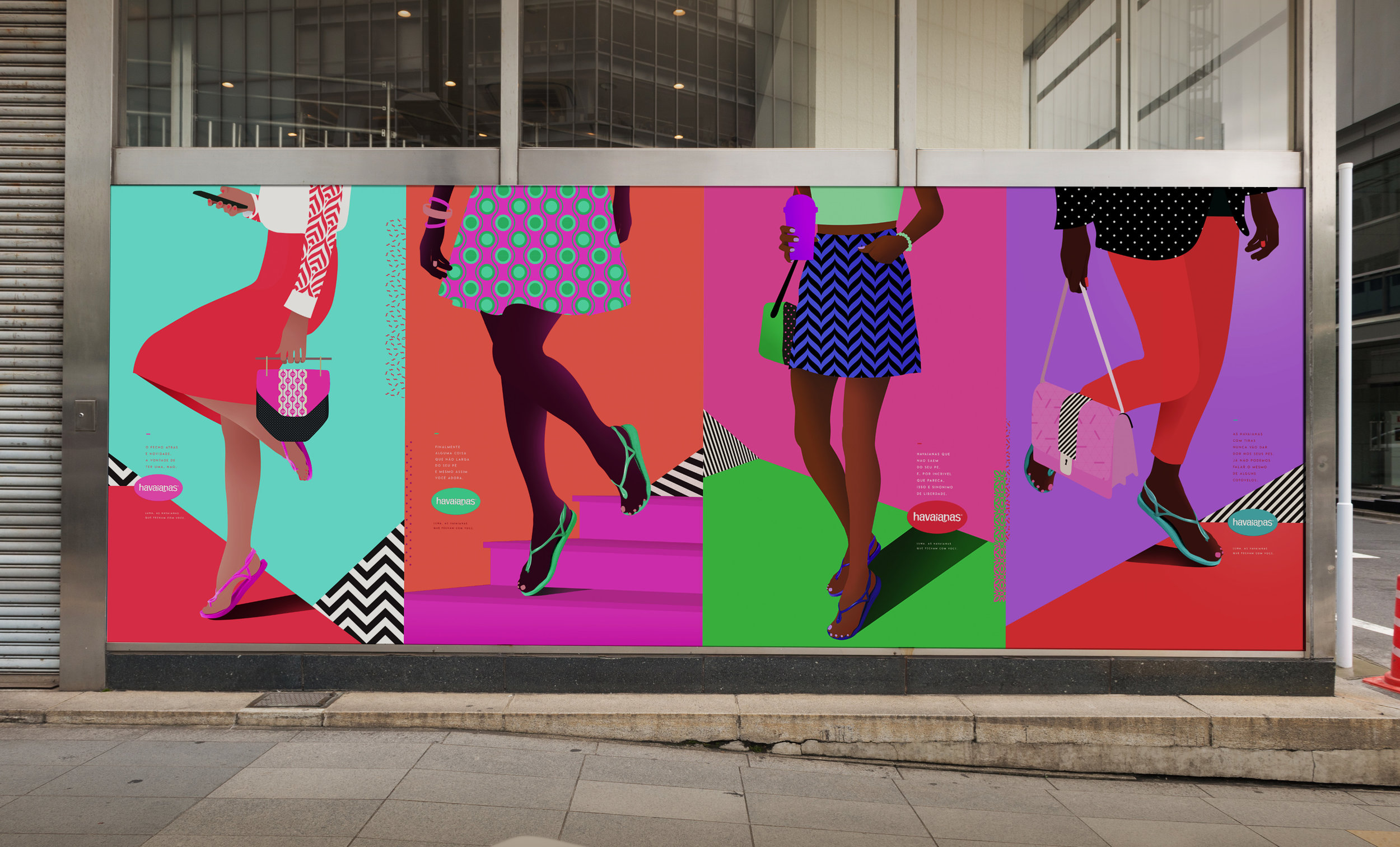
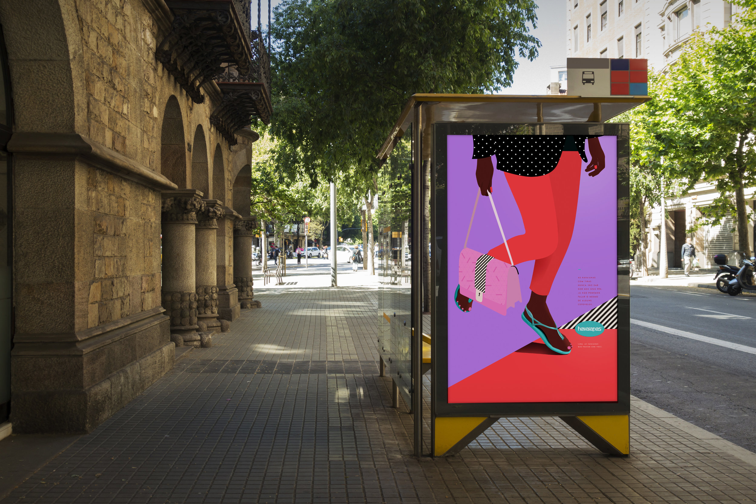
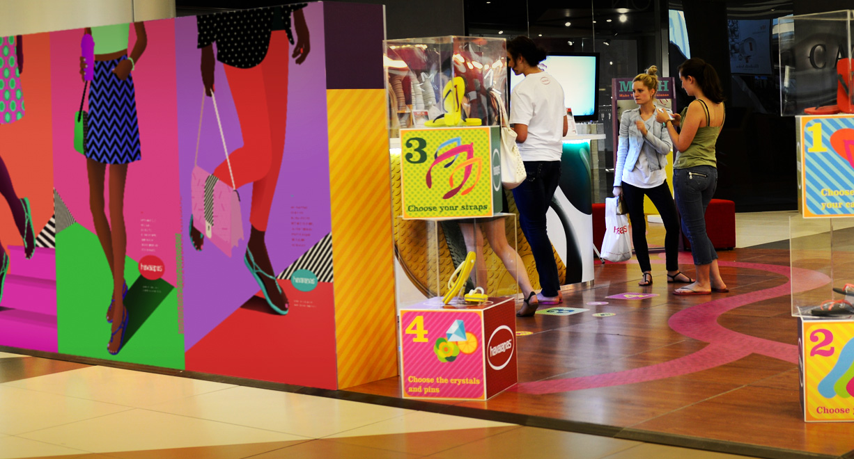
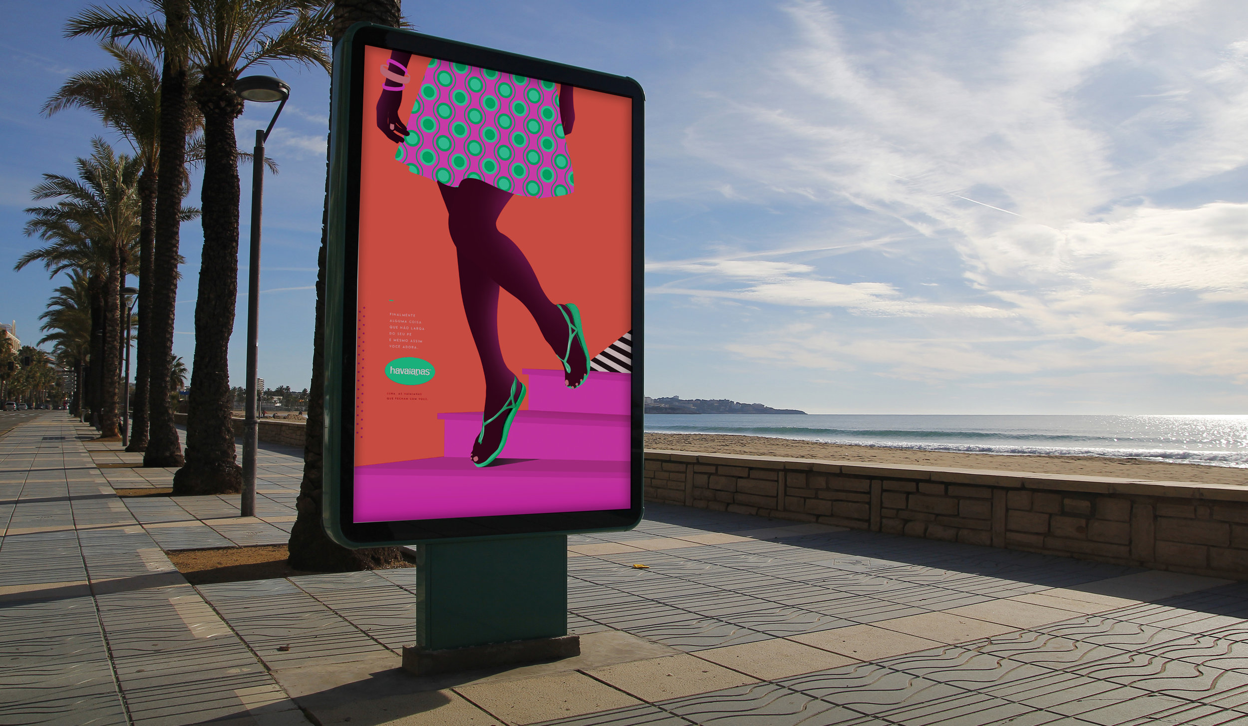
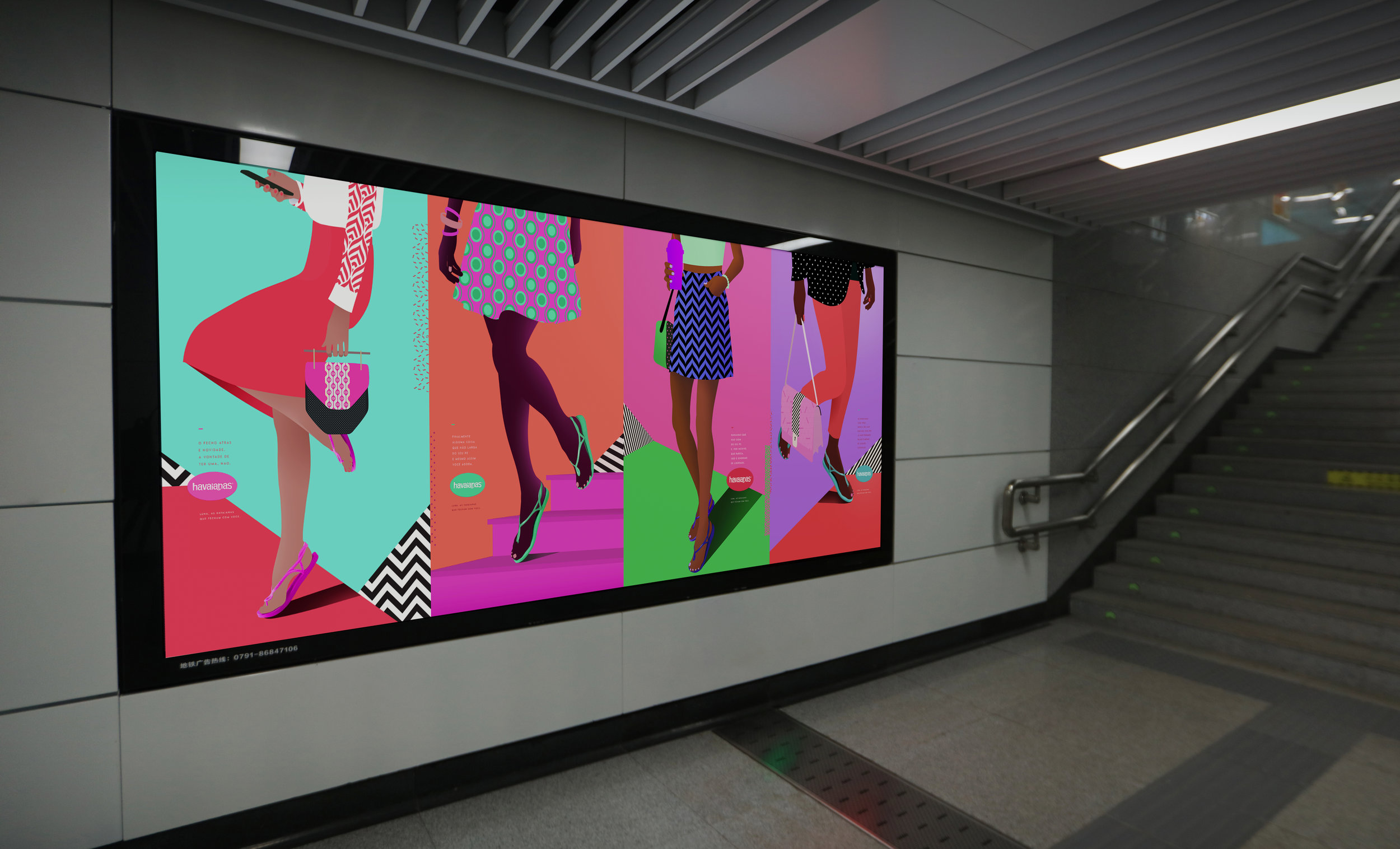
Campaign for the Havaianas Fashion Collection.
-
Creative team:
rafael gil ( art director ) / rodrigo almeida ( copywriter )

-
Print Campaign
-
-
Film Campaign
-
In Brazil, Havaianas is much more than colors.
It represents the democracy of fashion, once it is worn by the rich and by the people from lower social classes as well. On the TV campaign, we showed this equality using celebrities: Patricia Poeta (an important TV presenter in Brazil) and a doorman in a building.

craft - packshot
To show the variety of colors, we made the illustrations, frame by frame, on a recorded scene.

-
Soccer Campaign
Campaign with the theme “soccer”. Other movies are going to be released in 2017.

-
Biro-Biro is a former soccer player in Brazil, more famous by his hair than by his playing style.

craft - packshot


-
Poster for Havaianas Kids Spring Collection
-
Some details


est
#9
–

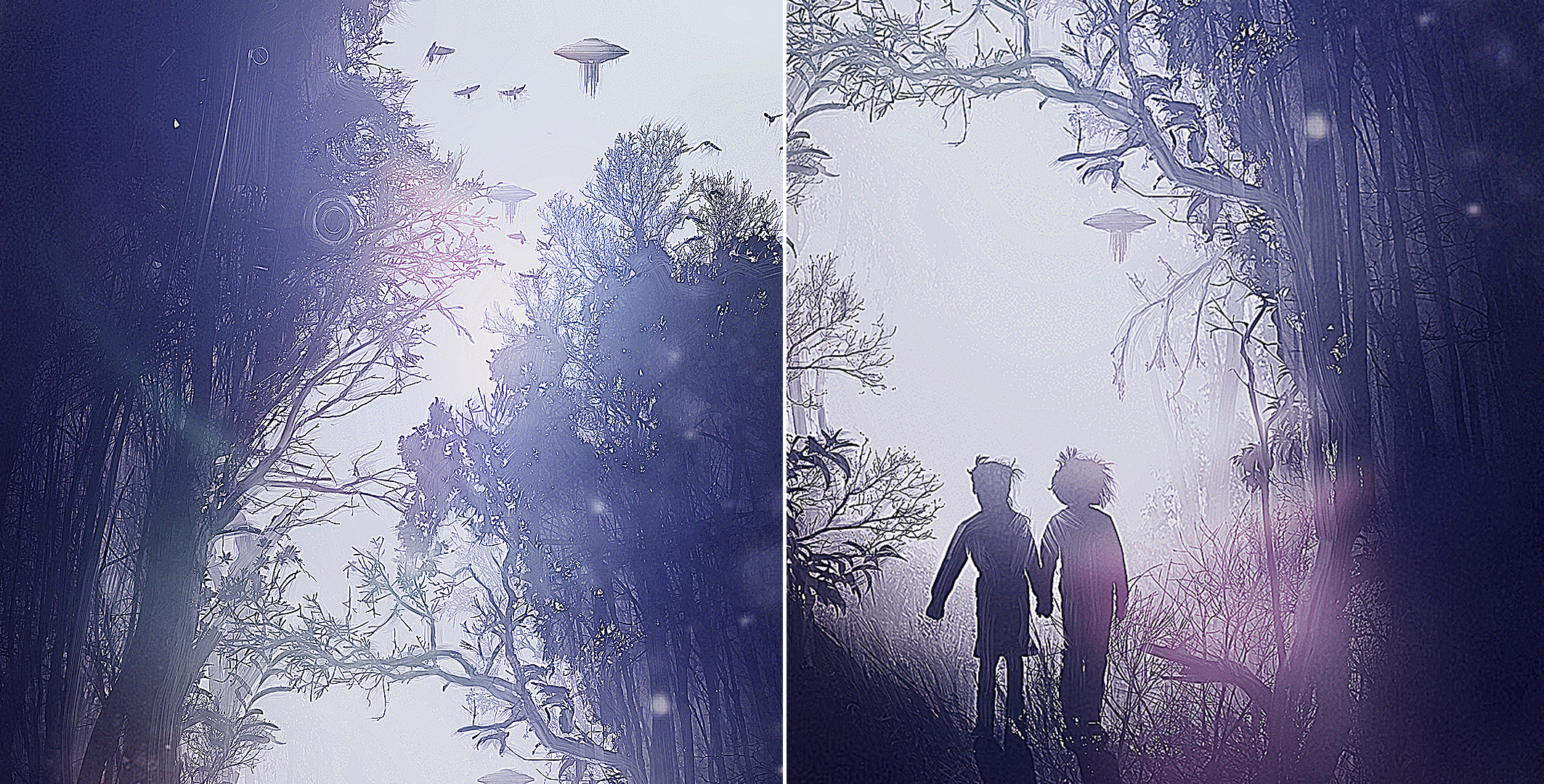
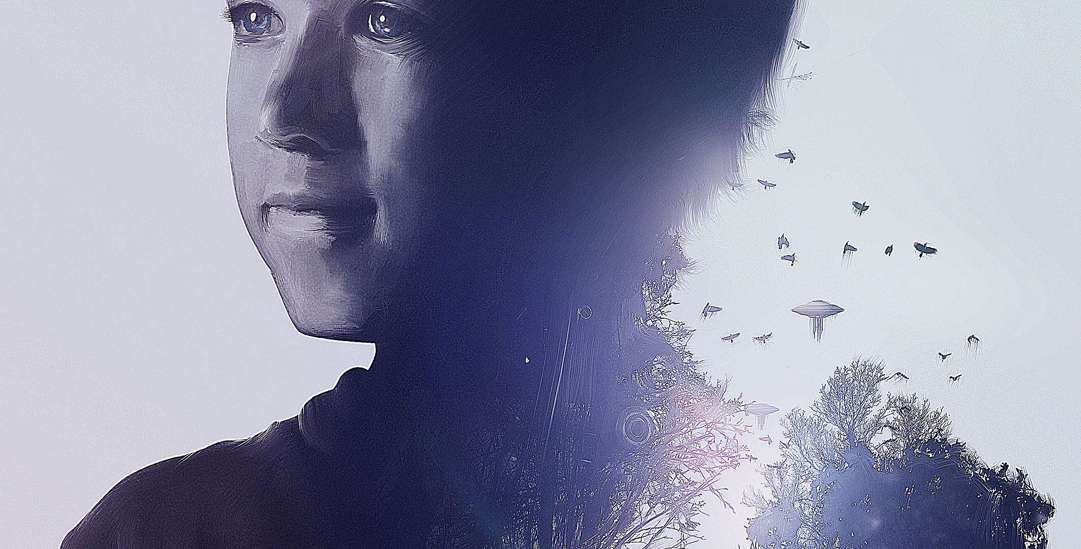
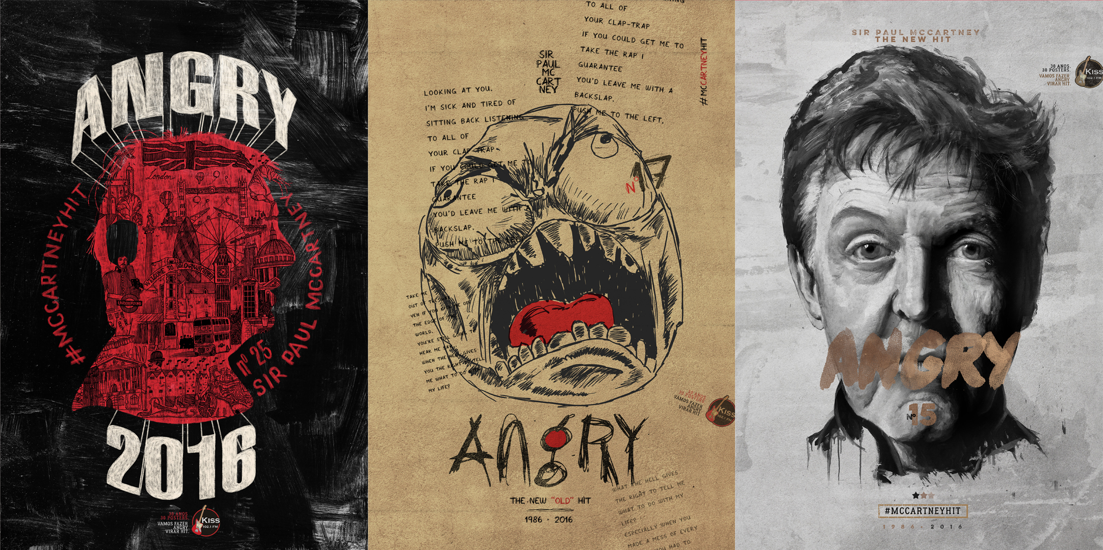
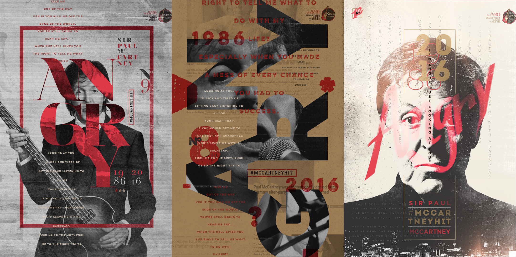
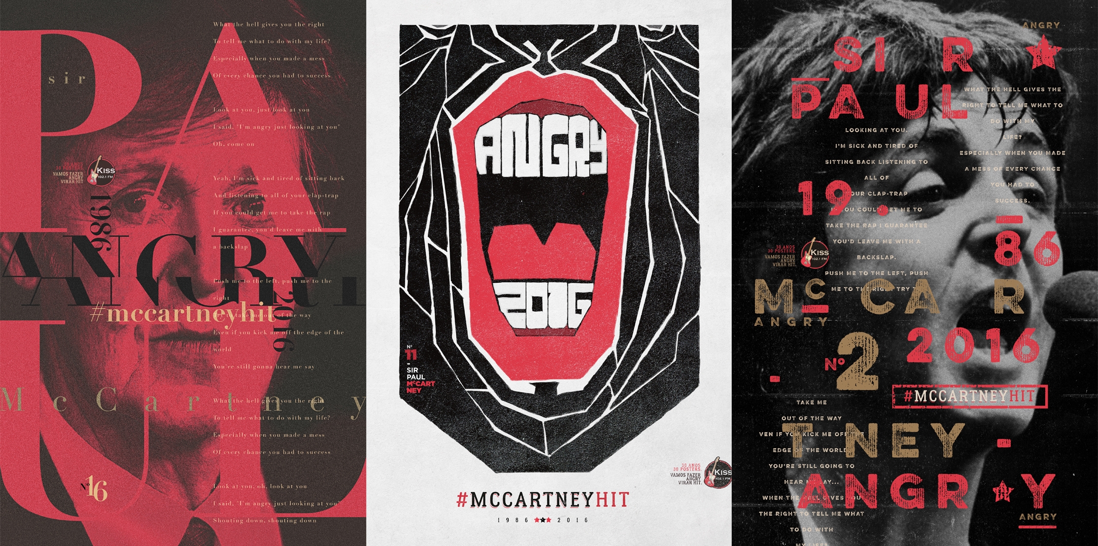
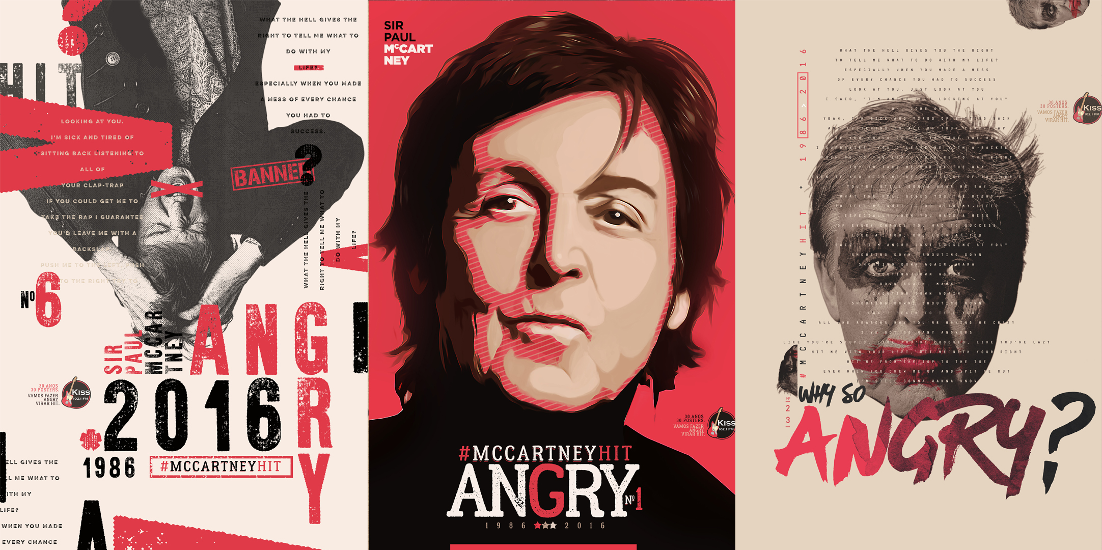
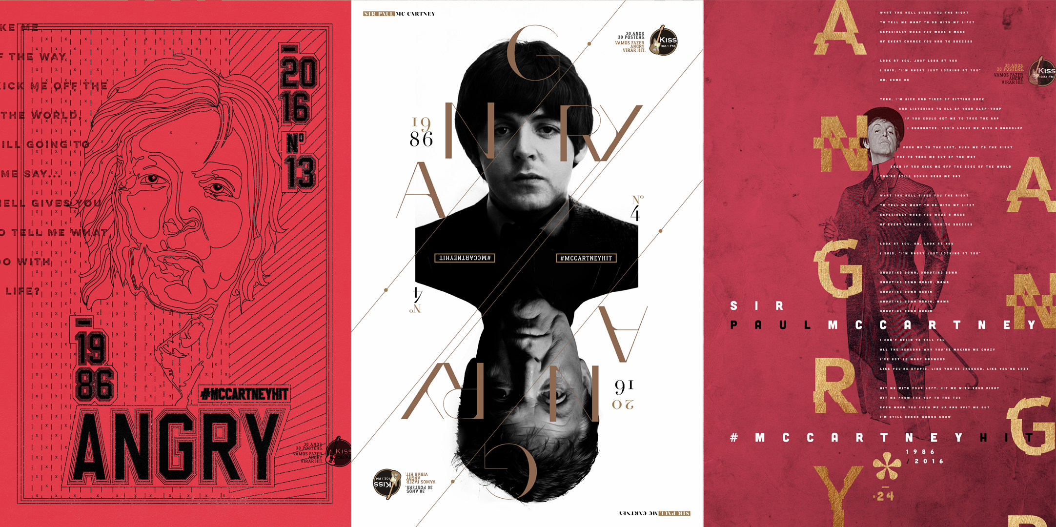
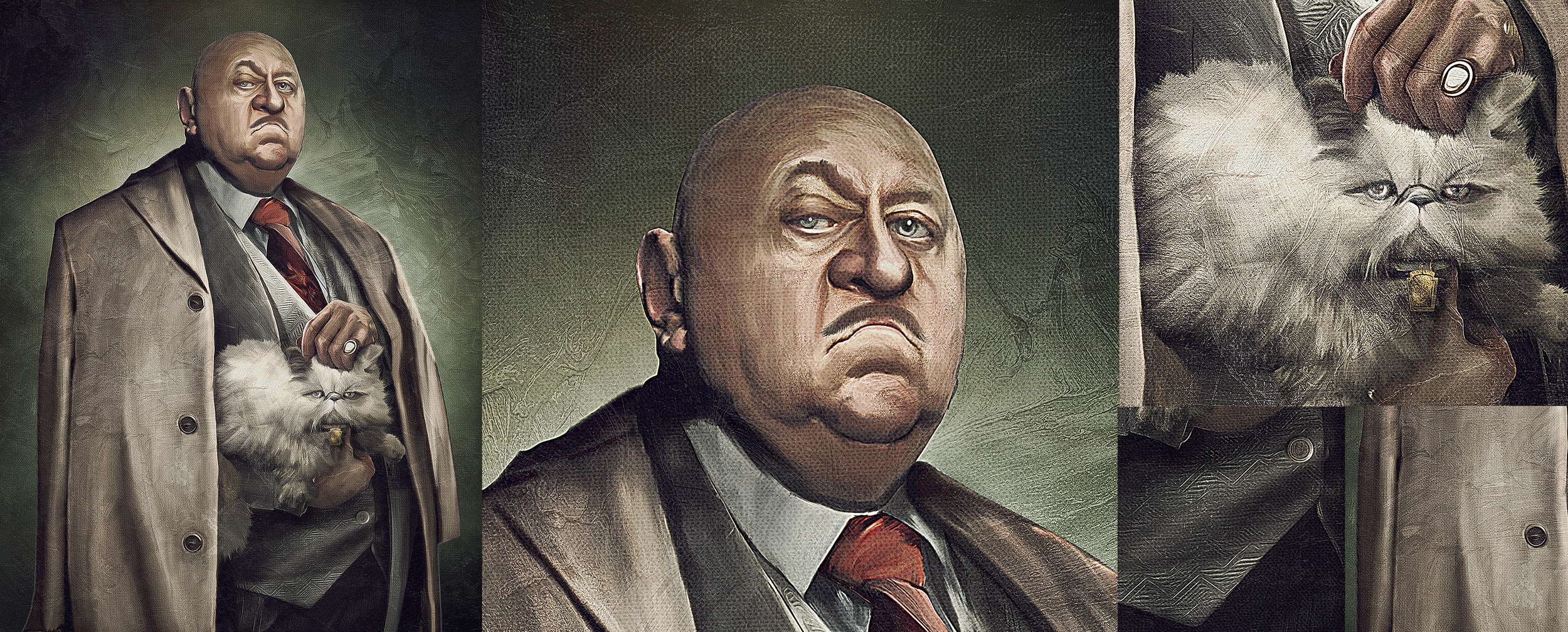
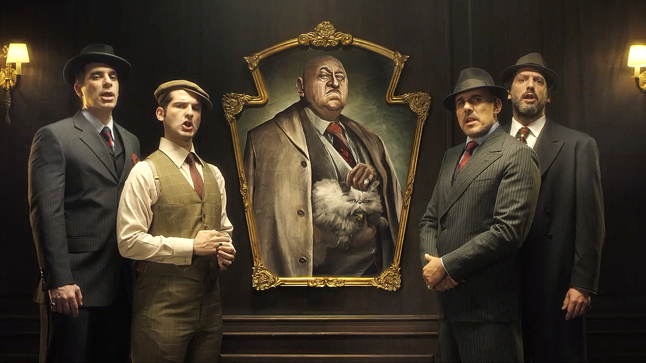
Paul McCartney was turned away at one of the afterparties for the 2016 Grammys because the bouncers didn't know who he was. At the time, Sir McCartney joked that he needed a new hit to get famous again. We took him seriously.
We decided to make one of Macca’s songs a hit – not just on our airwaves, but all across Brazil. So we encouraged rock and roll fans to get the lesser-known song "Angry", from 1986, to the top of the charts. We used our own broadcast and social media profiles to invite our fans to request “Angry” from all the other radio stations. Kiss hosts themselves called in live to our competing stations, asking them to play "Angry.”
-
Creative team:
rafael gil ( art director ) / rodrigo almeida ( copywriter ) / bruno pereira ( copywriter )


CRAFT
As it was an opportunity campaign, we created 30 posters in 3 days. Each poster represented 1 year of the song “Angry” by Paul McCartney.
Poster Design : Rafael Gil / Bernardo Silveira / Pedro Reis / Vinícius Valeiro / Eduardo Vares / João Souza / Eric Benitez / Carlos Garcia


-
A 30-year-old song became a hit in 2016, thanks to audience engagement.
Fans flooded the social media profiles of the other stations. + than 10k shares

* CASE DESIGN
–


est
#10
–

A project in which I was able to contribute with the development of the idea.
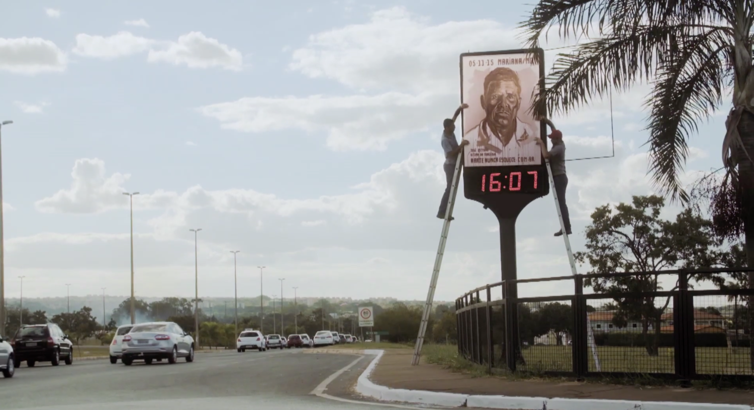
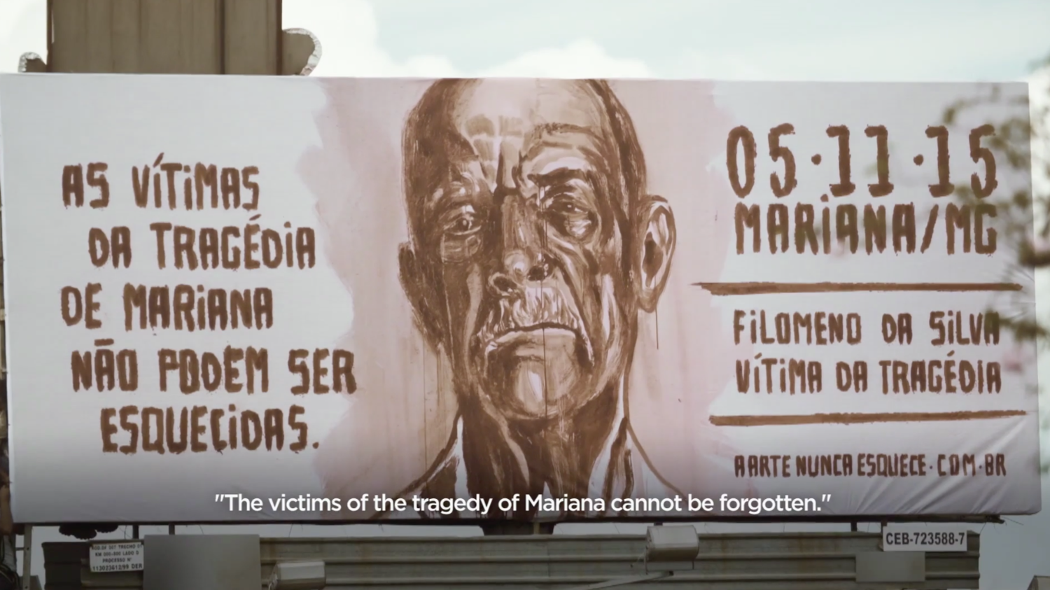
On November 5th, 2015, the collapse of the Fundão Dam unleashed an onslaught of toxic mud that devastated the municipality of Mariana, where hundreds of families had their lives destroyed in the largest environmental disaster Brazil has ever seen. The catastrophe made headlines across the media, sparking a wave of indignation across the world. But time has passed, the media has backed off, and just five months after the disaster, the parliamentary commission created with the sole objective of finding solutions for the victims had two sessions canceled for lack of attendance on the part of the federal deputies.
Aware that one of the most important functions of art is to force society to remember its most difficult moments, the Panamericana School of Art and Design decided to take a stand, sending an alumnus to the site of the tragedy. There, he heard the stories of those who lost everything and gathered up some of the mud that had devastated the houses, neighborhoods, and lives of these people. Back in the studio, the artist used the mud as a raw material to create a series of portraits of the victims, which were then displayed on the streets of Brasília, the capital of Brazil, strategically placed along the route that politicians take to get to Congress.
-
Creative team:
rafael gil ( art director ) / marcelo pignatari ( copywriter ) / marcelo tolentino ( illustrator )


CRAFT
All of the visual identity was based on the mud aesthetic. To do so, I created a typographic family called “mariana doesn’t forget”. The font was handmade and then given a digital retouch.
Besides that, I digitally illustrated the area map where the billboards were distributed. I did all the layout of the site where the action took place.


est
#11
–

Kids don’t tend to like healthy foods.But we eat with our eyes first. That's why we designed a collection of plates that make vegetables and greens more attractive to kids: the food is used to make fun pictures.
-
Creative team:
rafael gil ( art director / illustrator ) / rodrigo almeida ( copywriter )


-
It makes it easy for everybody . The illustrations are already drawn on the plates. The adults just need to arrange the food in place and... voilà!
craft
In partnership with Studiorama, we drew the illustrations of the plates and the location of each vegetable.


> The package followed the fun appearance of the plates.


est
#12
–

We wanted to find a way of helping GRAACC, a group that supports children and teenagers with cancer, which depends on donations to keep working. We managed to help them by creating a line of jewelry which used diamonds made out of the patient’s hair, with the revenue reverted to the hospital. Hair loss is a fact that most exposes and touches the patients, especially children. We believe that transforming their hair into diamonds we transform a symbol of fragility into something unbreakable, as the patient’s hope should be. Therefore the campaign’s name: Unbreakable Hope. Besides bringing a positive message, which raised the GRAAC patients’ self-esteem, the line Unbreakable Hope will continue as revenue for the hospital.
-
Creative team:
rafael gil ( art director ) / guigo oliva ( copywriter )


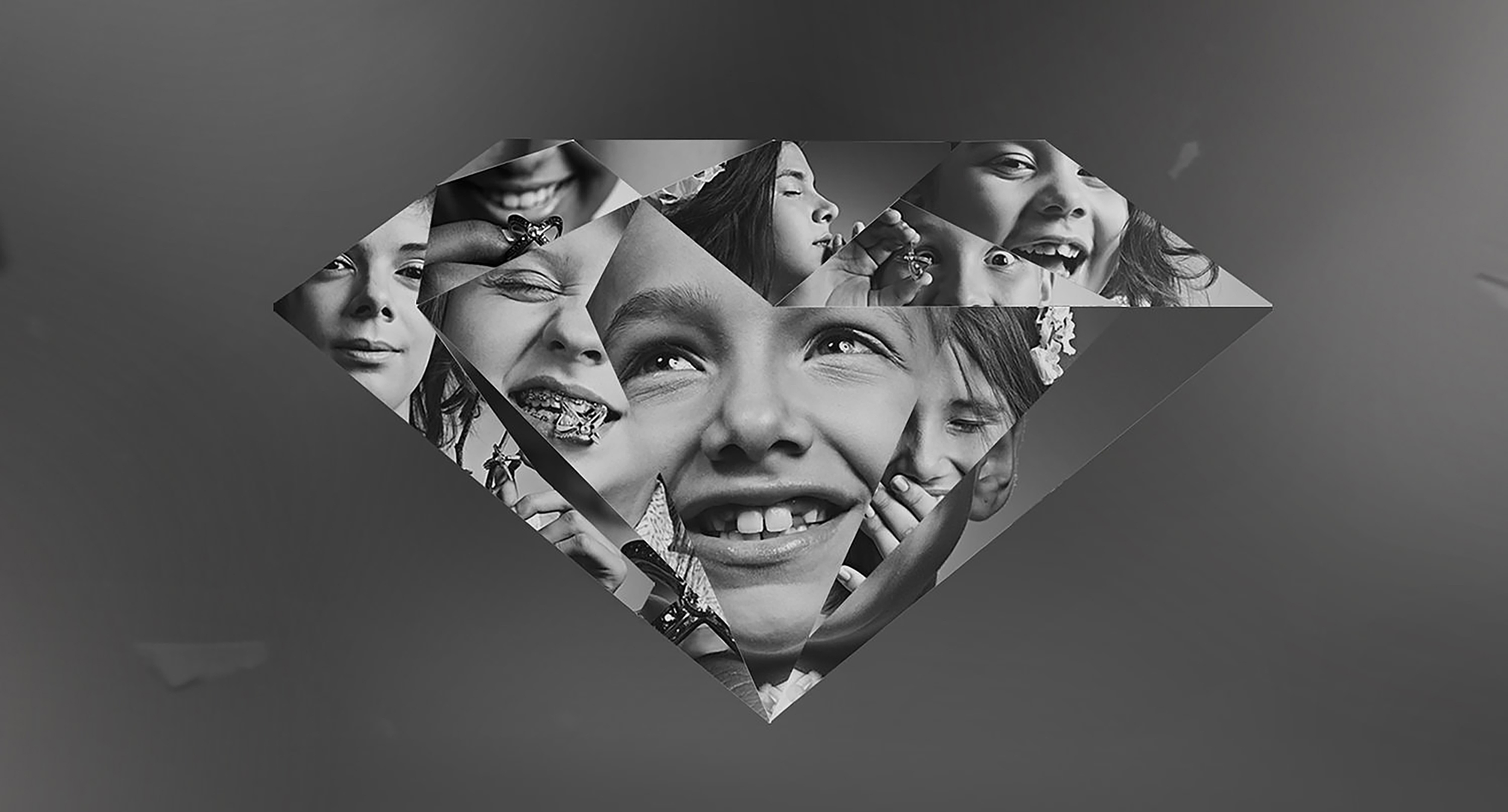


The ring
It was developed with a unique mechanism that allows the diamond to spin around itself, standing or upside down. It was meant to be an analogy of how the patients feel due to the disease: sometimes they are down, but with a positive attitude and GRAAC’s job, they bounce back.


-
Print campaign
craft
Hand typography


-
The line "Unbreakable Hope" was sold out on its pre-launch, bringing immediate resources to the hospital. Now it is going to be launched on a great event, in which there will be an auction with the concept jewelry collection, sponsored by artists and means of communication.


est
#13
–

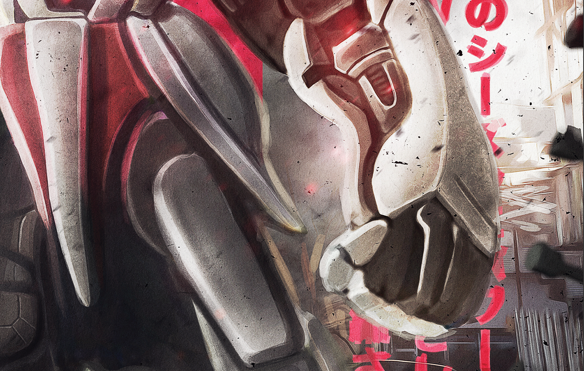
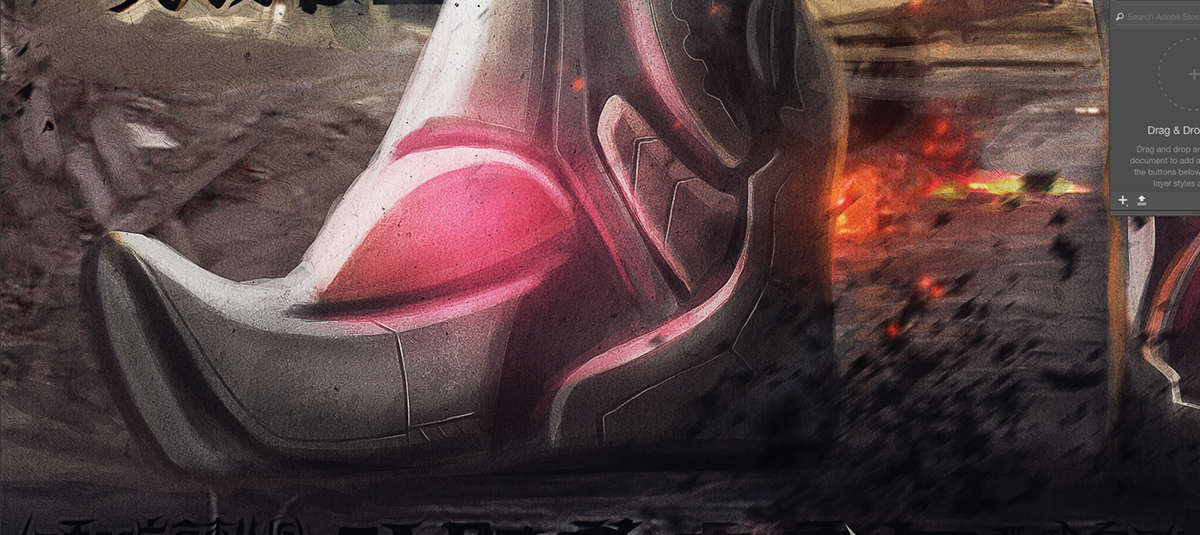
We have created a new product that is being developed and licensed by UFC, which helps the fans of this sport to enjoy their fights without any disturbance.
-
Creative team:
rafael gil ( art director/illustrator ) / guigo oliva ( copywriter ) / paulo filipe ( illustrator )
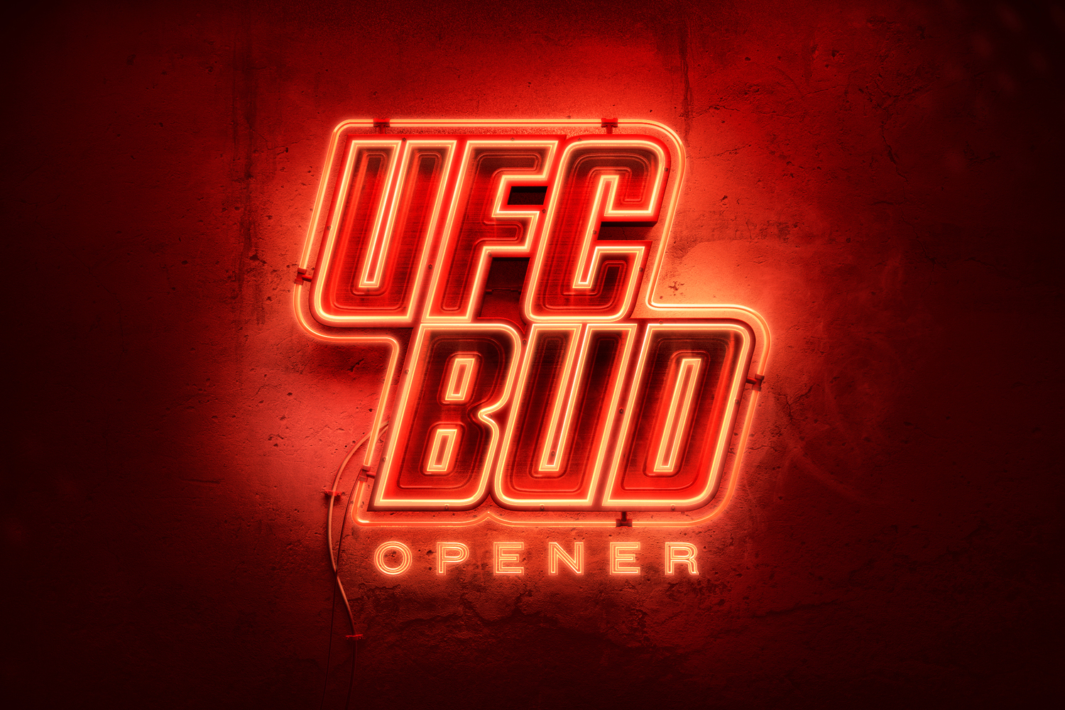

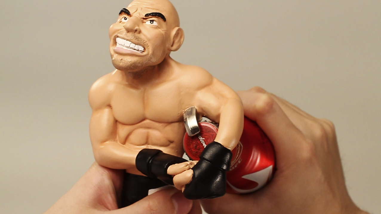
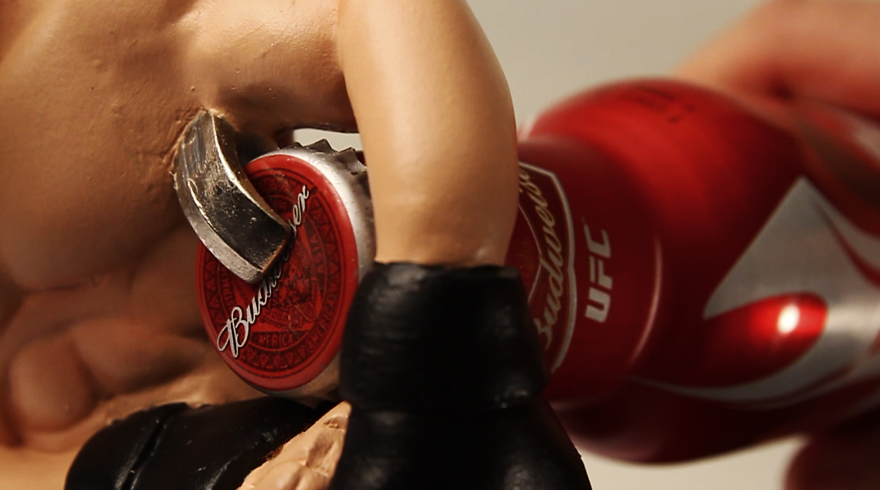
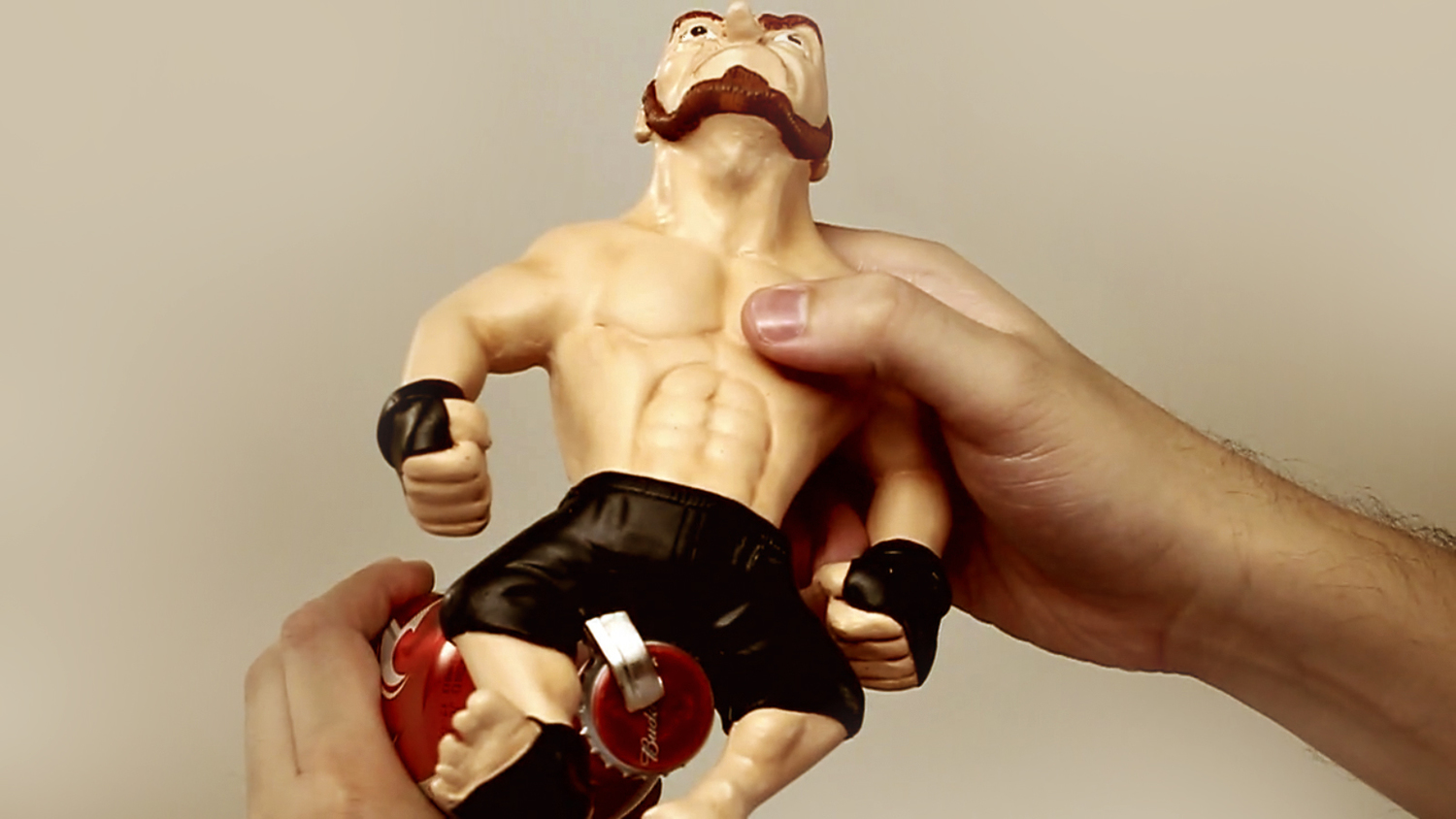
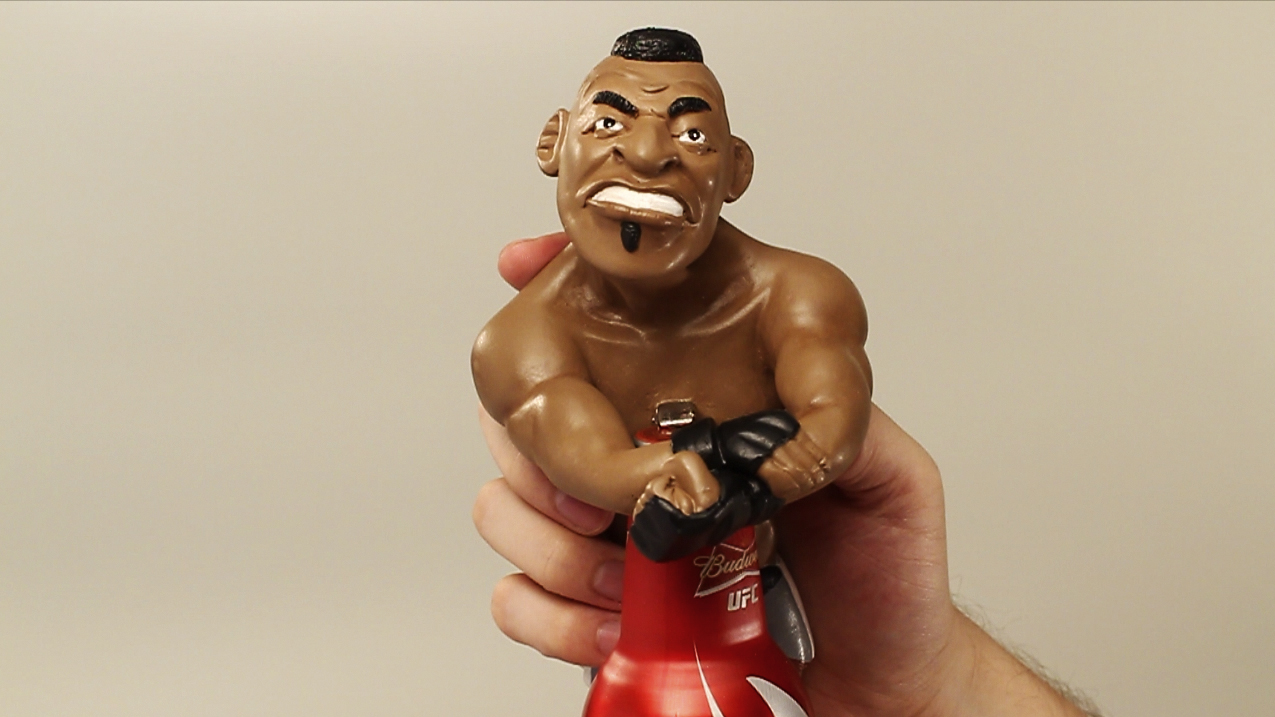
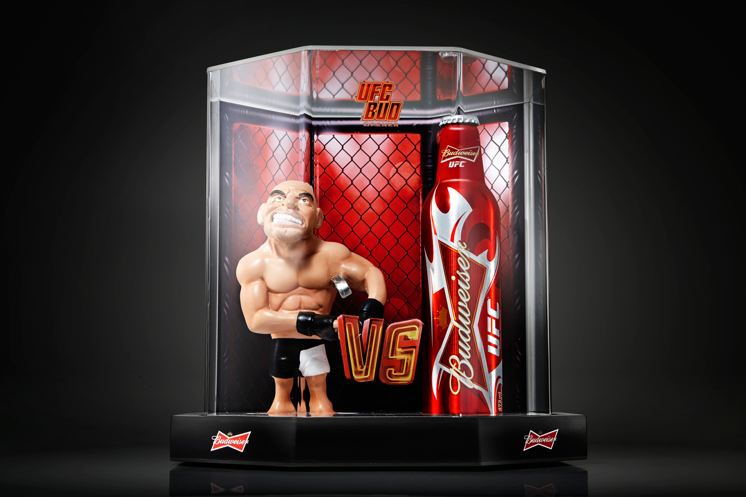
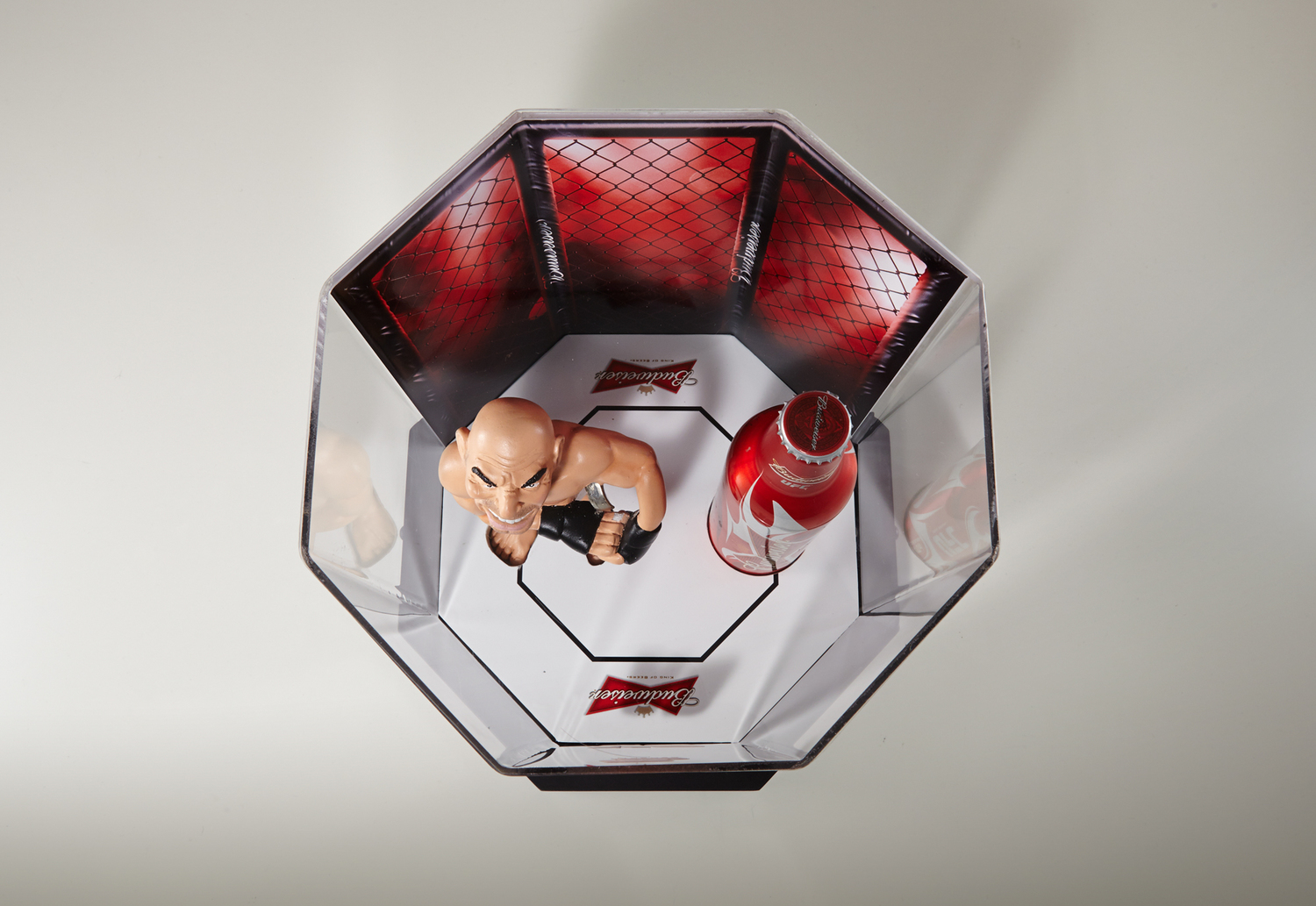

3d logo developed in collaboration if Paulo Filipe Souza cargo collective.com/pfsouza


est
#14
–

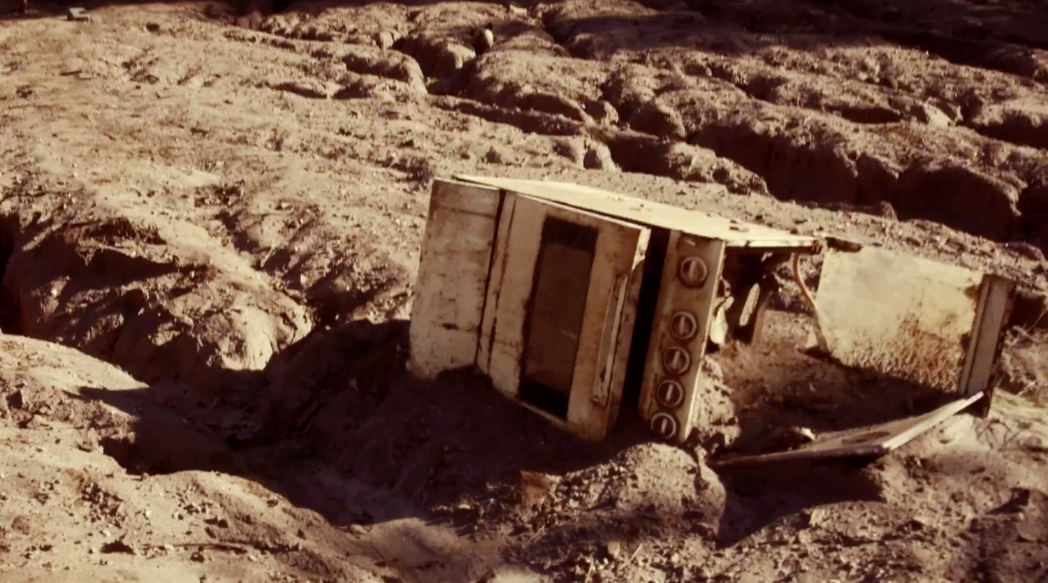
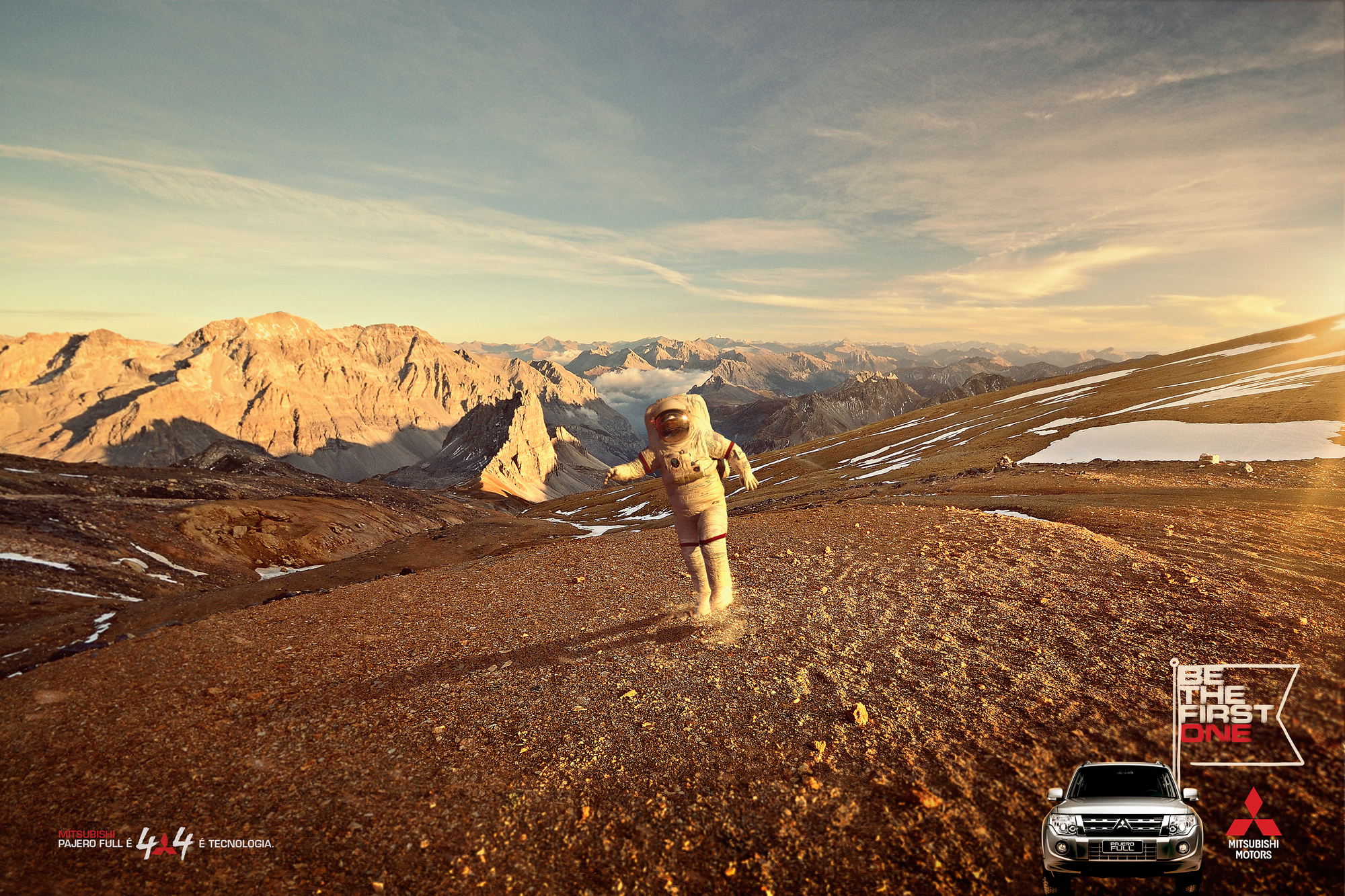
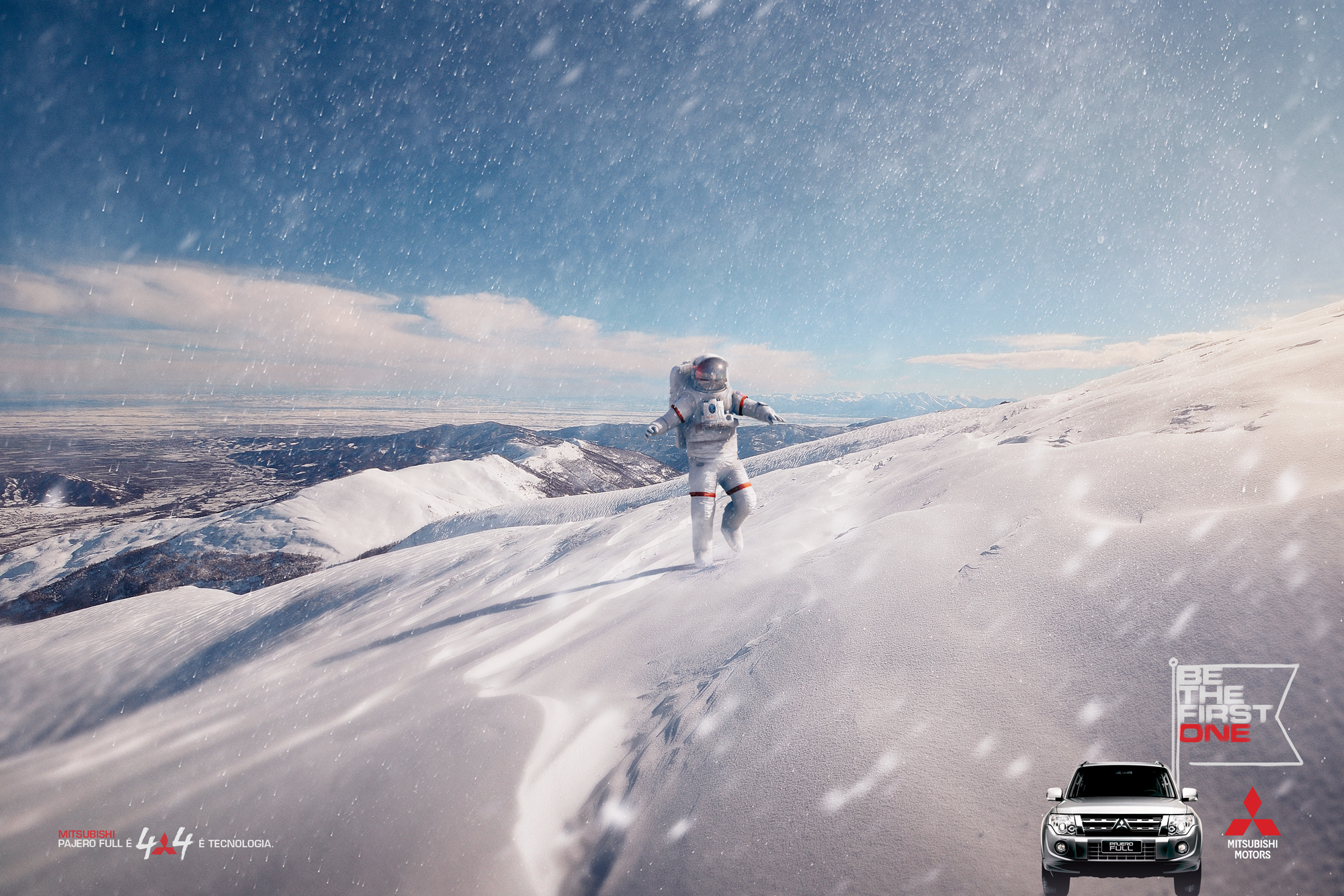
A series of posters for Pajero Full by Mitsubish which showed the suffocating sensation that we sometimes feel when living in big cities.
-
Creative team:
rafael gil ( art director/illustrator ) / gustavo costa ( copywriter ) / ale burset ( photo )

CRAFT
“We have thought to execute the idea this way: people dive into the water and we project chaotic images on the surface, so that we could get the real image in only one shoot. There is a little catch though, we don’t know if it will work out, lol” “Ok, let’s do it this way, however, I think that way…”
This was the dialogue I had with the photographer, which would be amazing just for having had his trust, but it becomes even more extraordinary when the photographer who took the challenge is the best one in the world: Ale Burset. Only he would have had the sensitivity to perform a job like that. See below the rehearsal shoot.
The typography was digitally hand drawn, as if it was dissolving in the water.

est
#15
–

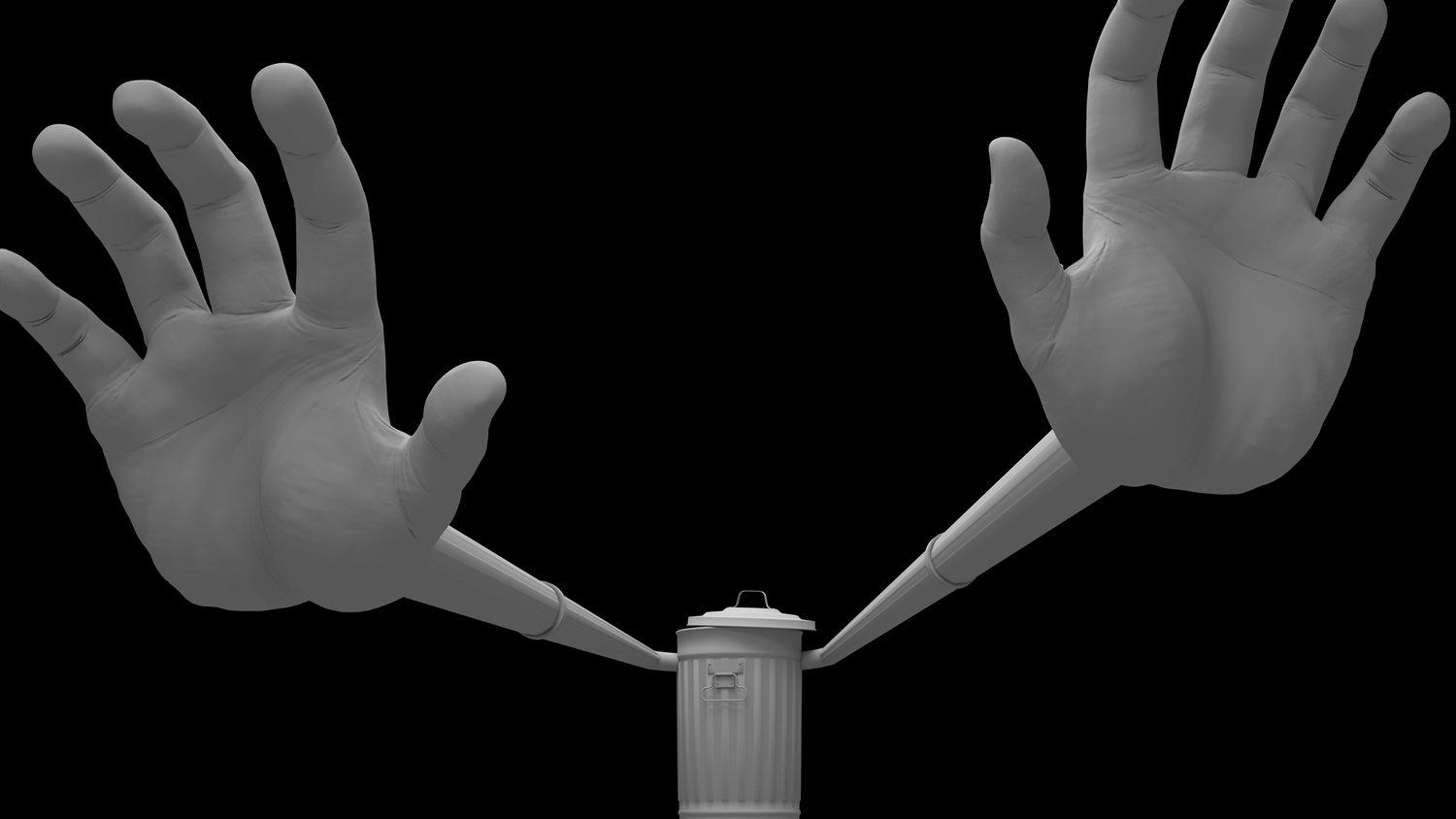
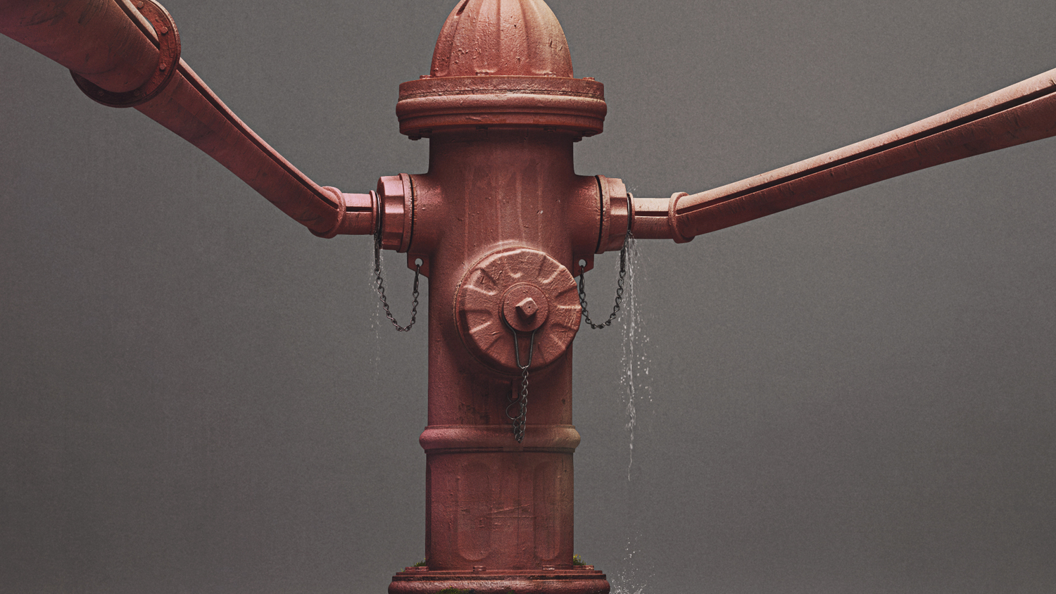
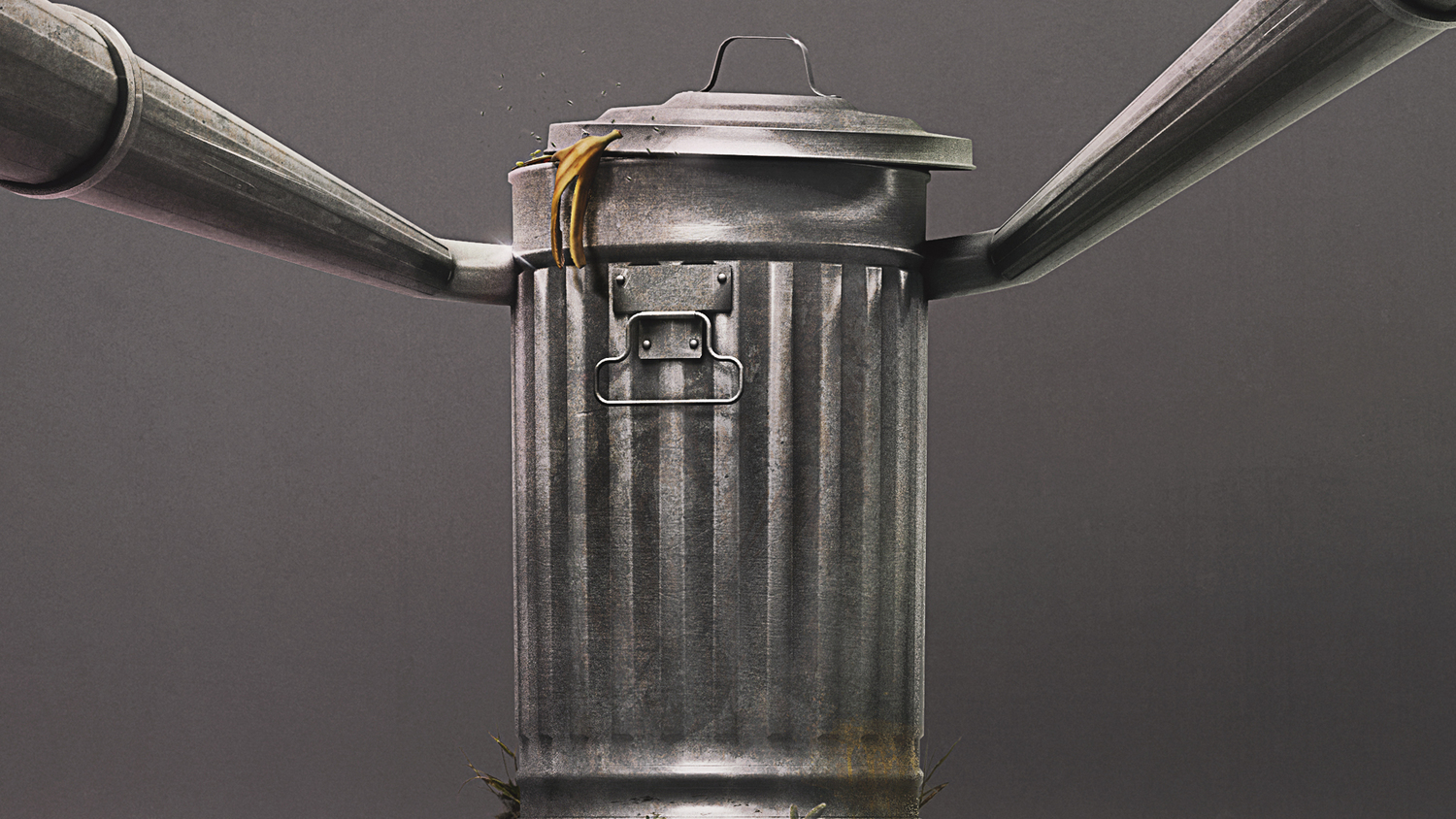
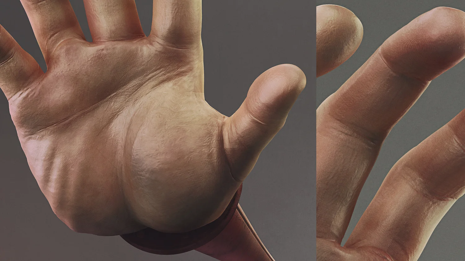
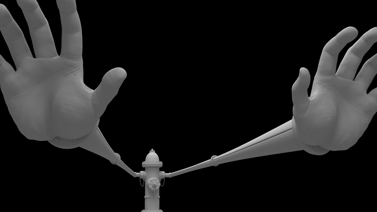
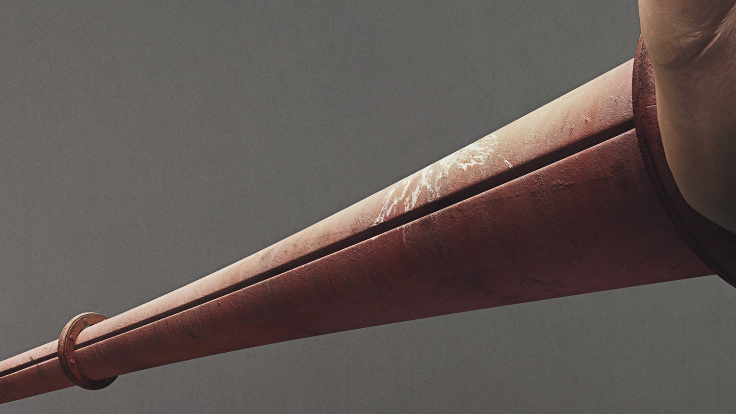
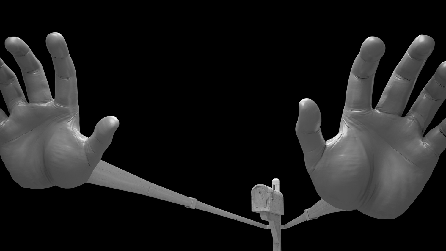
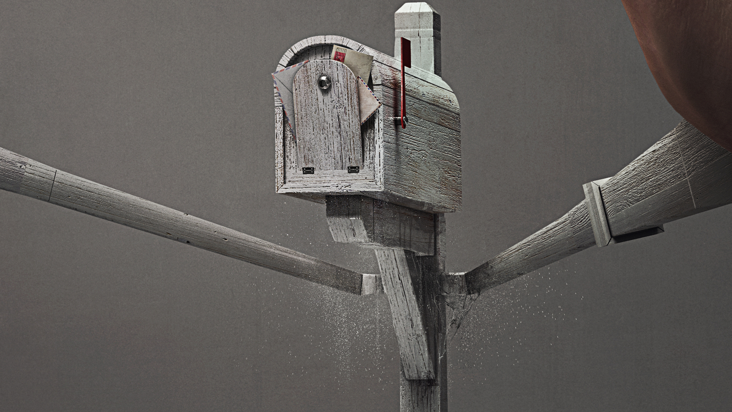
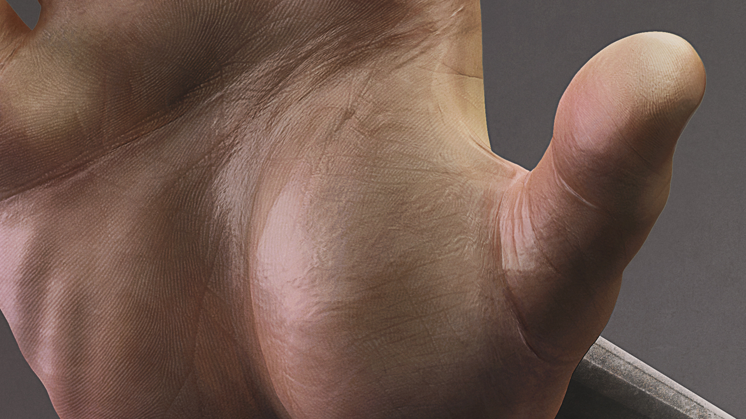
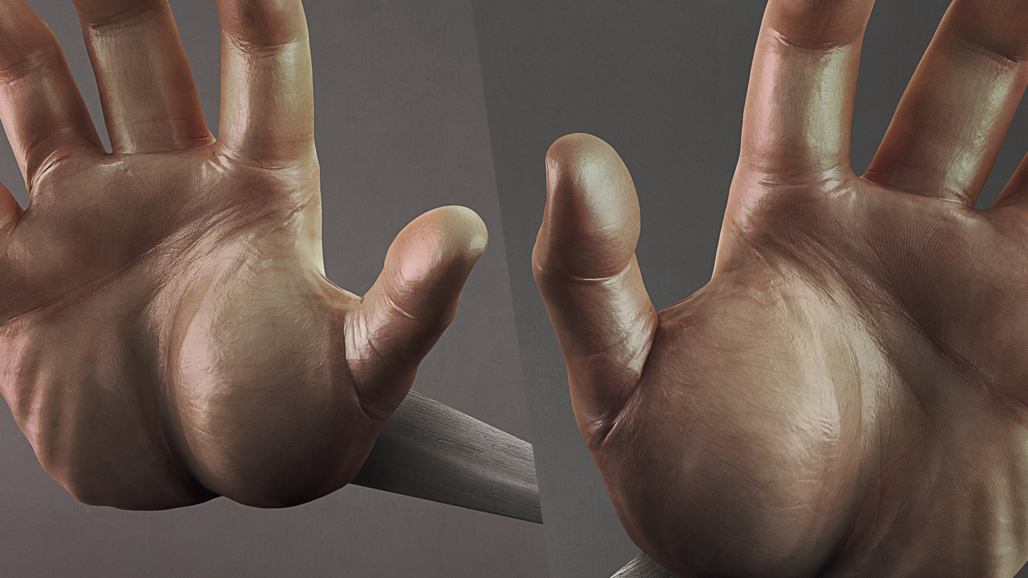
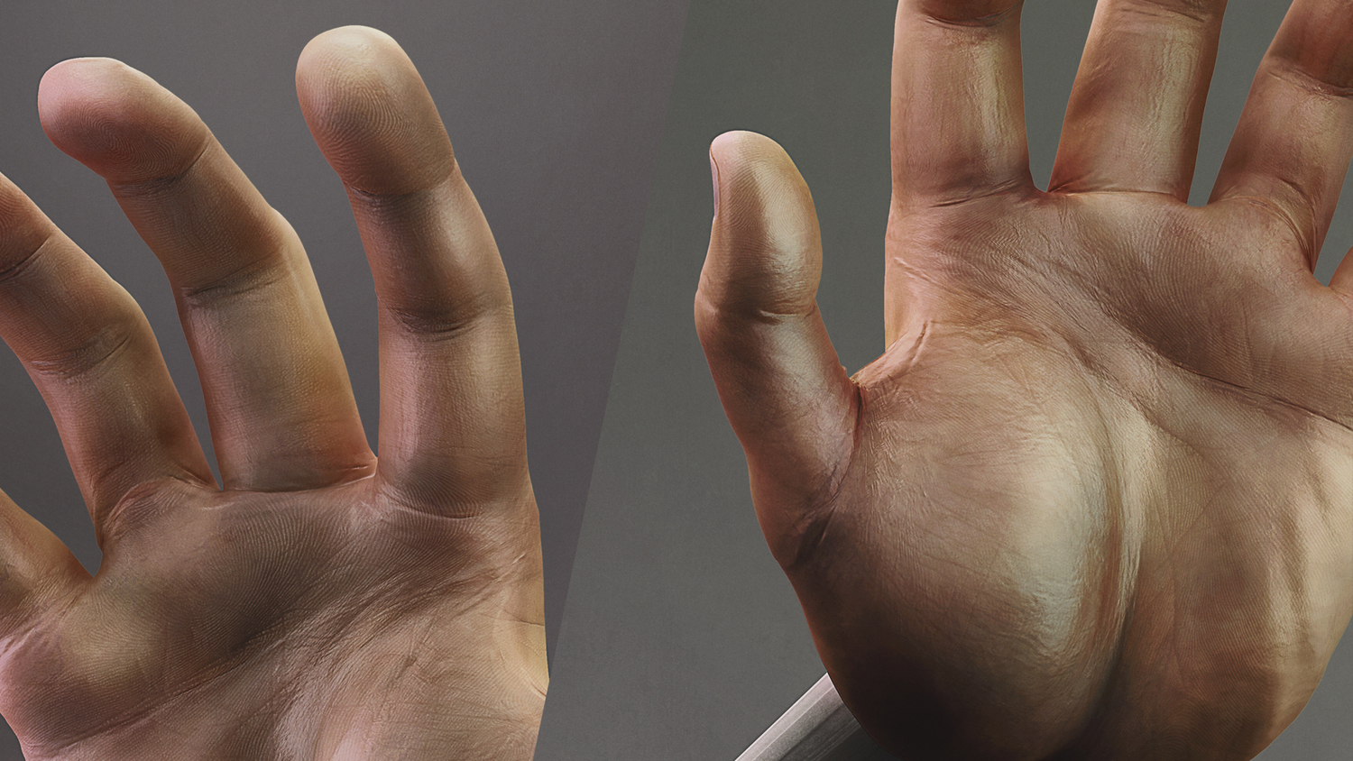
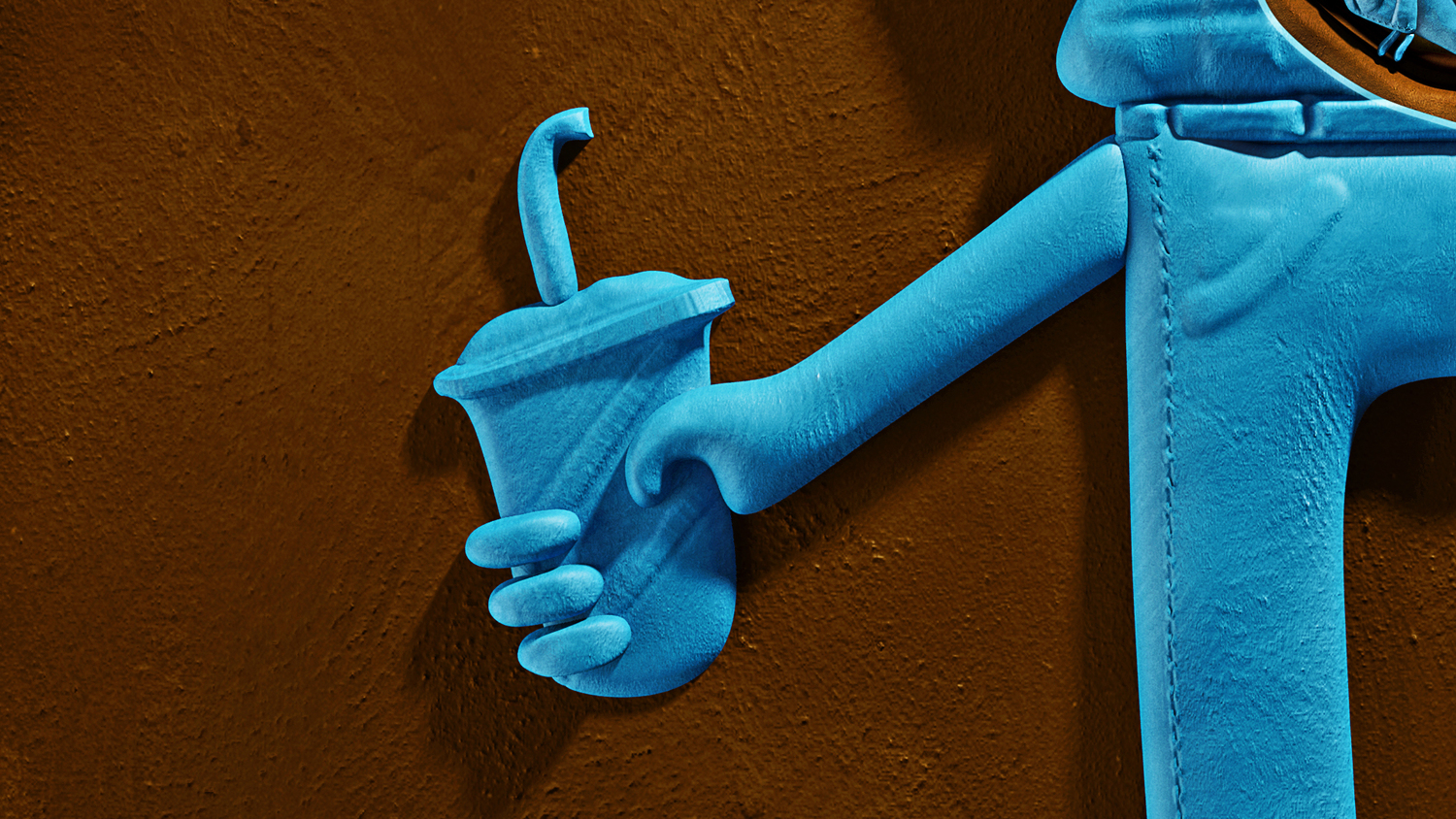
Campaign for new Grand Vitara with reversing camera.
-
Creative team:
rafael gil ( art director/illustrator ) / gustavo costa ( copywriter ) / paulo filipe ( art director/illustrator )
CRAFT
In this work i divided the execution of 3d with Paulo Filipe. I made the sculpture of hands from a model already created. Besides the modeling of the post office box and the final retouch of all images. My friend Paulo Filipe got the job of materials and lighting of the final scene.


est
#16
–

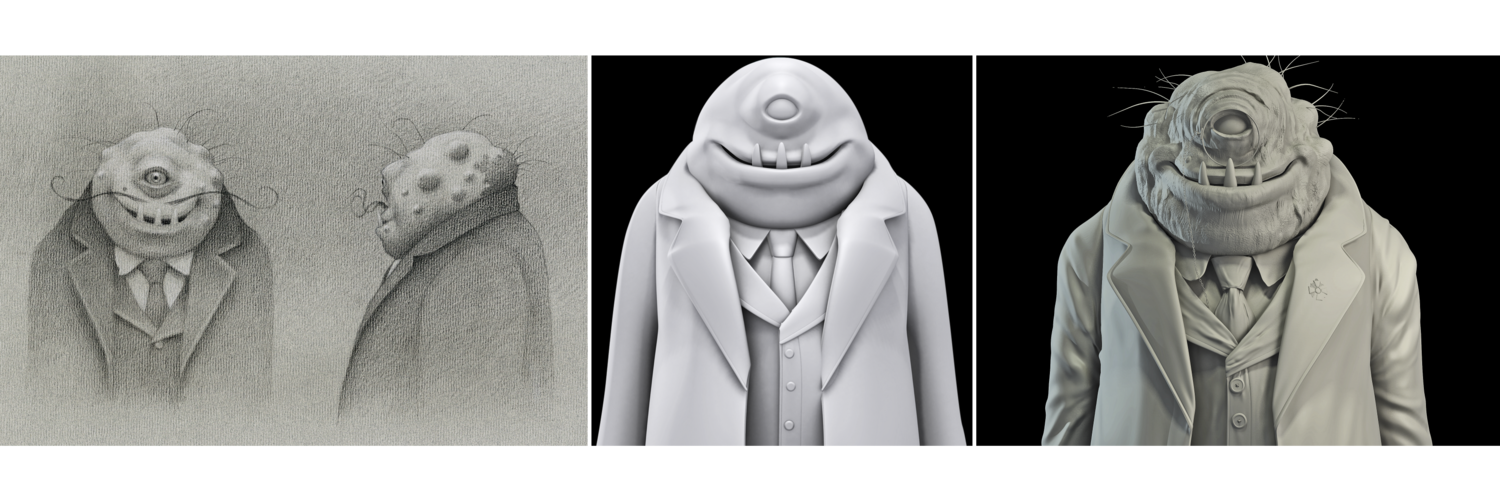
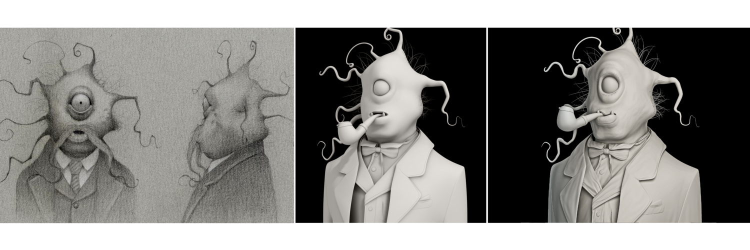
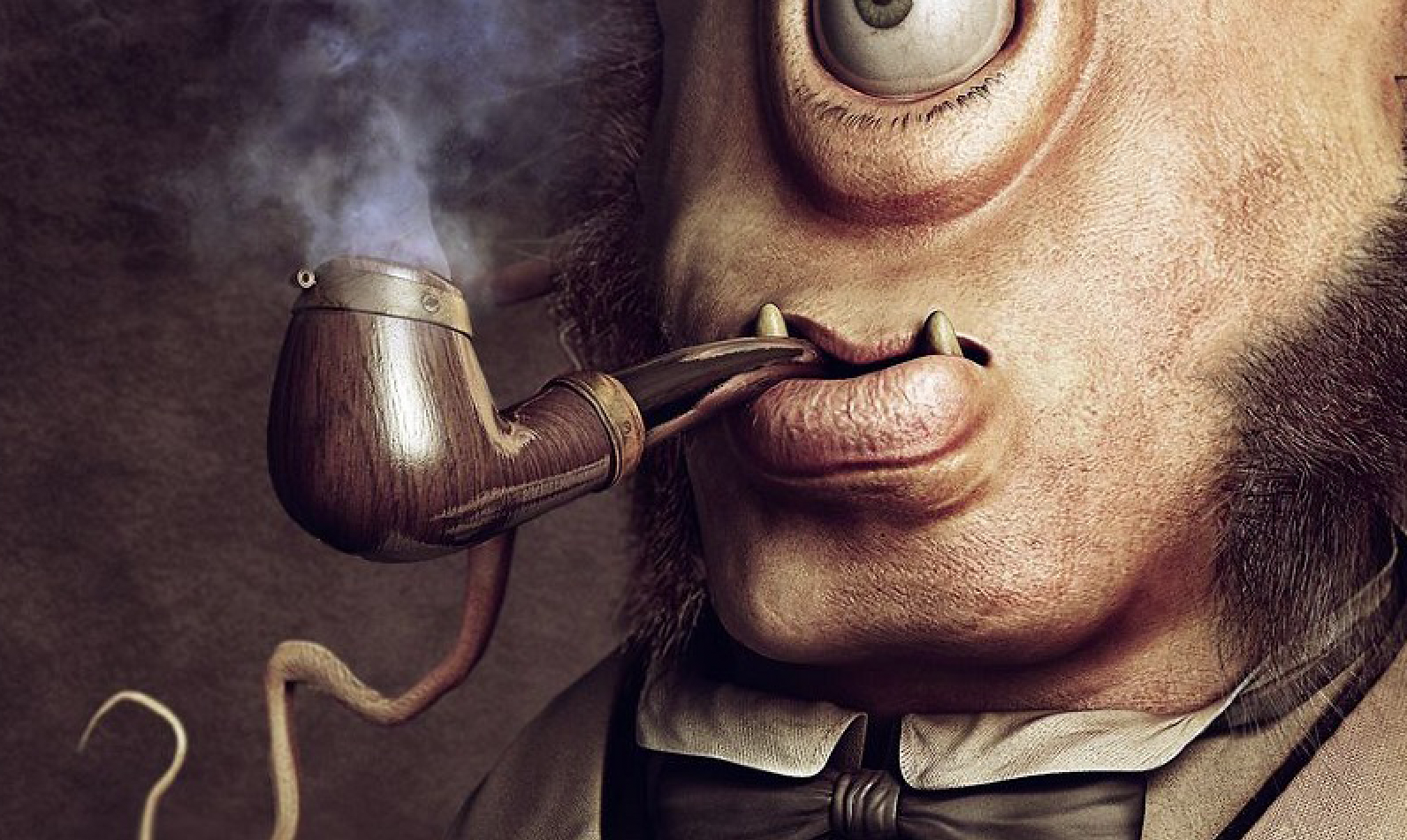
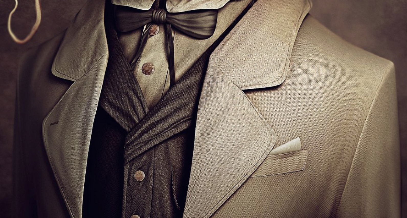
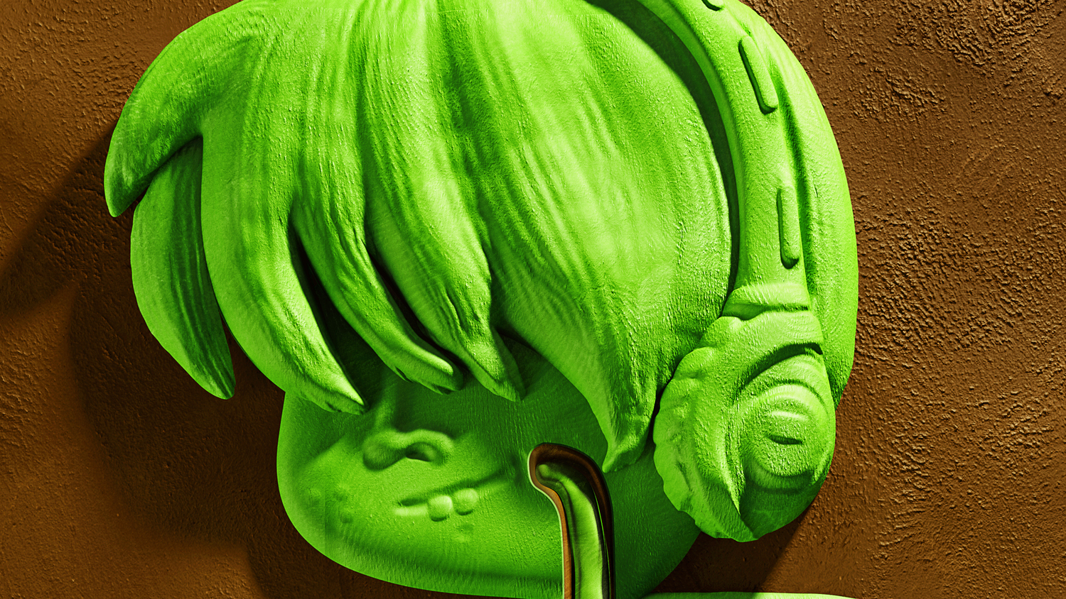
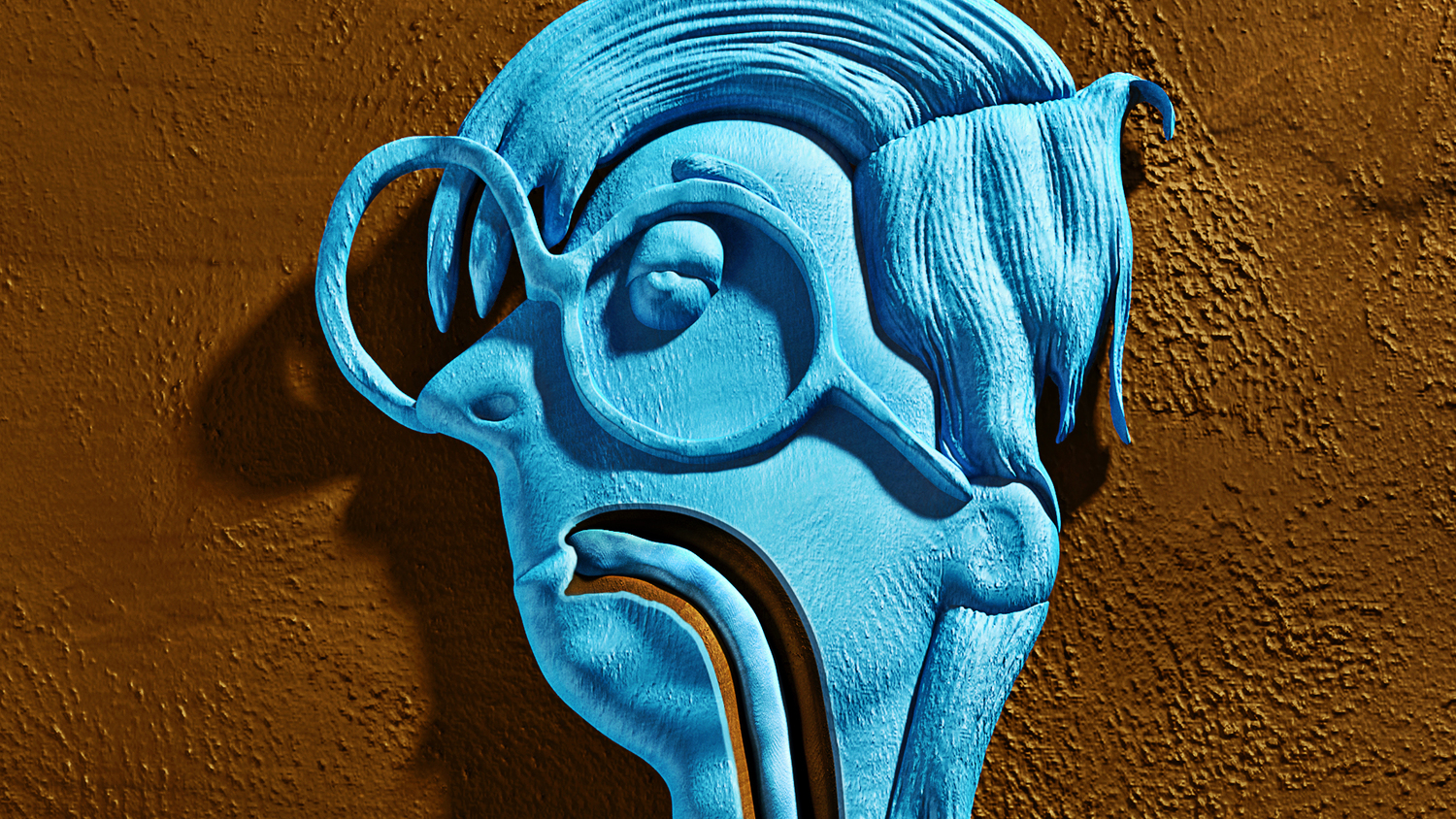
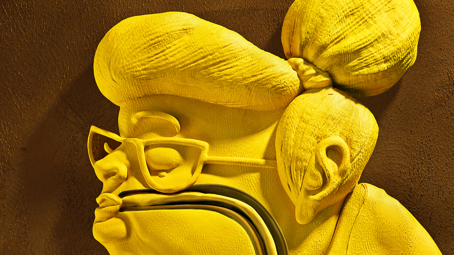
Campaign developed for Smart, a bleach with a greater power of germs and bacteria elimination.
-
Creative team:
rafael gil ( art director/illustrator ) / leandro neves ( copywriter ) / travis louie ( illustrator )

Craft
Concept – modeling – 3d Sculpture
After the concept has been created, I called the excellent illustrator Travis Louie to develop the characters’ design. From that, I transformed the design into 3d, adding details that made the illustration look more real. At the end, I changed one of Travis’s illustrations from male to female, respecting the style he had created.

-
Details


est
#17
–

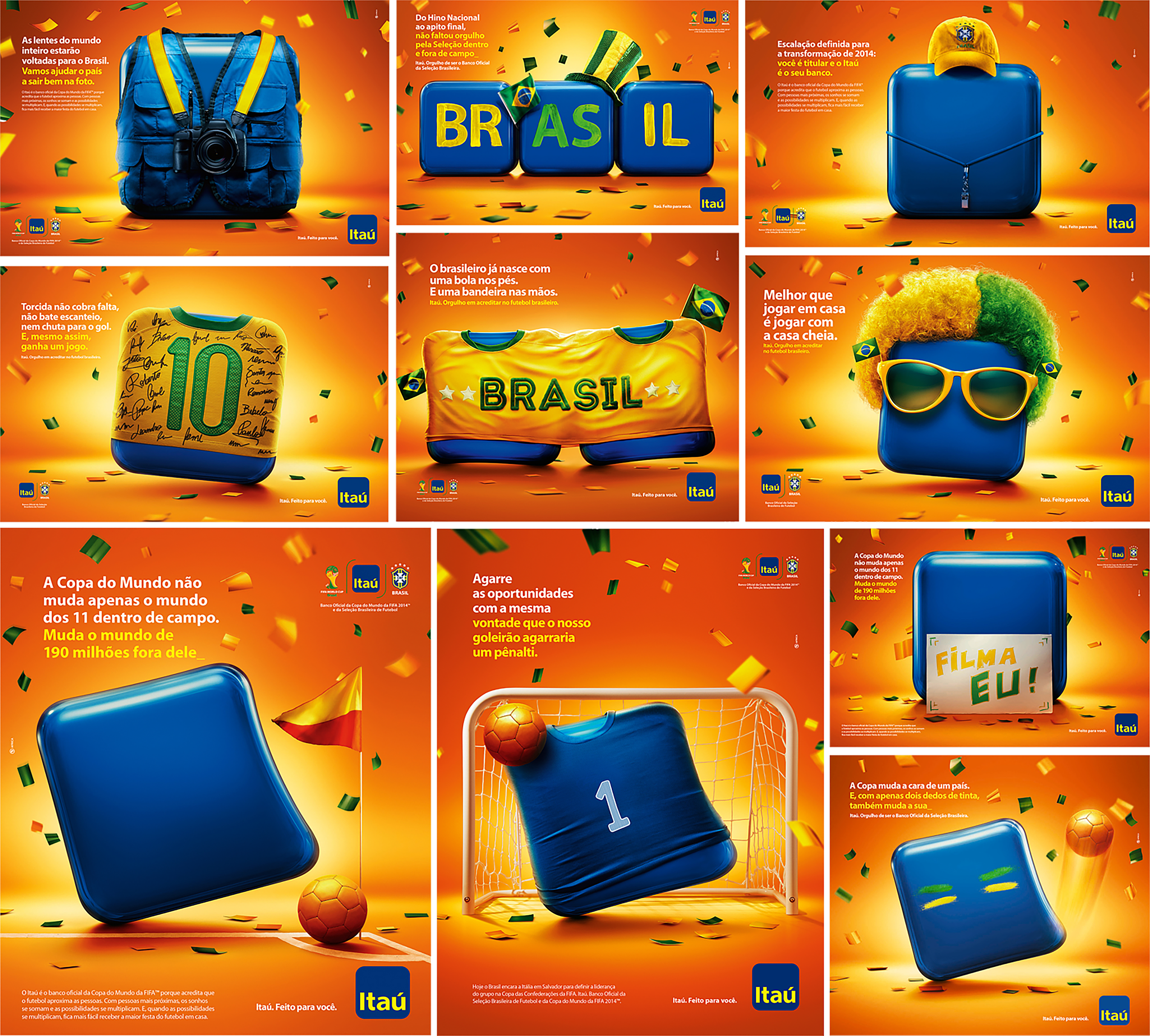
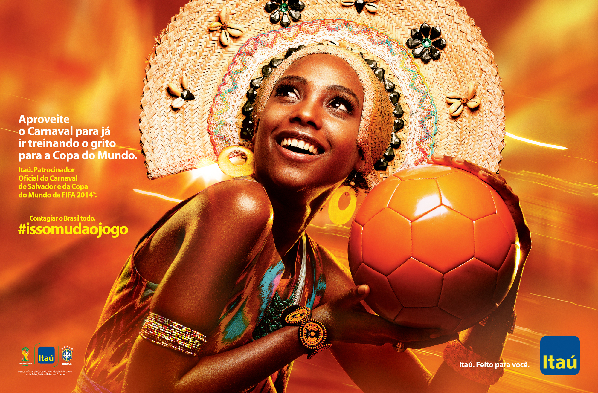
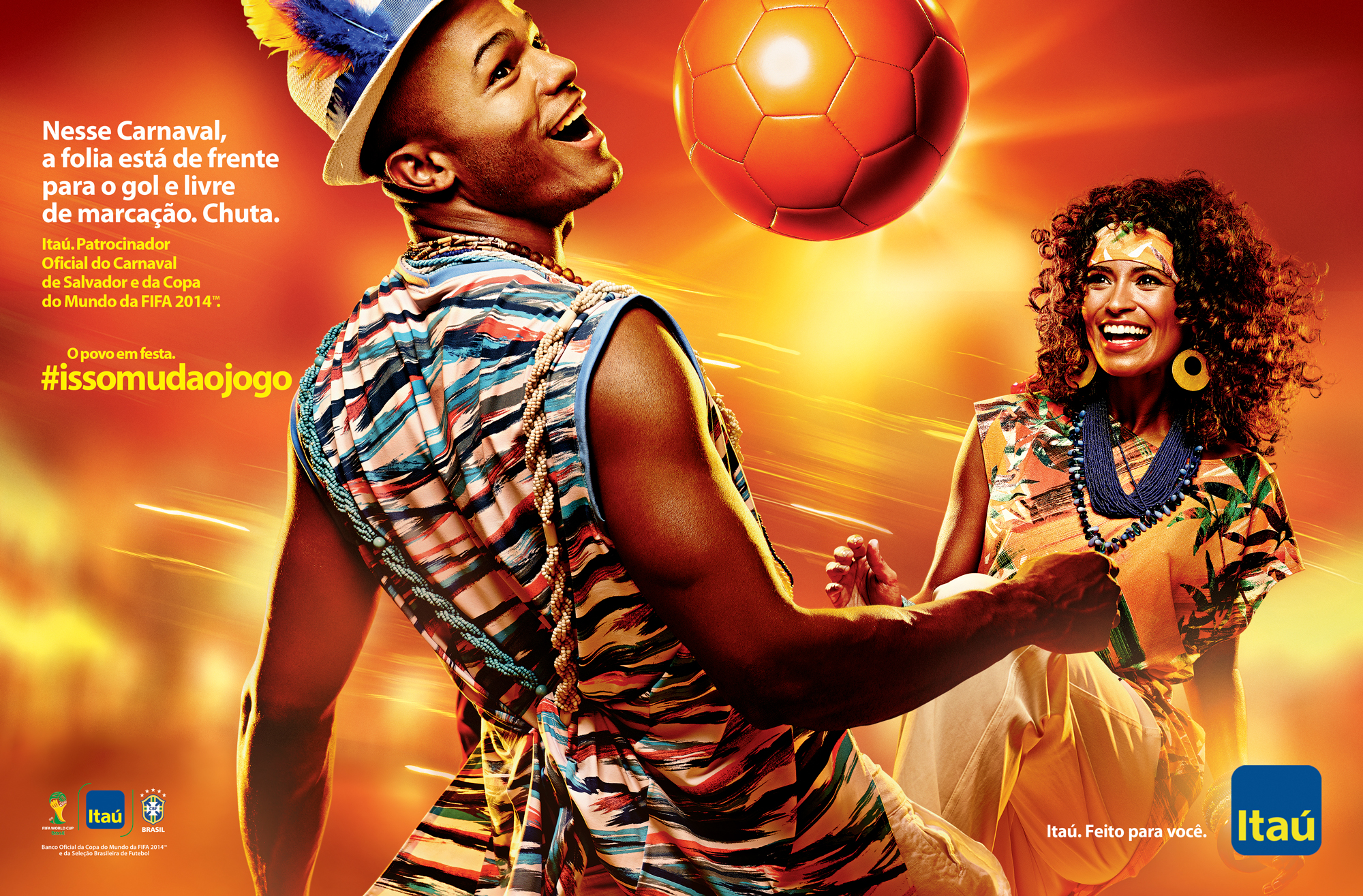
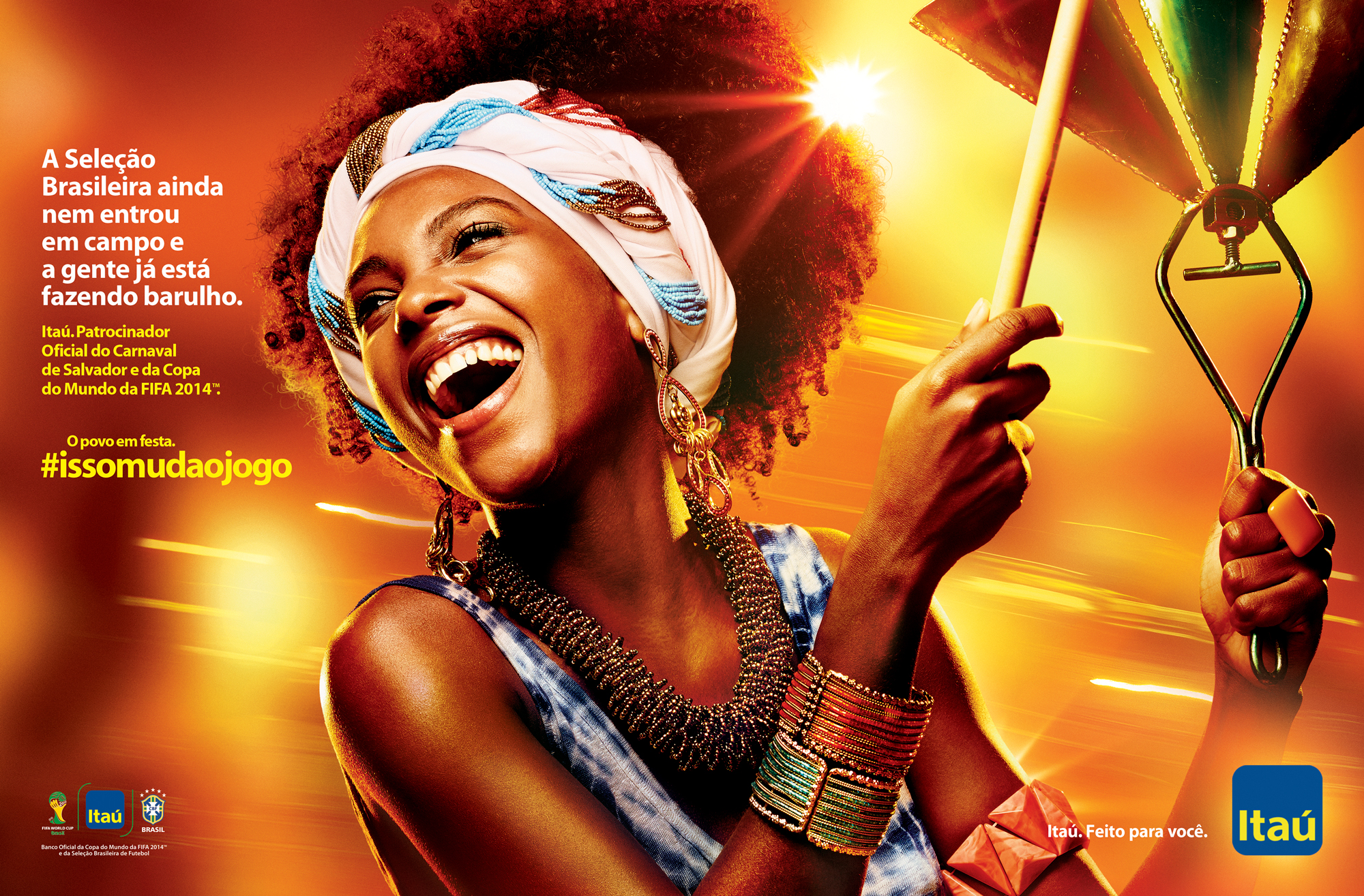
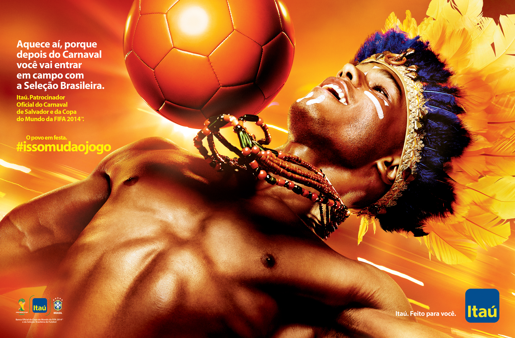
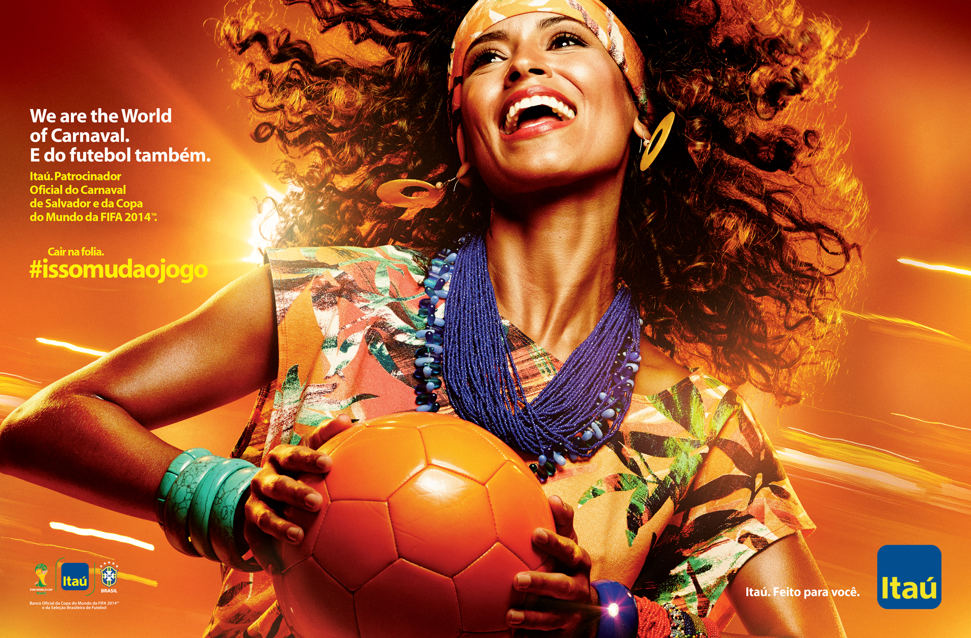
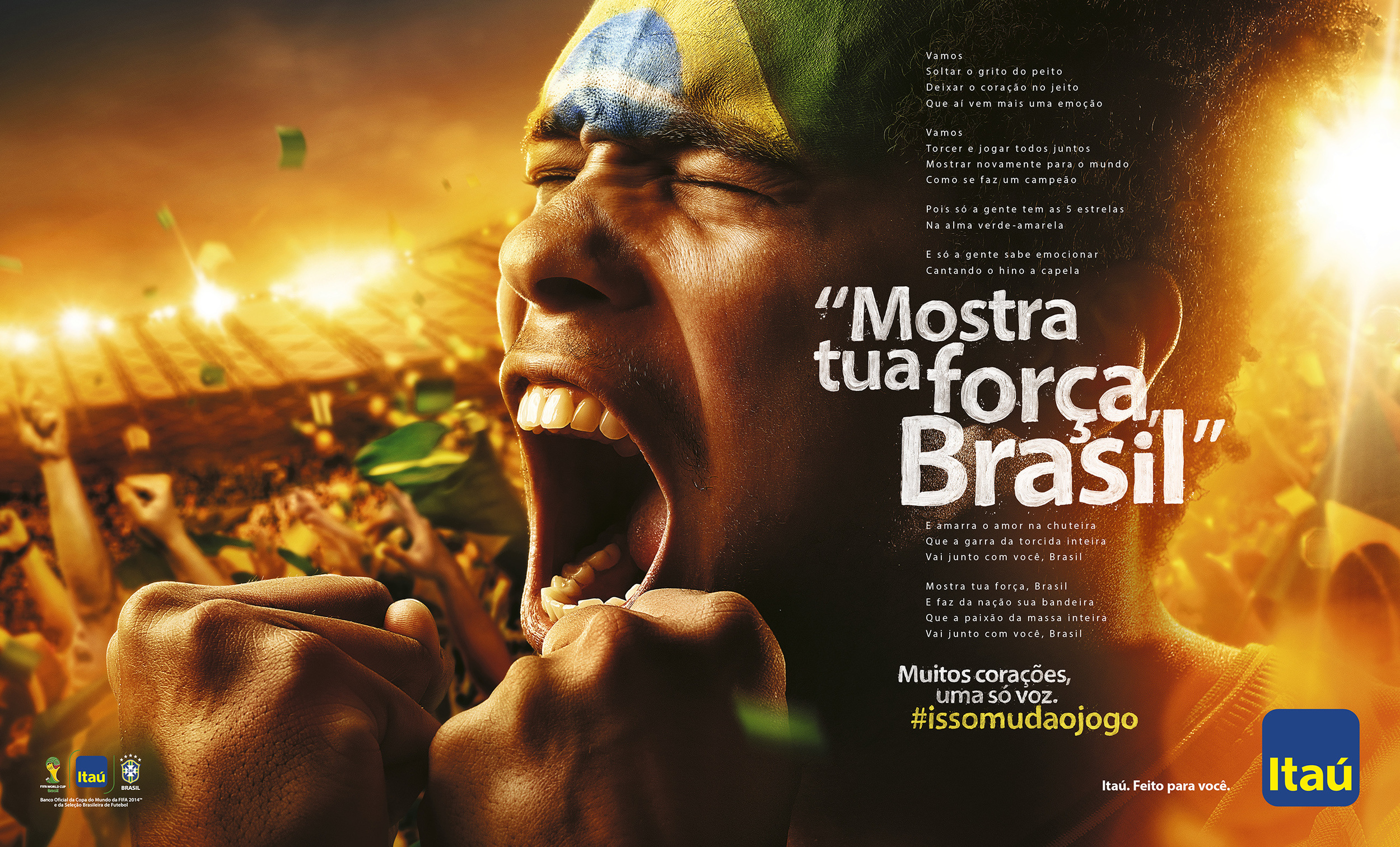
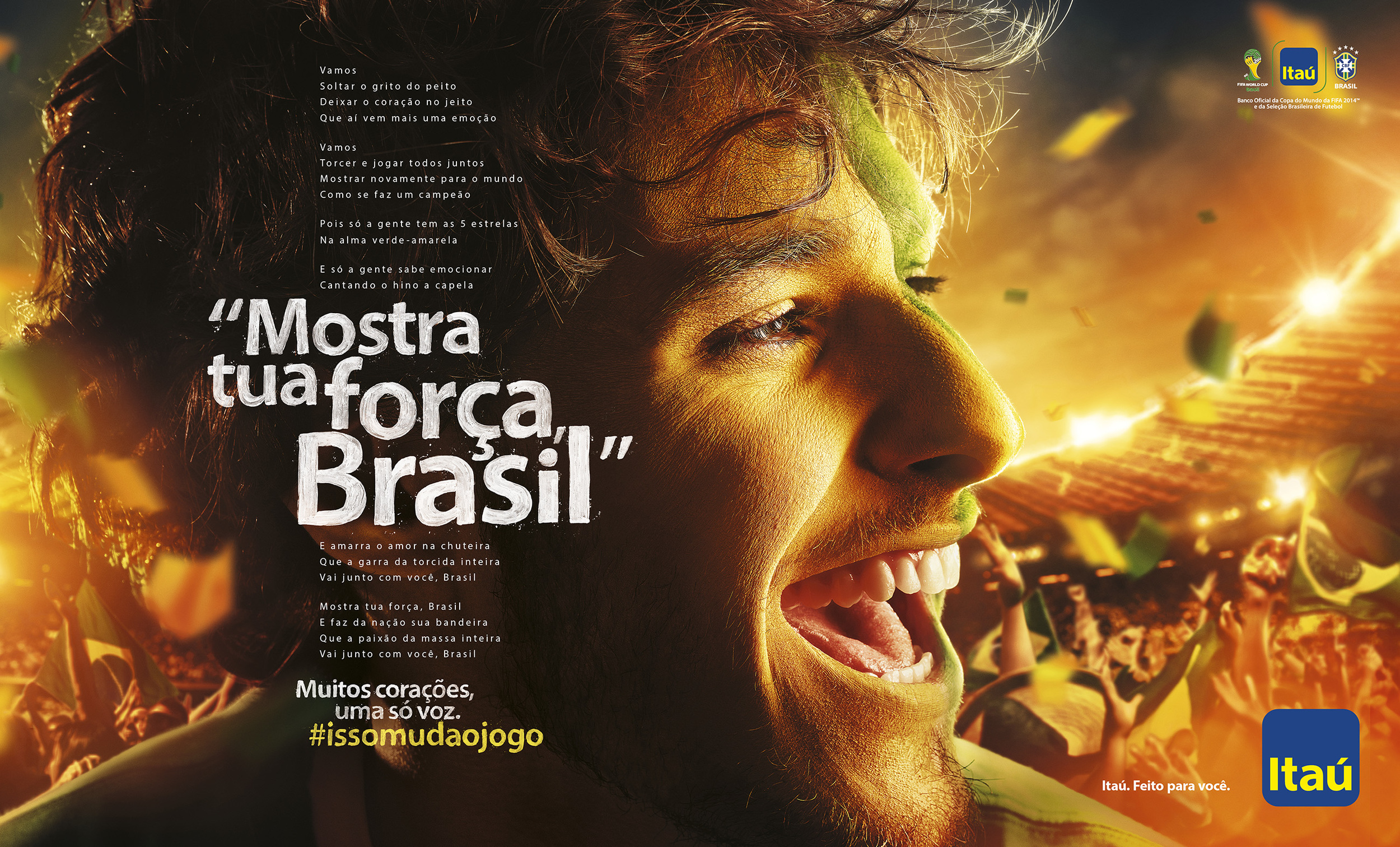
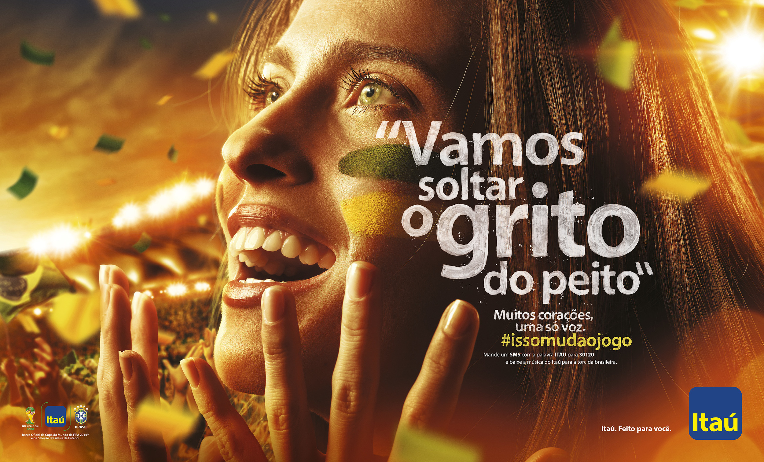
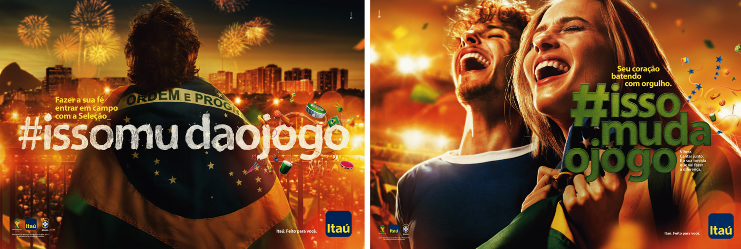
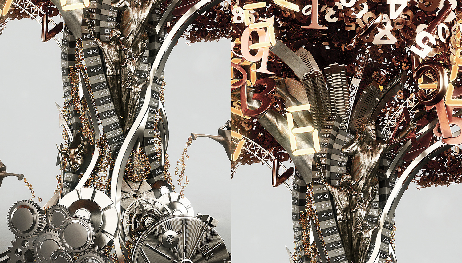
Itaú is present in more than 27 countries in the world and is the largest bank in Latin America and the Southern hemisphere. The big challenge was to link the image of a bank with the biggest event in the world, which is the FIFA world cup, being a layer 3 advertiser in the event, competing with historic sponsors as Coca Cola, Nike, Adidas, Hyundai, Volkswagen, amongst others. Below, see my participation in the developing of its piece of work which I followed for one and a half years, and from which resulted in Itaú being the second most remembered brand in the event, behind Coca Cola only, and for a narrow margin. It had the soundtrack that most brought people together. I worked as the creative, art director and digital artist at distinct moments.
-
Creative team:
rafael gil ( art director/illustrator ) / guigo oliva ( copywriter ) / iron brito ( art director/illustrator ) rodrigo da mata ( copywriter ) / leandro lourenção ( copywriter ) / rodrigo panucci ( illustrator ) / miriam malta ( art director ) / andré marques ( art director ) / leandro neves ( copywriter ) / paulo filipe ( art director )

My participation in the strategy started at the Confederations Cup, when we decided to get closer to the Brazilian supporters. To do so, we used Itaú’s traditional blue shape, in which it came to life and started to take part into the world cup’s atmosphere. This way, we started to deconstruct the bank’s cold image, adding a more joyful and carefree feature. This idea was also used in vignettes, shown before TV programs related to the world cup, Brazilian championship games or exhibition matches.

-
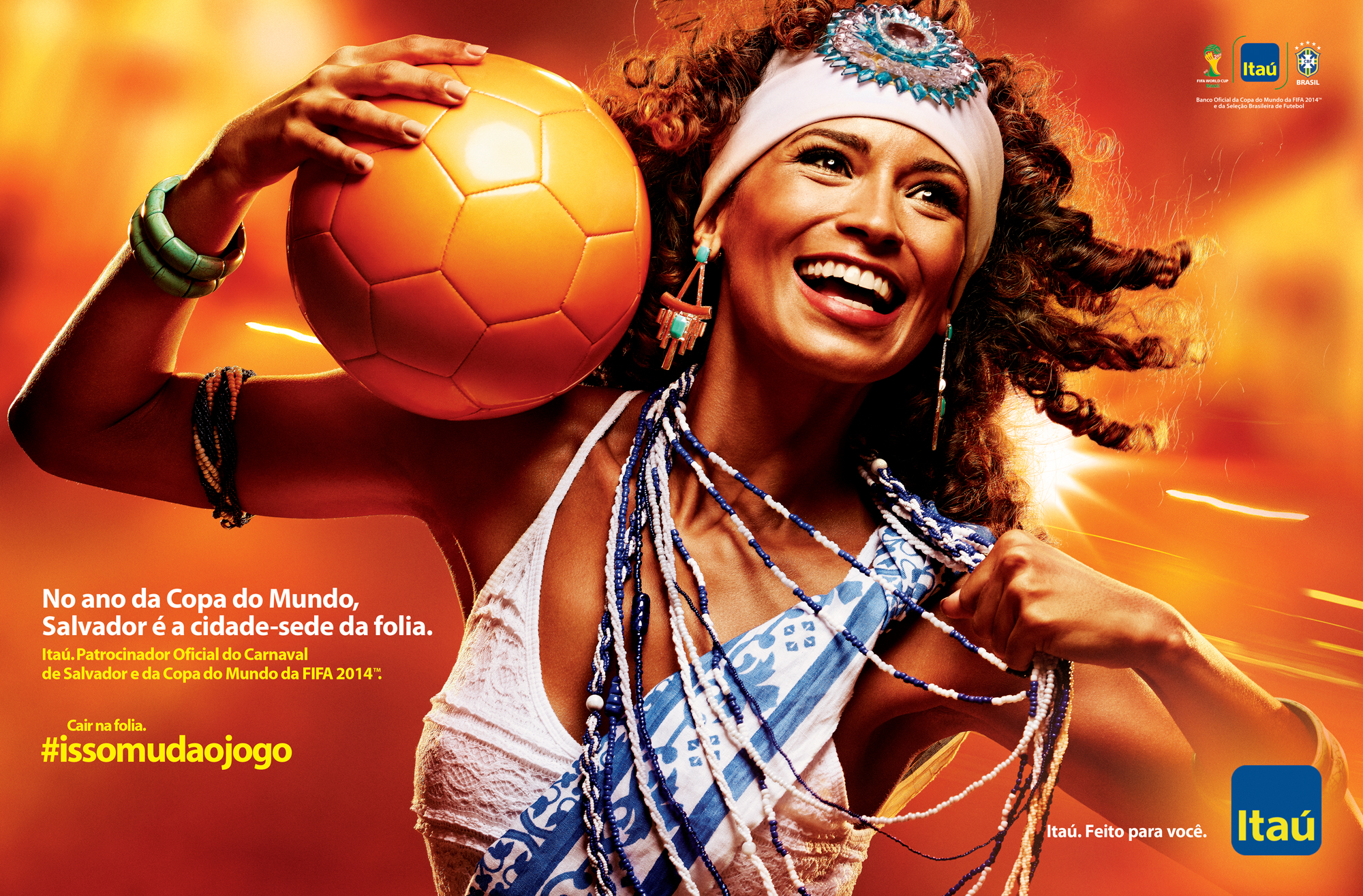
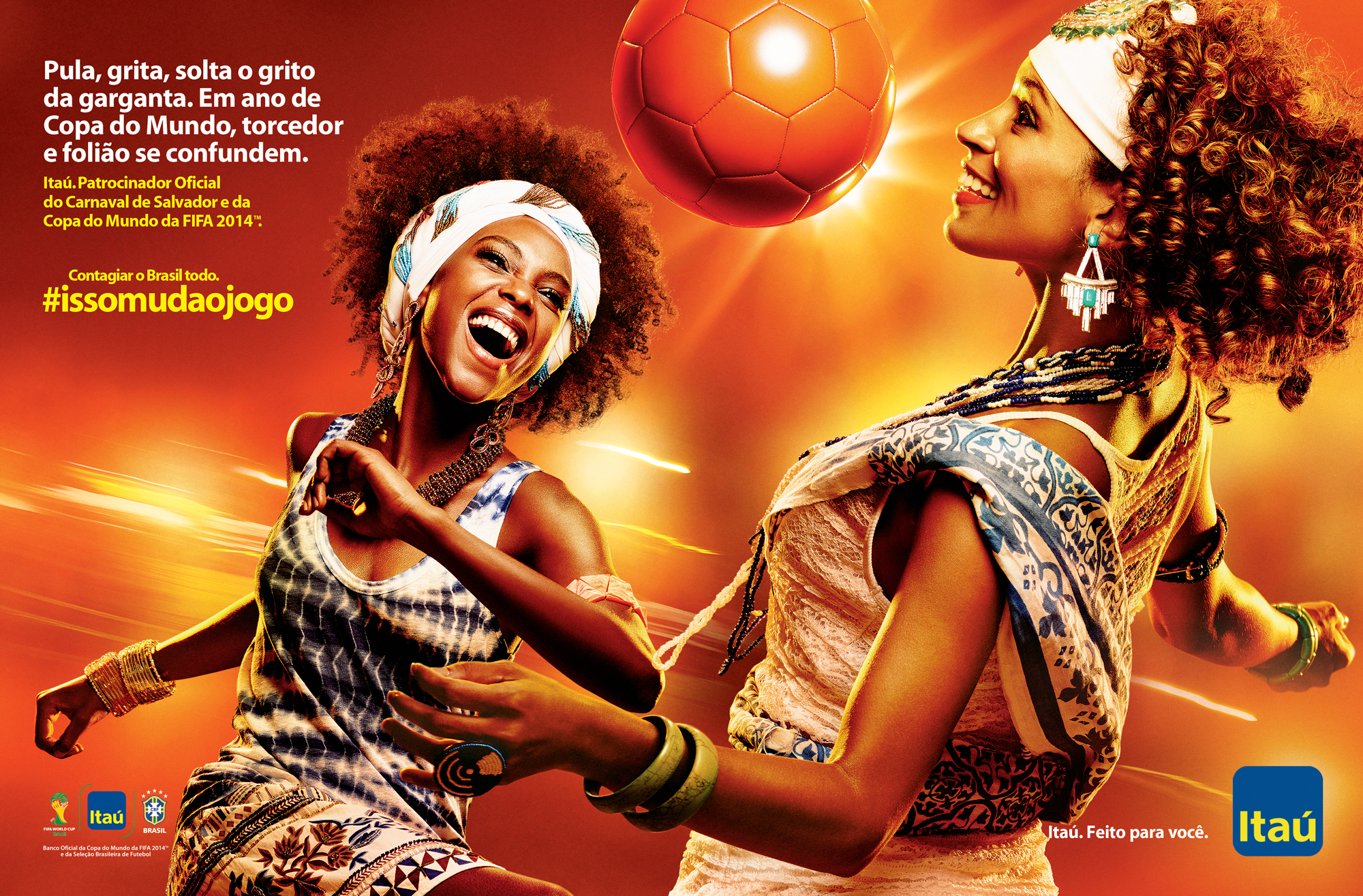
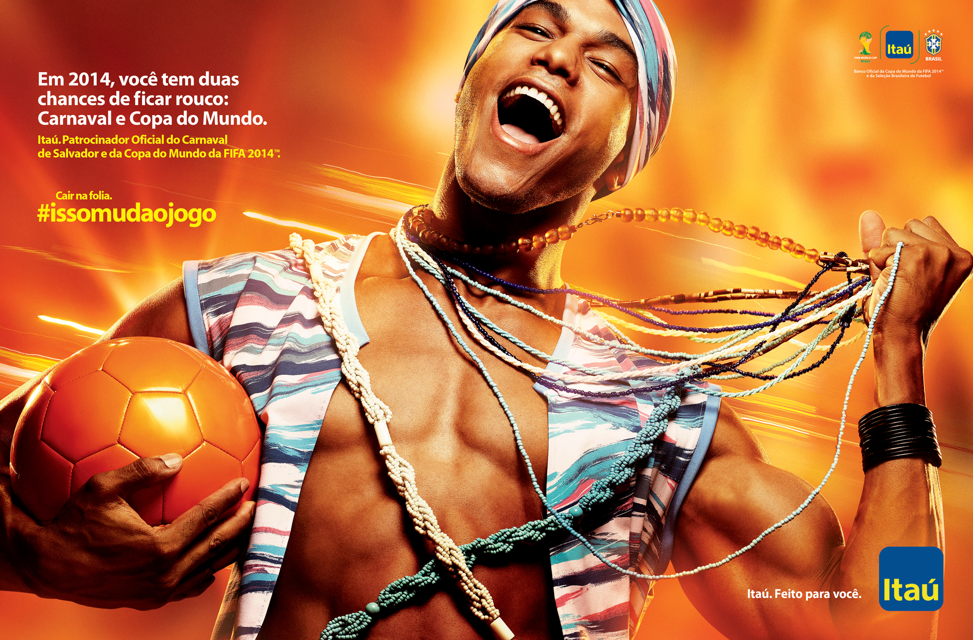
Following the idea of carelessness and joy, we have created the campaign for the Carnival of Salvador (one of the most important carnival parties in Brazil) that brought together the partygoers and soccer, as if it was in a dance.
-
With the Confederations Cup, the Brazilian supporters met the Brazilian team again, and it has been of extreme importance towards the players’ motivation. From that on, the strategy went deep in a way of appropriating the field of emotion. Our campaigns were focused on the hearts of Brazilian people. At the end, we realized that this change of pace made a difference for the campaign’s success.
Great transformation
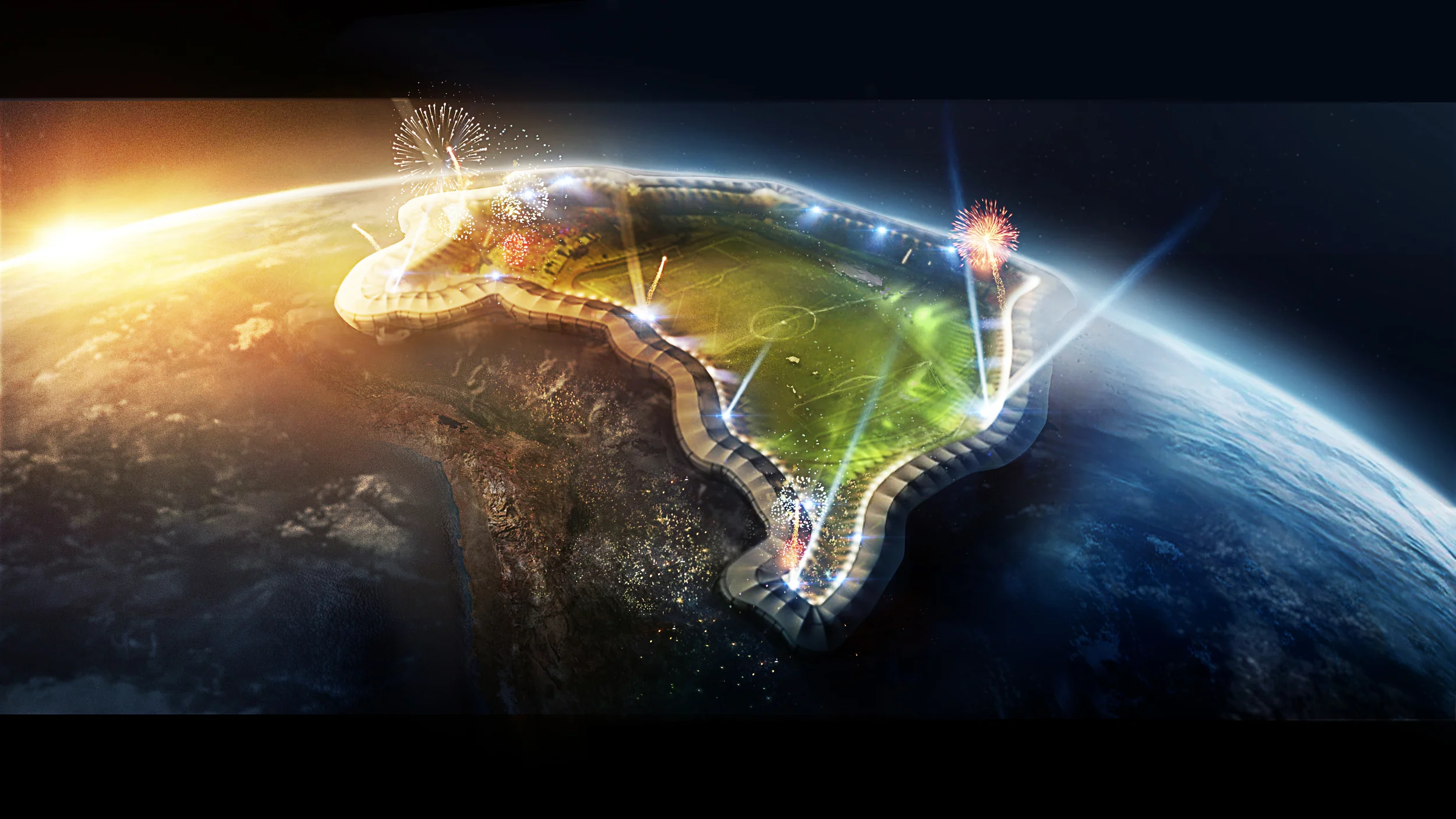
On this film I have worked only as the digital artist, developing the concept of the ending scene with the stadium on the planet Earth (which was used in the online version of the film). The film has won world repercussion, being praised by the president of Brazil, Dilma Rousseff.
Pop-up ad
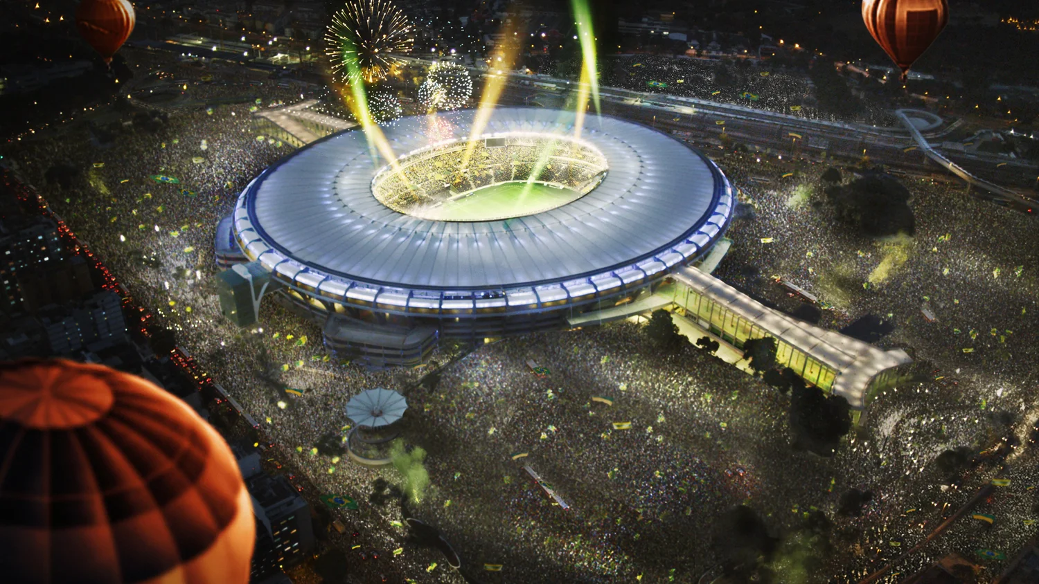
Special ad for the Great Transformation campaign. When the webpage opened, a stadium emerged right in front of the readers’ eyes. A little sound equipment made the reader hear the supporters’ scream echoing around the stadium terrace.


-
Tickets’ promo
-
World Cup’s soundtrack
Assured that the emotion’s territory was the best for Itaú, I developed the campaign of the world cup’s official soundtrack. It was widely accepted by the Brazilian people, with many national artists joining in, trigging hundreds of spontaneous versions on the internet.
In the Cities Travelling film, created by me and my partner Guigo Oliva, we made the advert sequence from the “Great Transformation” campaign. The movie showed the migration of several Brazilian people, from the most different regions in the country, towards the great World Cup soccer field represented by the Maracanã stadium. We aimed at showing that, apart from where the people were from, all hearts were with the Brazilian team at the moment of the game. This movie marked the soundtrack launch, created by Simoninha and Jairzinho, performed by Paulo Miklos e Fernanda Takai. After the film launch, we received an email from the Brazilian coach Felipão praising us for the job.
I also worked as the digital artist of this film, developing all the concept scenes and CGI used in the film.


-
The soundtrack gained popularity and, because of that, we created another film that pushed our jingle from the spontaneous versions of the song created by the supporters.


-
Hearts’ beating
-
Like in Great Transformation, I worked only as the digital artist in this film, developing the CGI scenes used online. The film shows that the hearts of Brazilian people beat together when the Brazilian team enters the field.


-
Ad which celebrated the world cup opening, a great moment for all Brazilians and for me as well, ;-)


est
#18
–

Some works for Itau Bank, continuation campaign to promote the hashtag #issomudaomundo (#itchangestheworld in Portuguese), as well as a campaign to encourage the use of bikes as an alternative for urban mobility and ready for a children.
craft
This is another job i did with my friend Sergio Paulo.We split the image in two steps.I took the task of the adding details. Doing the 3d illustration and giving the final retouch to the image.
-
Vignettes
Concepts created by me, which helped Vetor Zero to adapt the ads into vignettes.


est
#19
–

itau has created a different way to encourage customers to check their receipts digitally: a collection of books from the greatest classics of brazilian literature printed using the same paper as the receipts. the collection was exhibited ar the bank's atms so that when customers would check their accounts. they were encouraged to see the receipts on the screen or to receive them via e-mail.
-
Creative team:
rafael gil ( art director/illustrator ) / leandro neves ( copywriter ) / andré marques ( art director/illustrator ) henrique martins ( copywriter ) / diego lauton ( art director )


est
#20
–

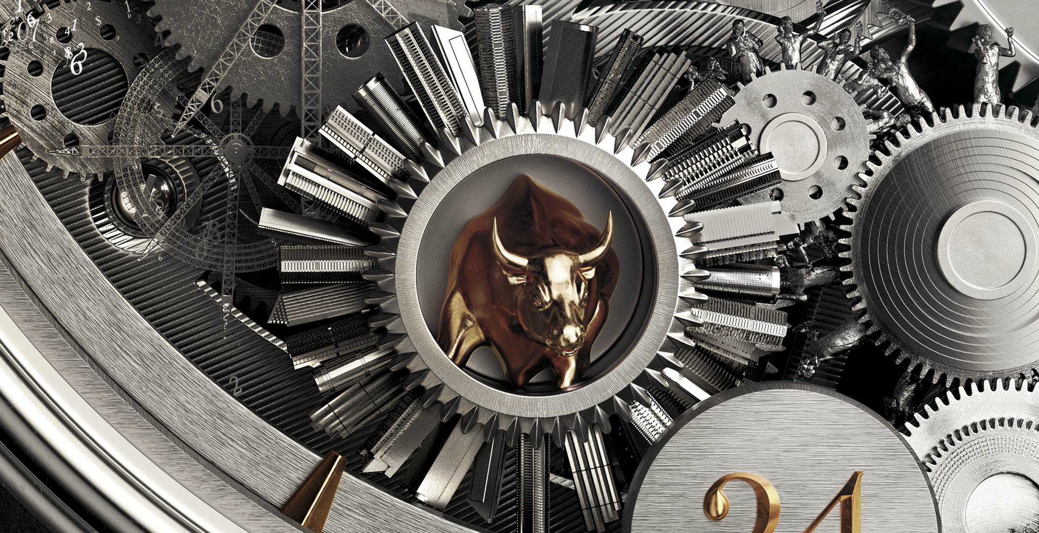
Itaú BBA is the biggest corporate investment bank and it is part of the group Itaú Unibanco, one of the biggest financial conglomerates in the world. It serves institutional investors and companies with the biggest business volume in the group. I developed the campaign for the bank’s new visual languages, though keeping the traditional reflection in its communication.
-
Creative team:
rafael gil ( art director/illustrator ) / gustavo costa ( copywriter ) / paulo filipe ( art director/illustrator ) patrícia medeiros ( art director ) / big studios ( illustrator )

-
2d/3d work together with the Big Studio.

-
Some Details


est
#21
–

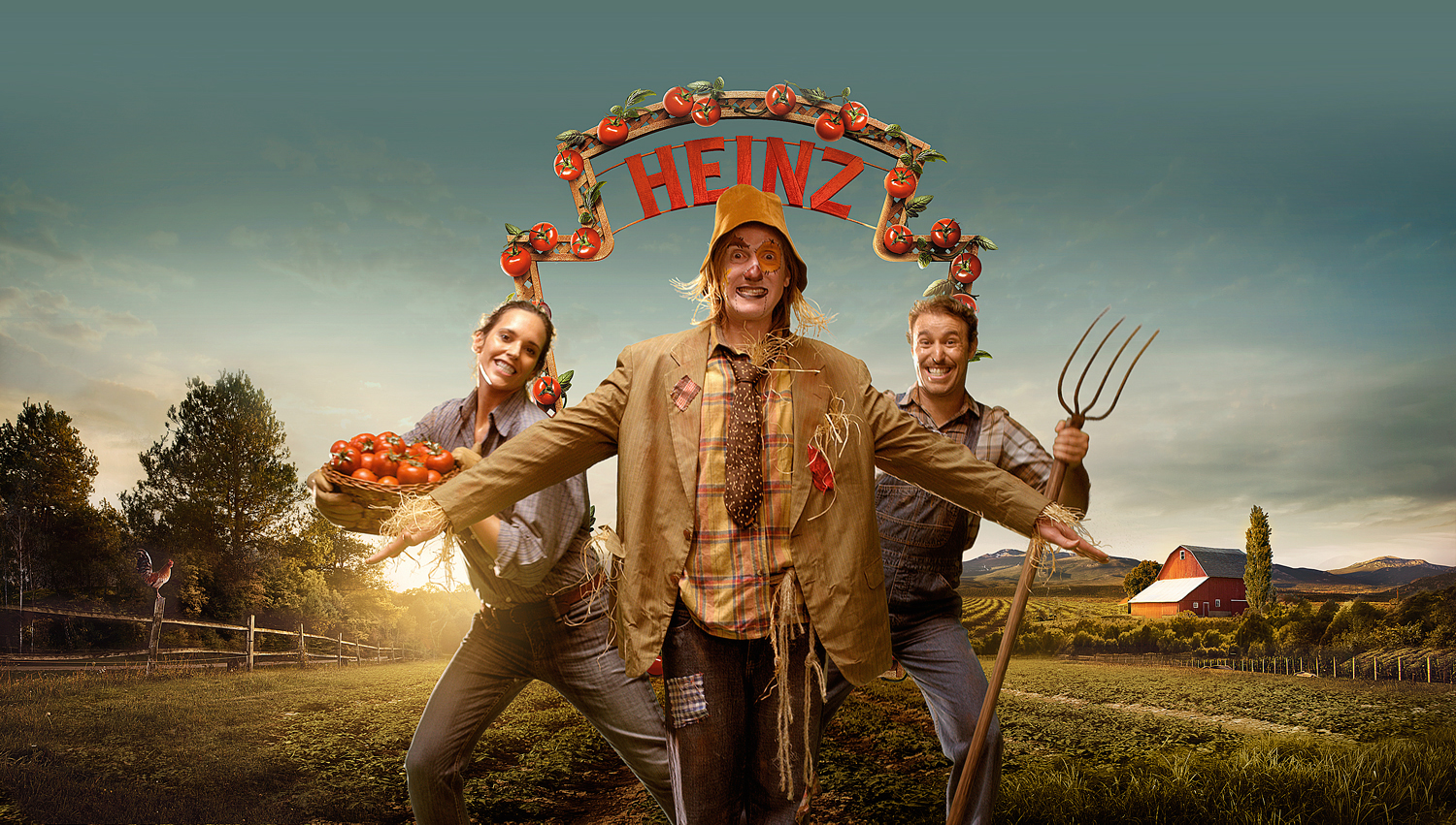
Launch of the brand Heinz in Brazil. With the theme " Nobody does it better than Heinz"
-
Creative team:
rafael gil ( art director/illustrator ) / guigo oliva ( copywriter ) / andré marques ( art director ) miriam malta ( art director )


CRAFT
Matte painting of the farm scene, with the scarecrow used in the movie. Beisdes that, i made the digital hand painting for the mobster scene.

-
Press Campaign
-


est
#22
–

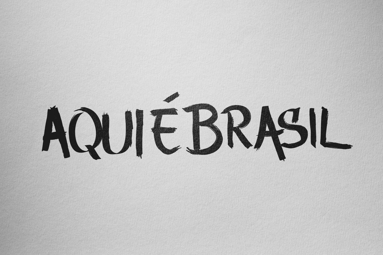
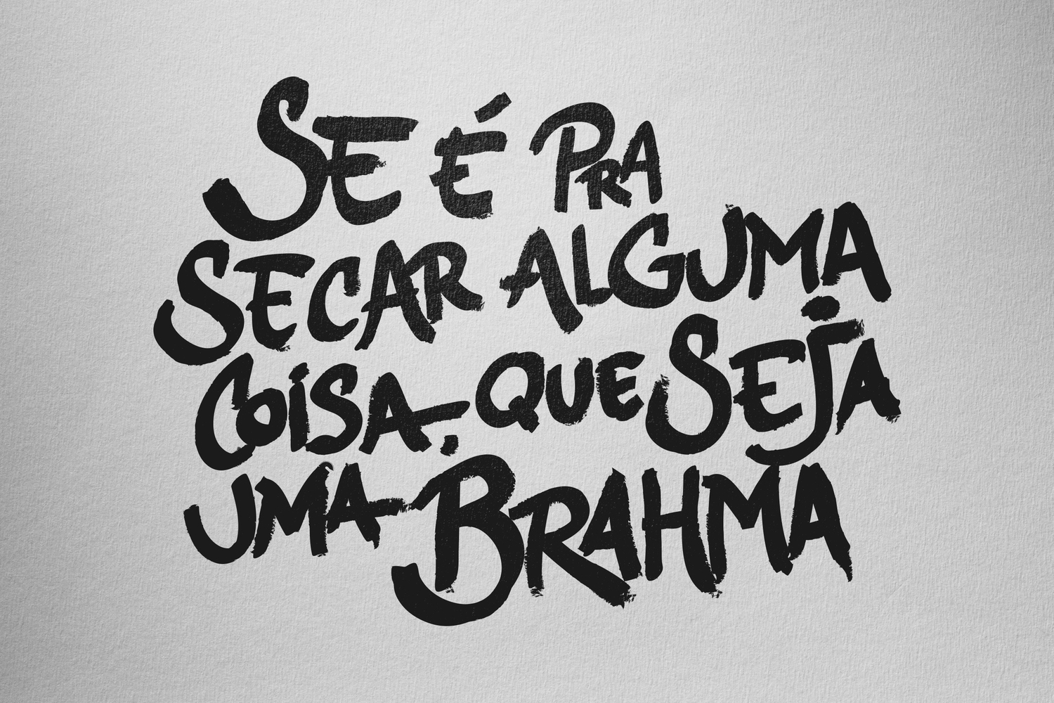
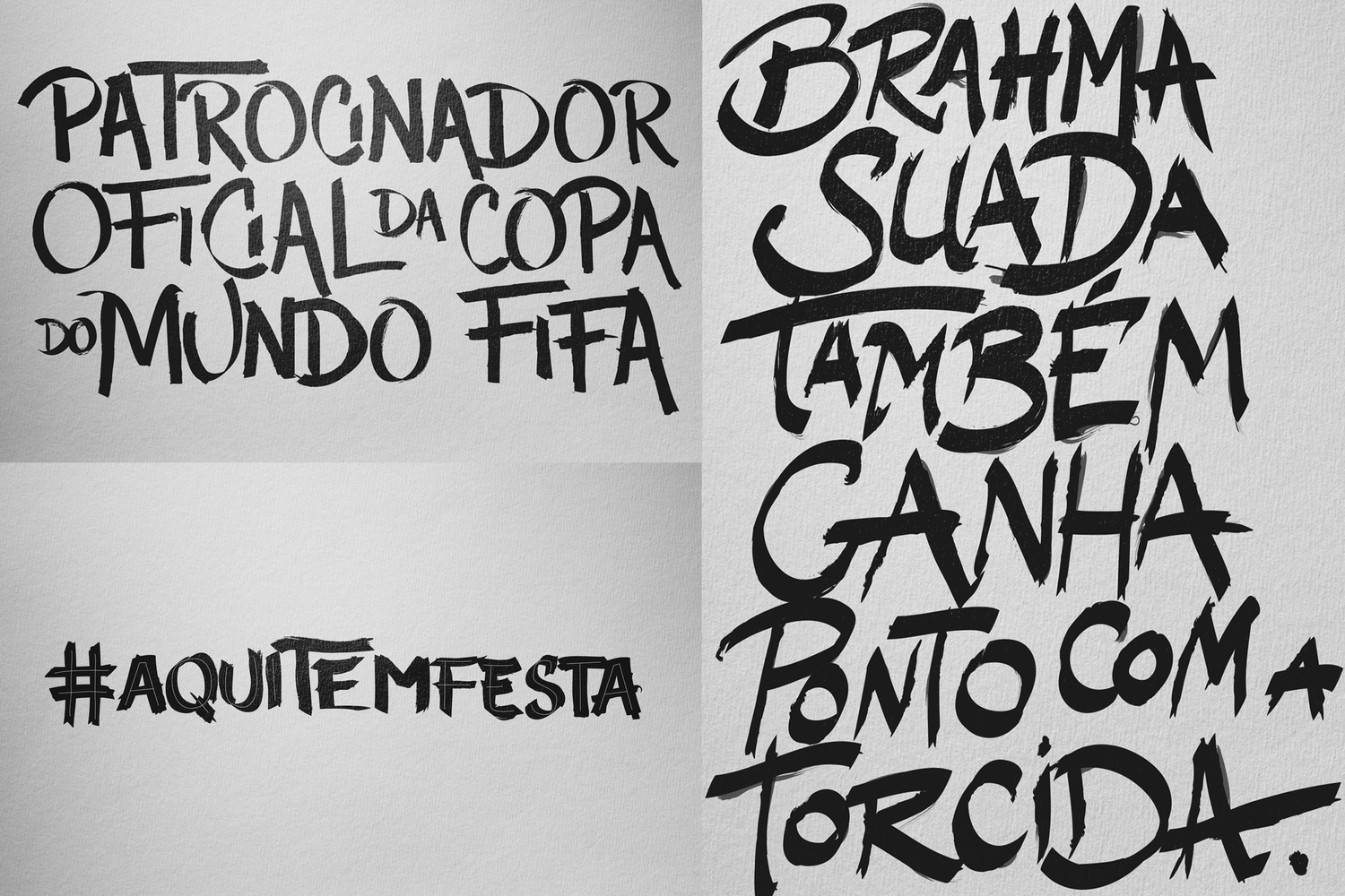
Pieces of advertising developed for the Confederations Cup and FIFA World Cup 2014.


CRAFT
Types digitally hand drawn.


est
#23
–

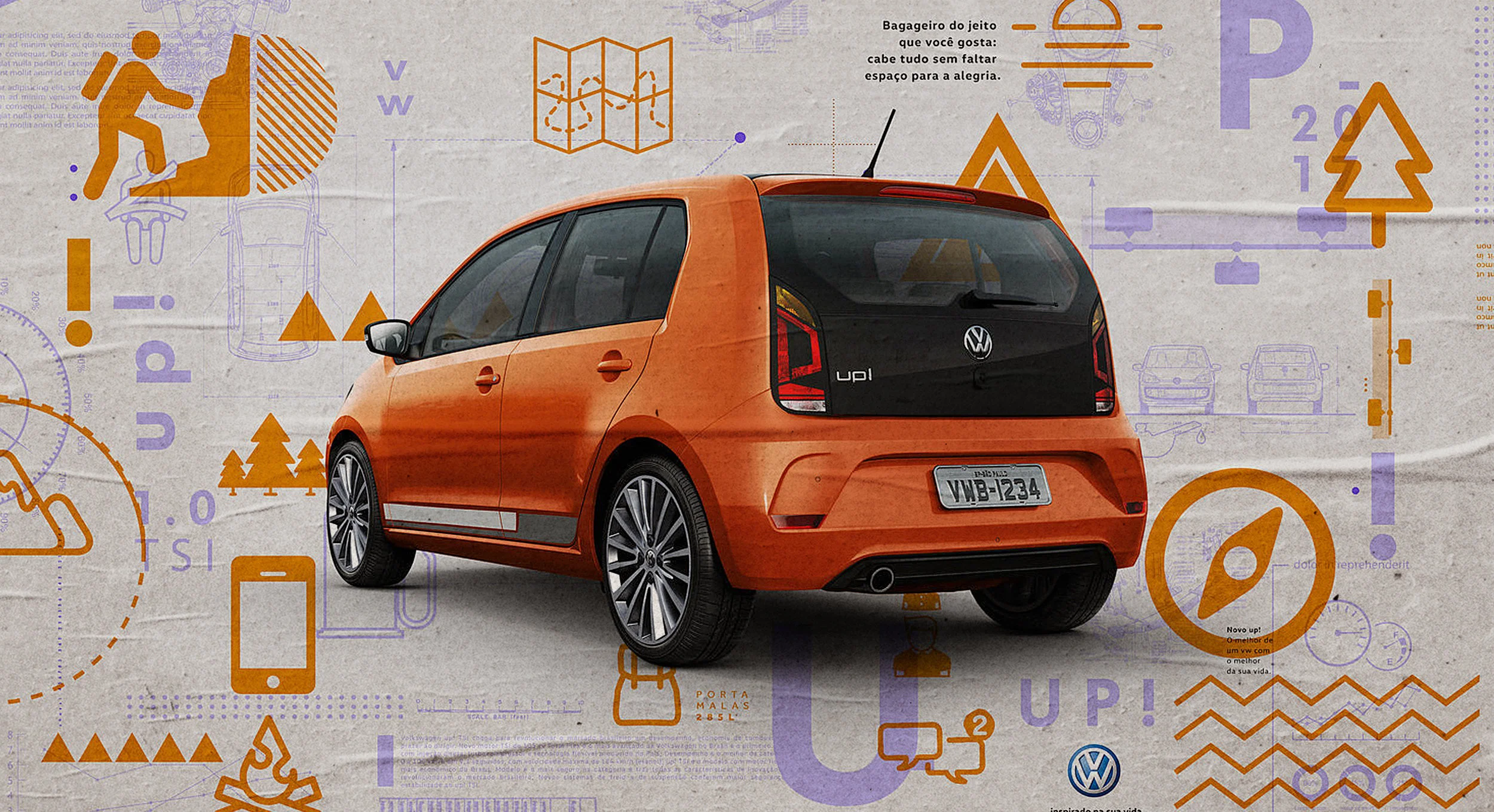
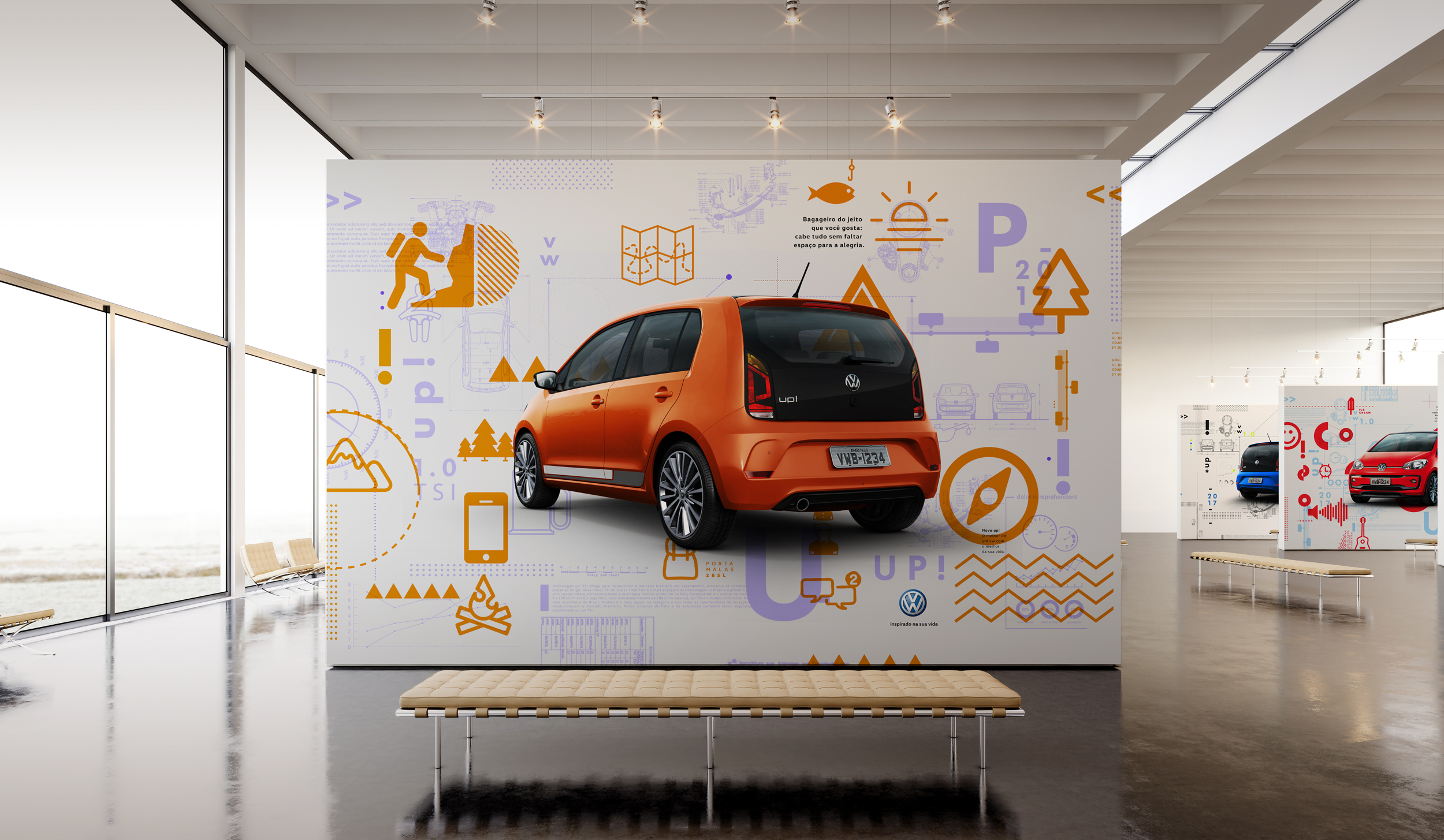
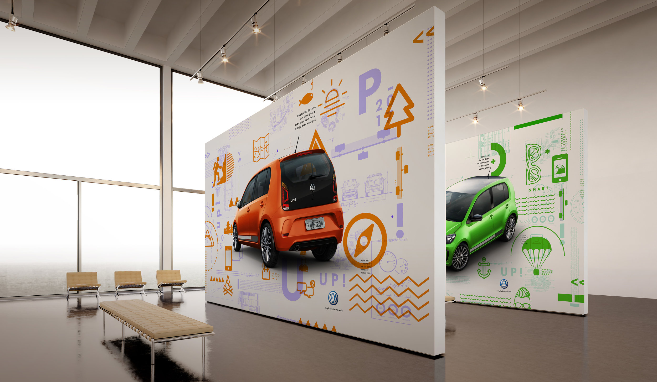
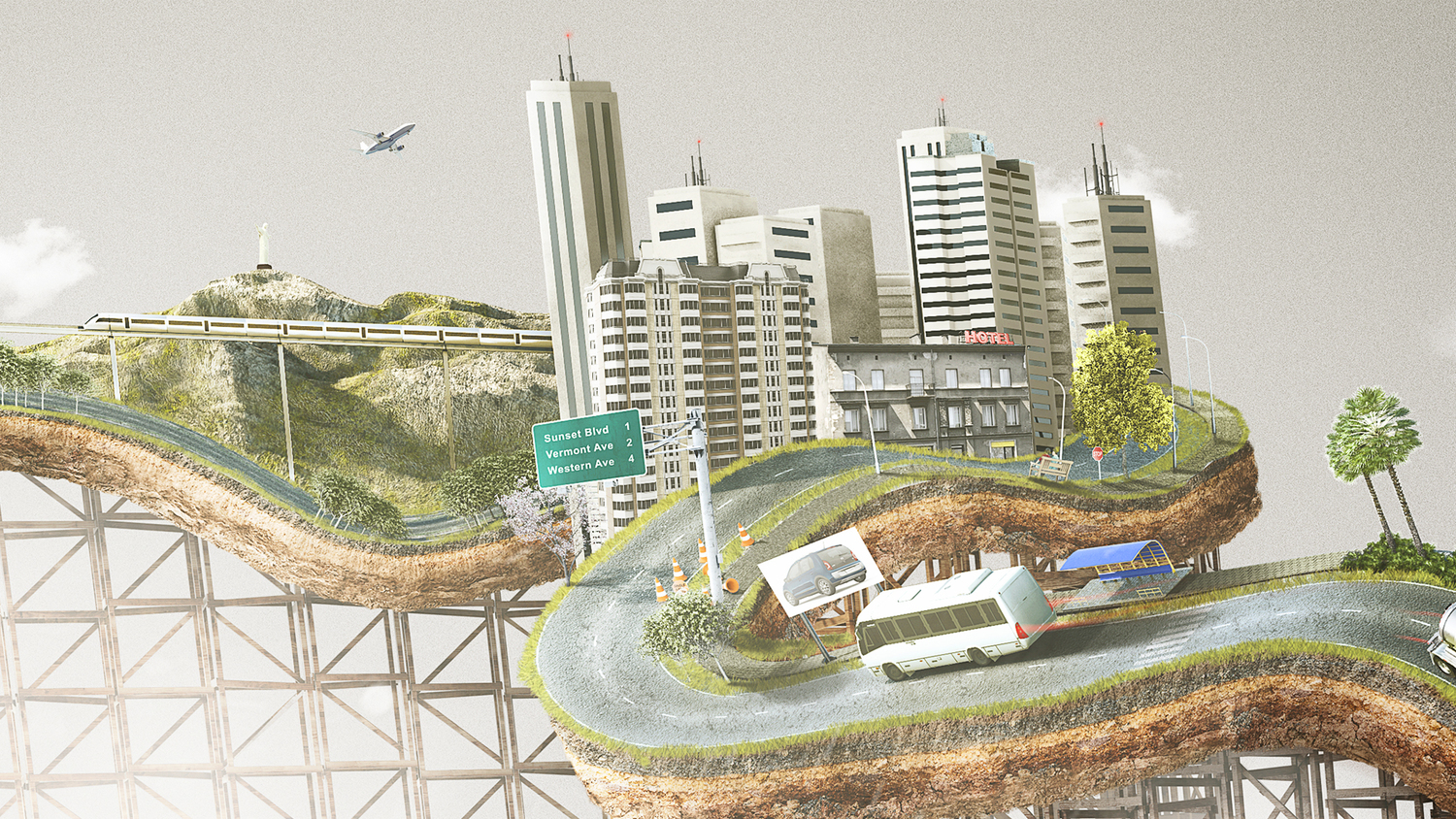
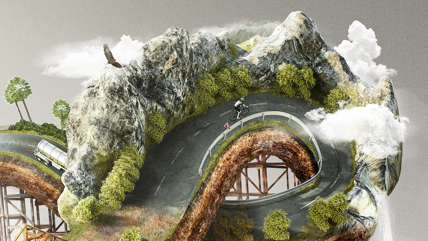
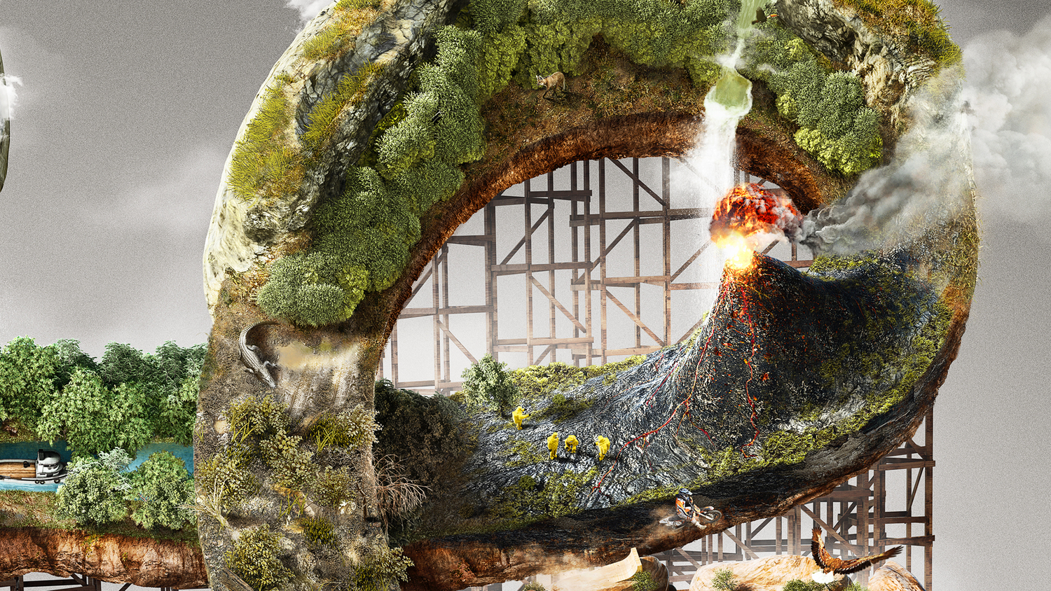
Some of the VW posters developed with my friend and director of art Eduardo Vares.
-
Creative team:
rafael gil ( art director/illustrator ) / eduardo vares ( art director/illustrator )

-
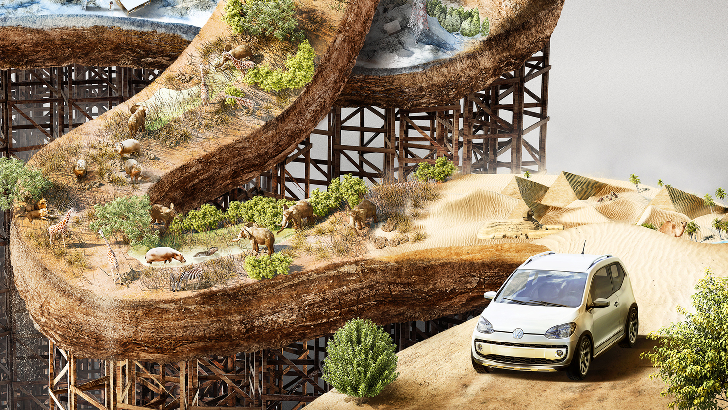
Campaign of launch of the new UP!
I developed the visual of the campaign with the directors of art Renato Butori and João Souza.

-
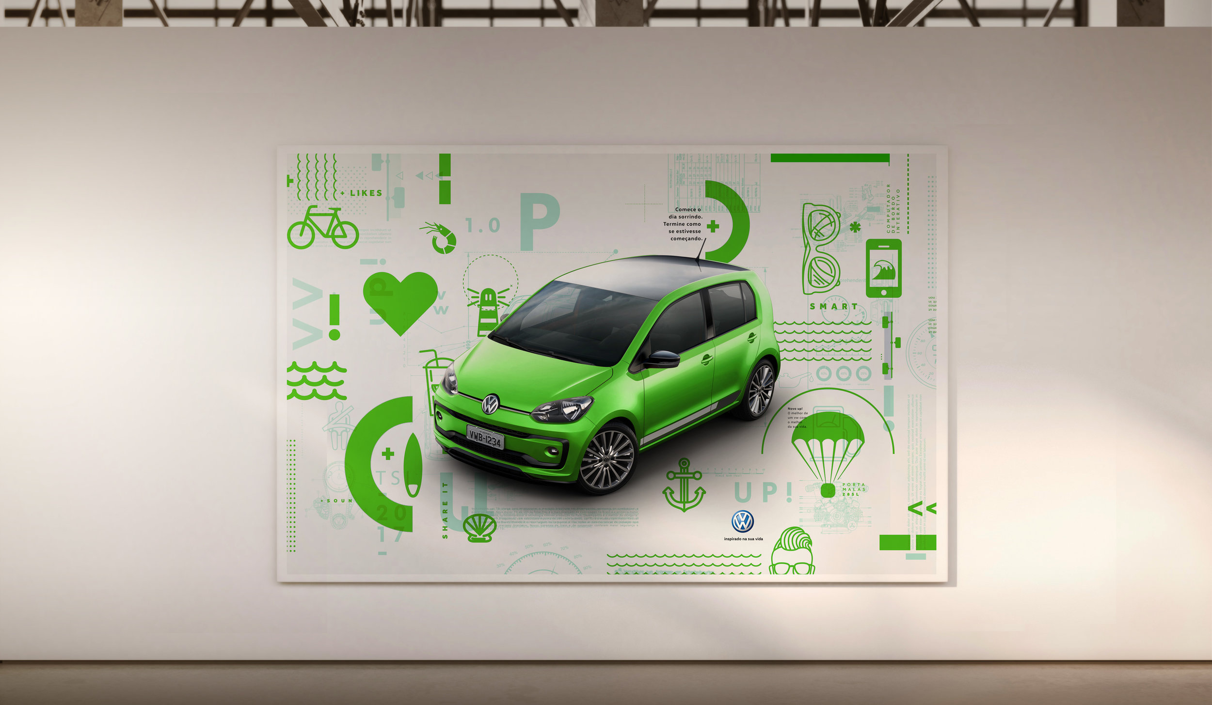
Ad for VW Cross Up!
CRAFT
Besides the concept, I made the images’ finishing and final retouch with Studio Yellow Mello.


est
#24
–

Some ads and crafts I created throughout my career.

-
In order to warn about the situation of children-soldiers, we created testimonials based on the lives of rescued children during the conflicts. A very powerful text, able to make us feel how cruel the life of a child-soldier is. At the end, we revealed that the army killed their most precious thing: childhood. The testimonial is, in fact, a posthumous memory of their childhood. After all, when a boy or a girl joins the war, they are forced to become an adult. The last willing is the wish of all children in the world living a free and fulfilled life, a child’s life, something that the young soldiers wouldn’t be able to accomplish.
-
Inhotim is best known as the world’s largest contemporary art museum in open air, located in a botanical garden in an area of 97 ha (240 acres), with both fauna and flora protected species. We have used the Arbor Day to raise awareness of man’s impact on the ecosystem, showing that along with a tree there is an enormous quantity of lives. If you kill a tree, it doesn’t die alone.

CRAFT
The fur has been made by hand, one by one, in order to give a more real aspect.

-
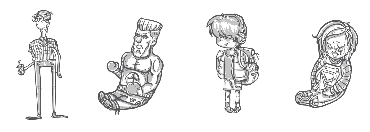
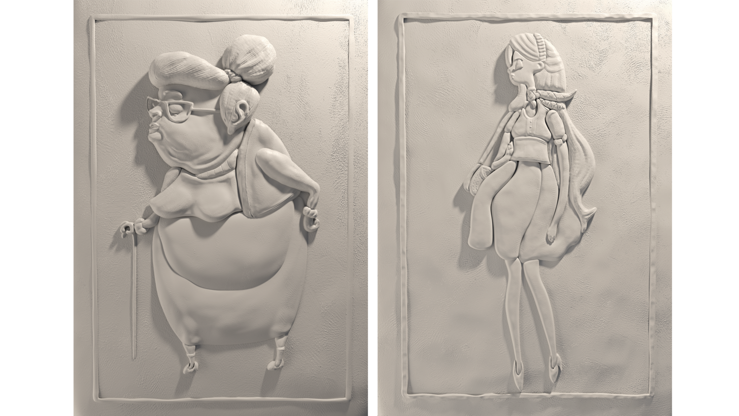
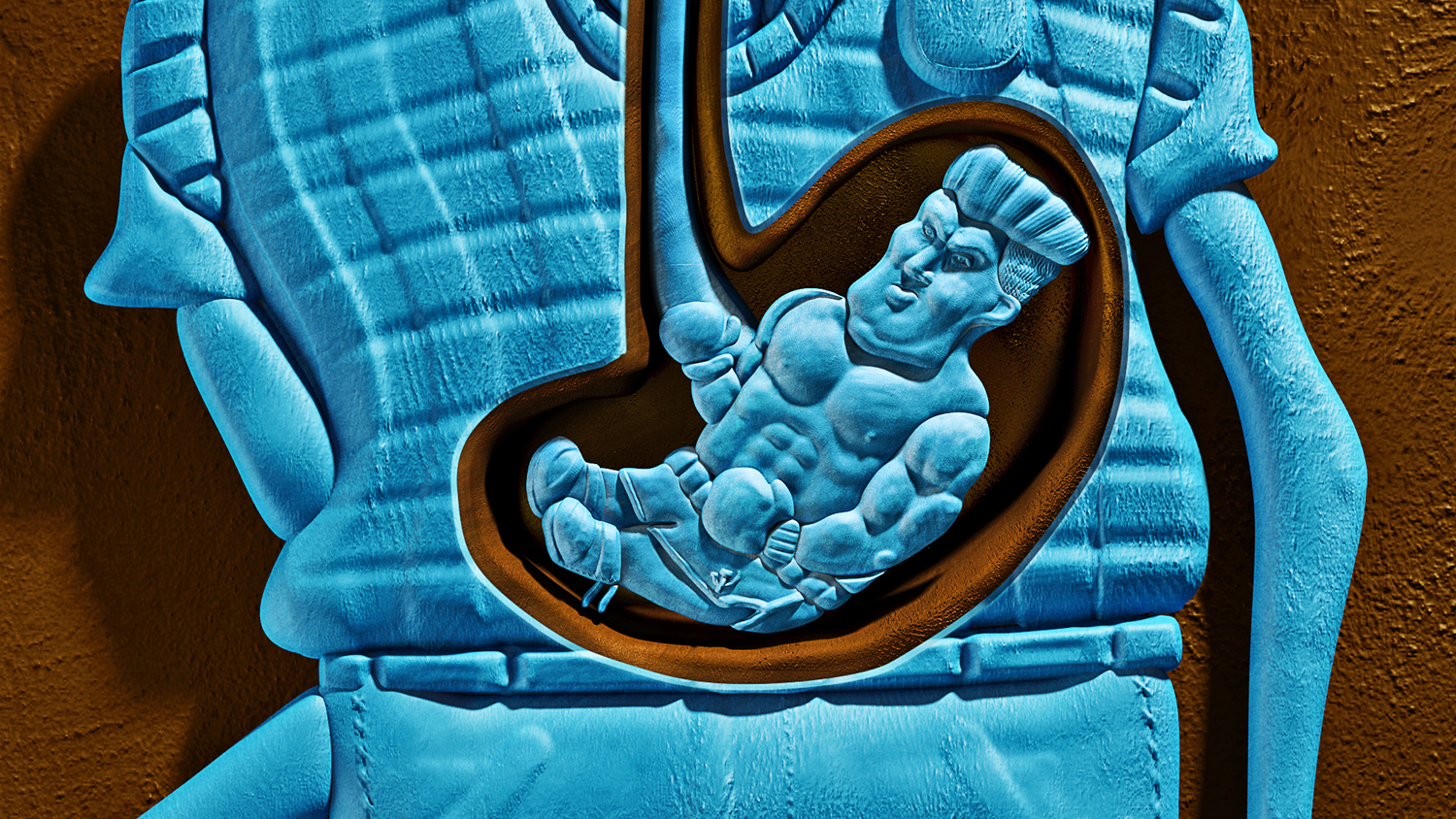
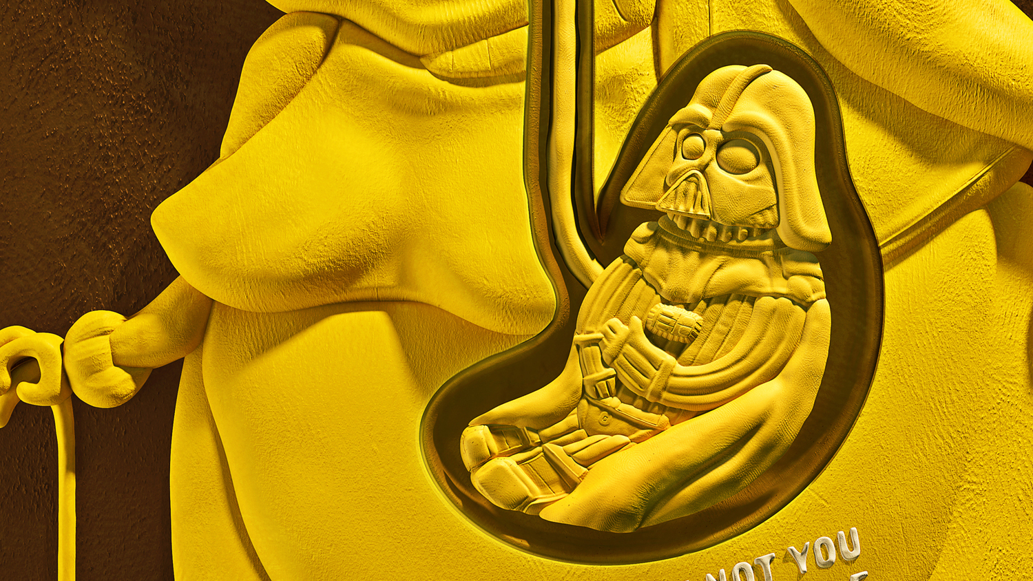
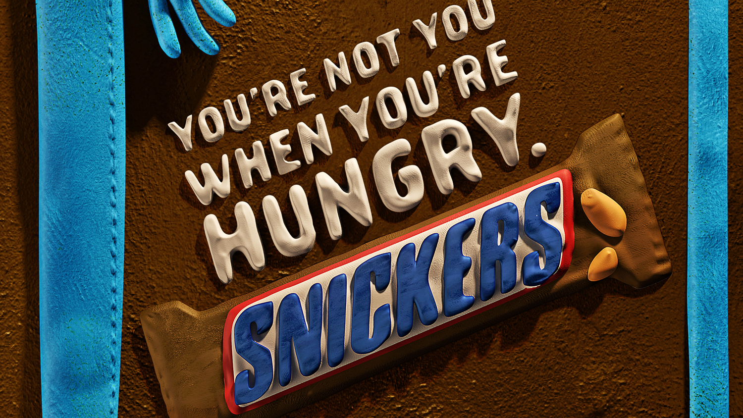
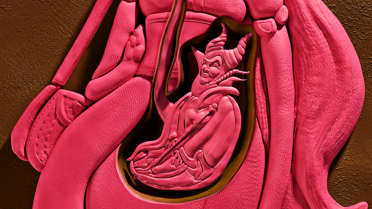
Poster for Snickers
CRAFT
I created the 2d characters’ concept and design with my friend and director of art Bernardo Silveira. After that, through digital sculpting, I transformed them into 3d, giving it a modeling-clay appearance.

-
Scrabble
Campaign which I was able to help develop, starting from the brand’s global concept, in collaboration with Paulo Coelho and Arício Fortes.


est
#25
–

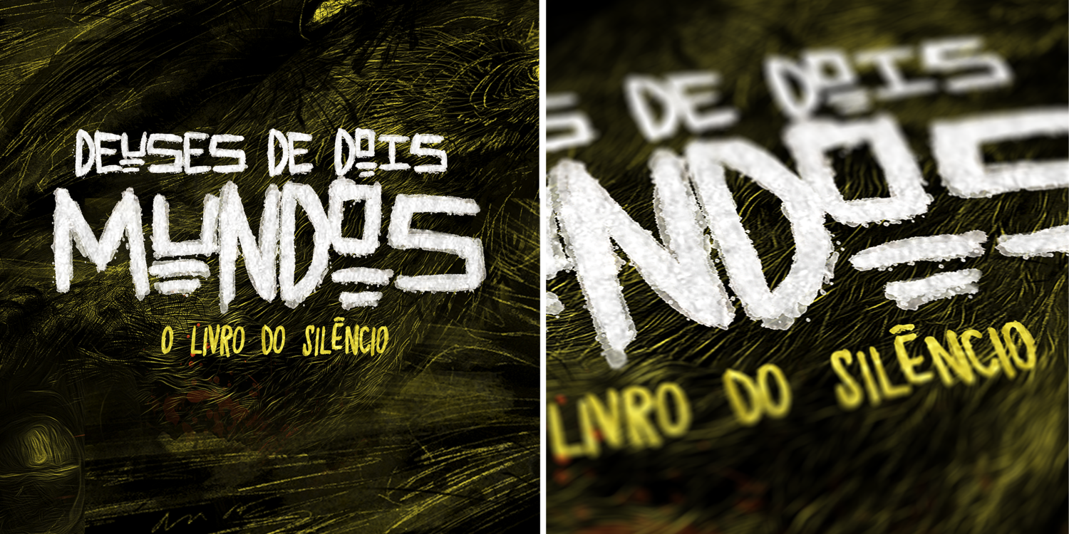
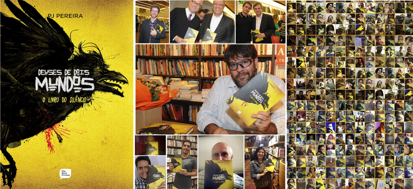
I have had the pleasure of being invited, along with Paulo Coelho (the great art director, not the writer), to develop the illustration and the art direction of the new book collection by PJ Pereira.
The story is entwined with two worlds: São Paulo, where an audacious journalist lives and is crazy to ascend in his career to achieve a high position, investigating a big business scandal, involving himself with colleagues and bosses. And Orum, the world of the rich African mythology where the orishas live, and where Orunmilá, the greatest fortune teller of all, has his powers silenced and tries to understand how to recover his capacity to foresee the future. In a journey that, little by little, reveals how it is possible for the two distant worlds to communicate with each other, the readers finds out the strongest feelings, capable of guiding people and gods.


CRAFT
Starting from the African world, I have developed the aesthetics of stained illustration, in which the bird is made with the story elements, in a technique of hand made hatchings.
The typography was also digitally hand drawn as if it were African paintings.


-
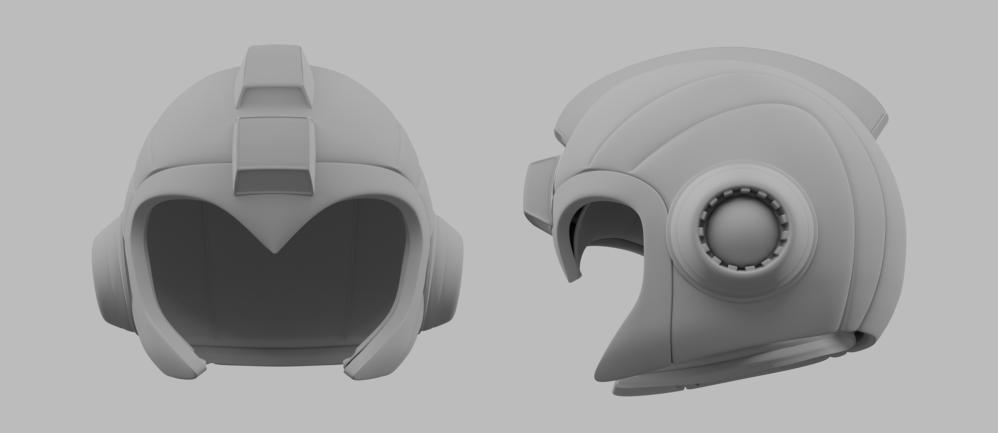
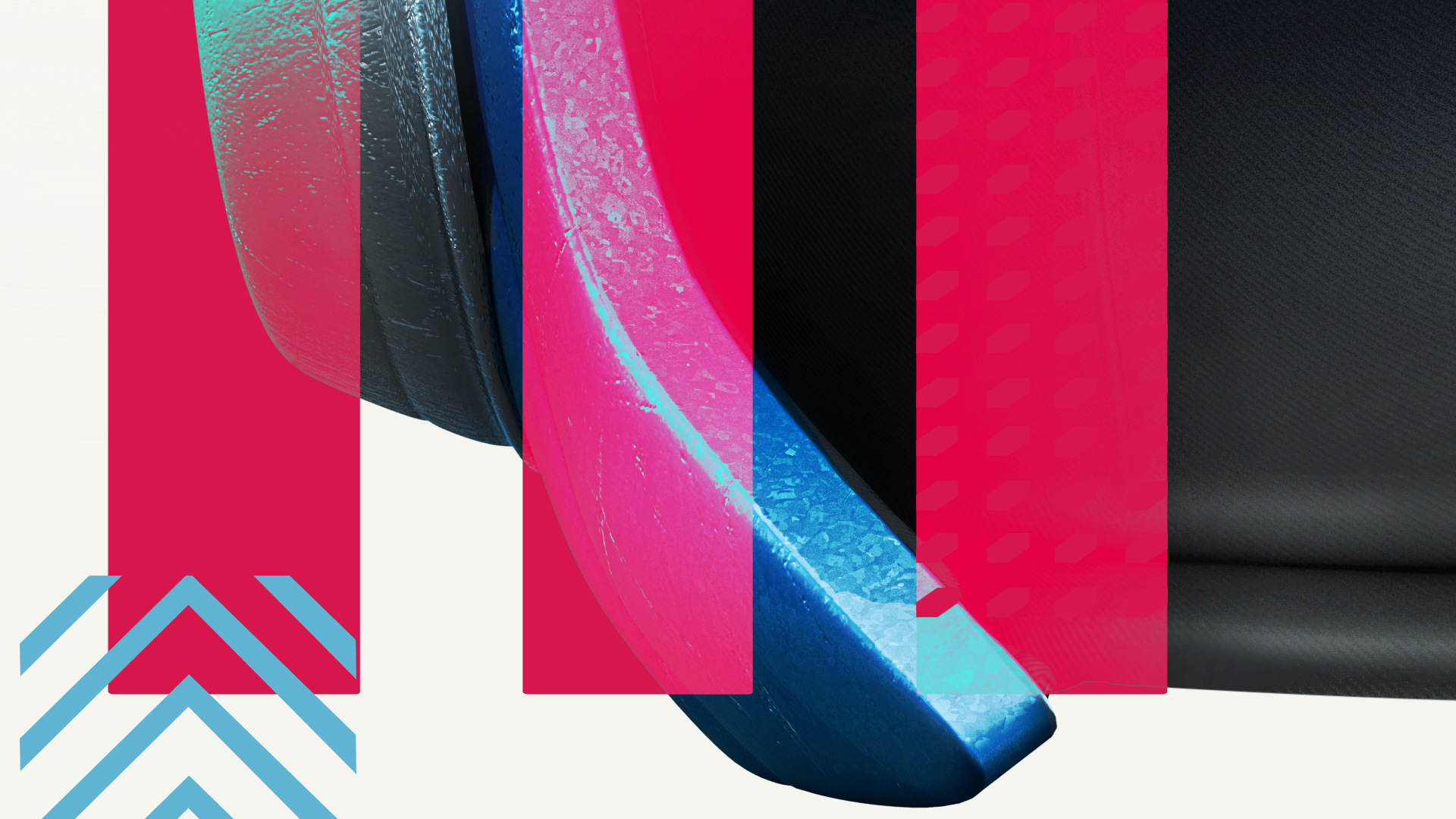
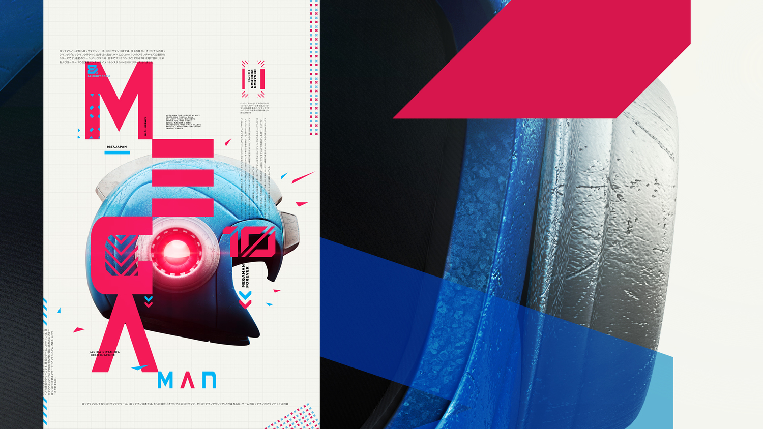
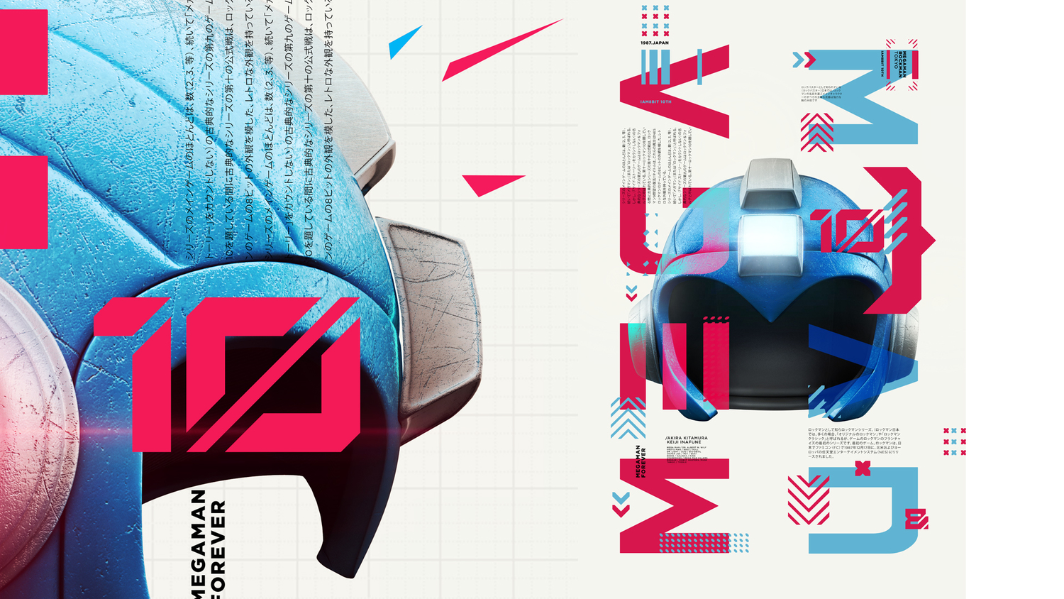
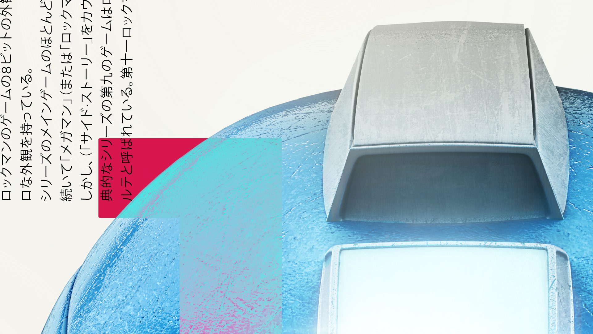
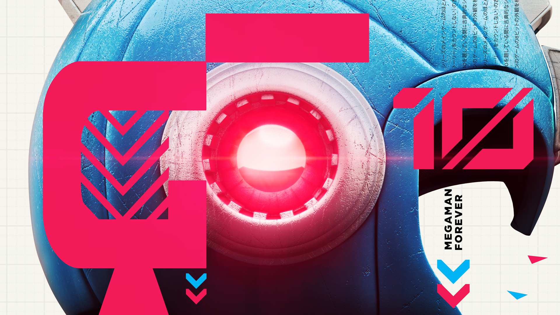
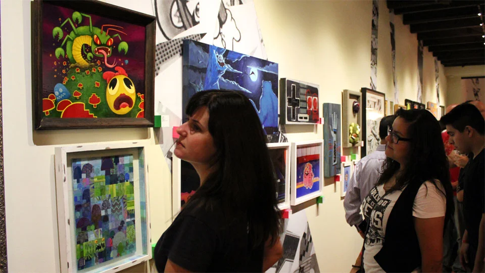
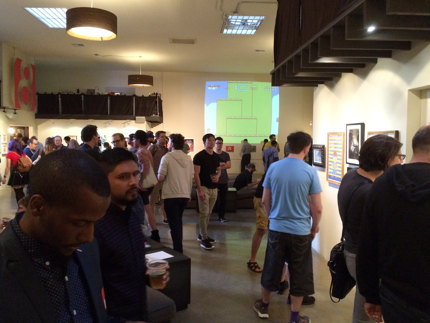
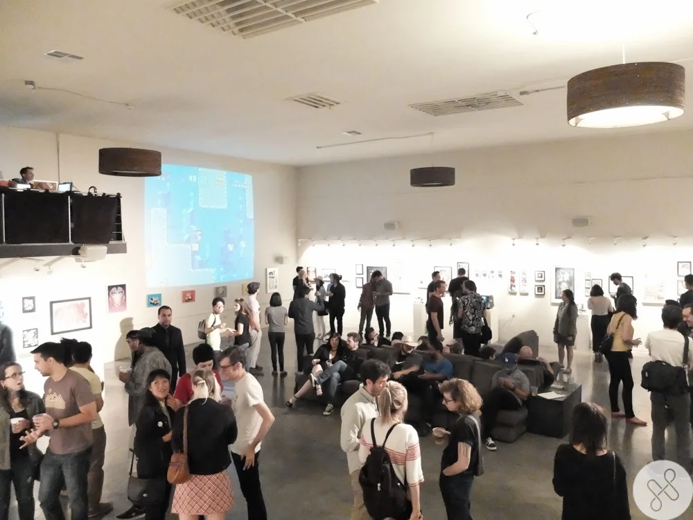
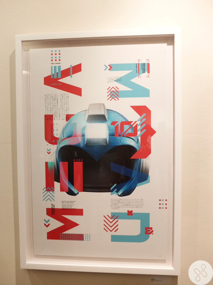
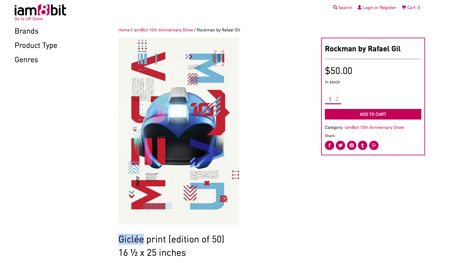
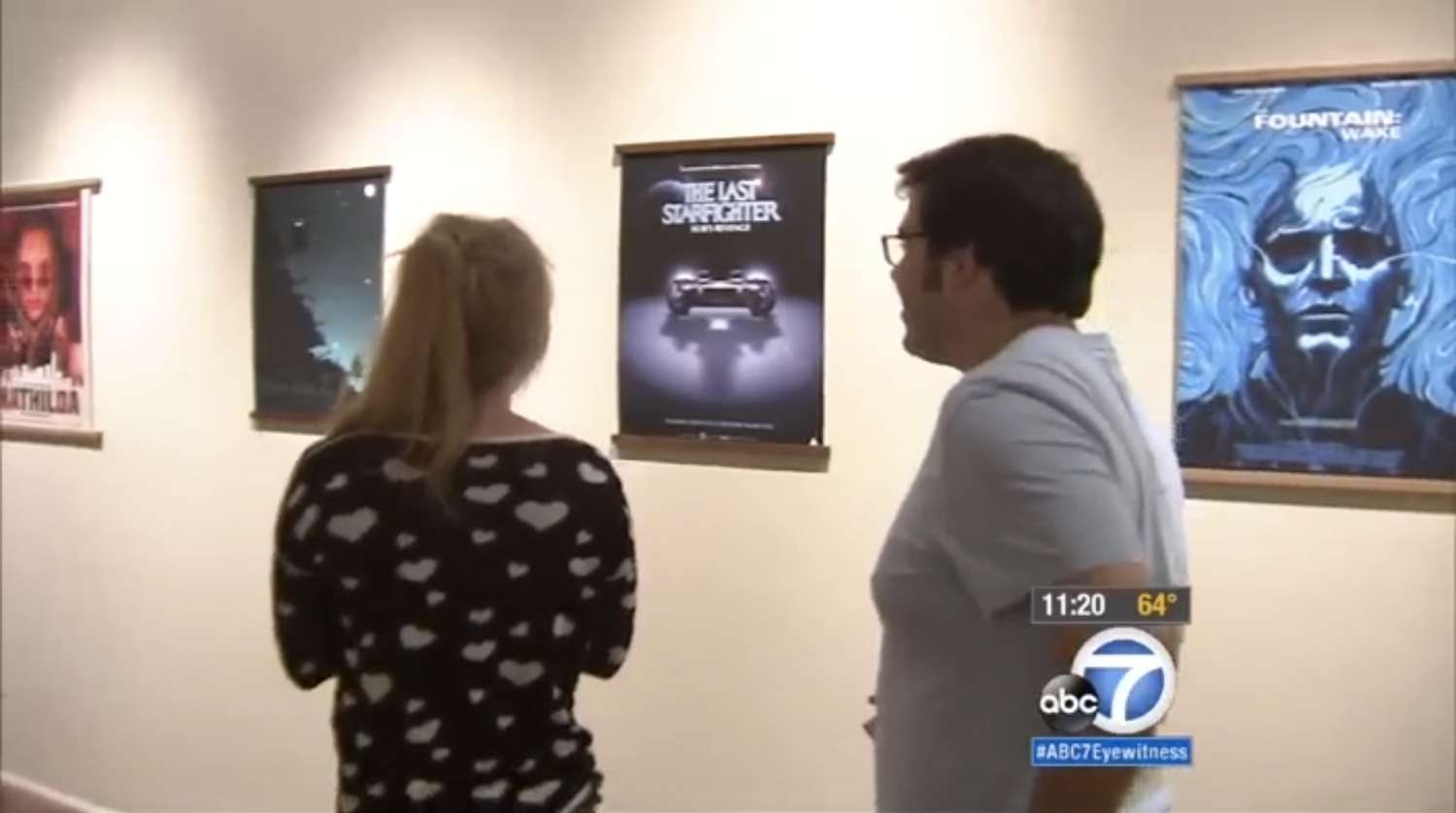
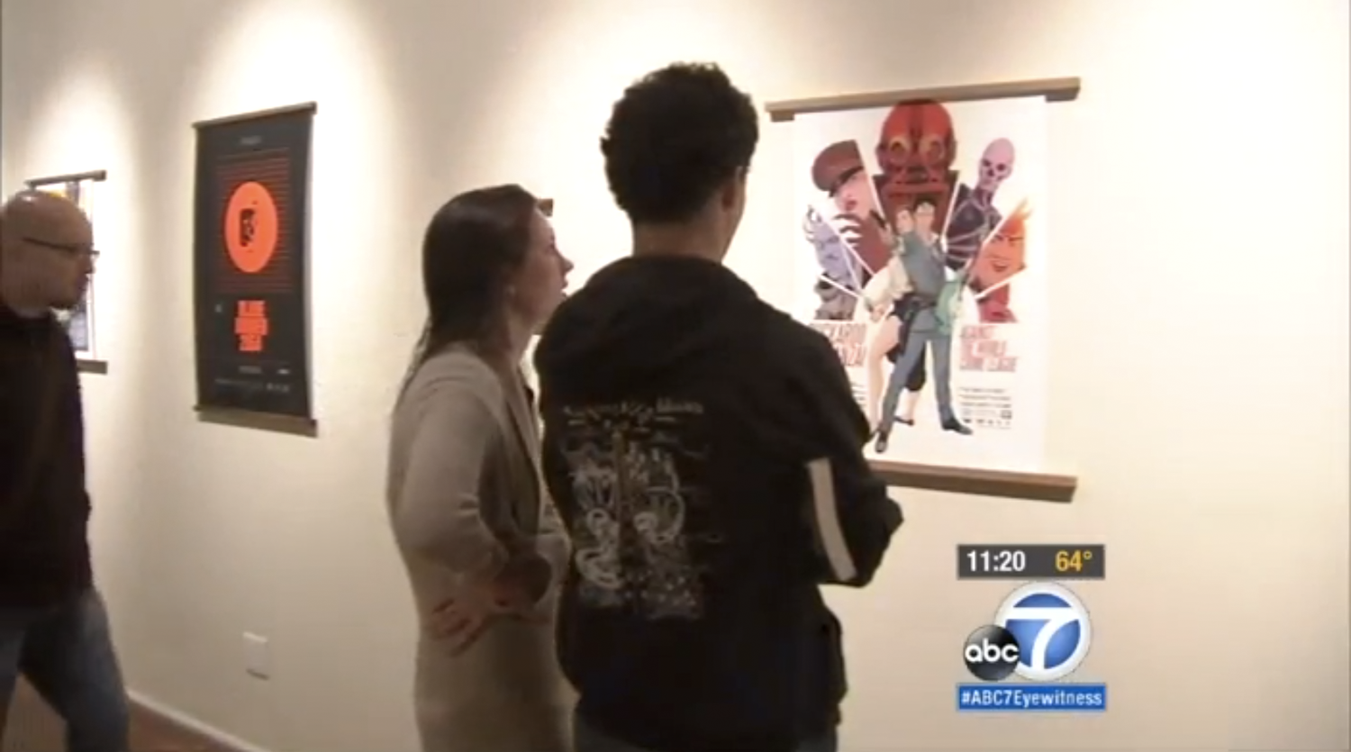
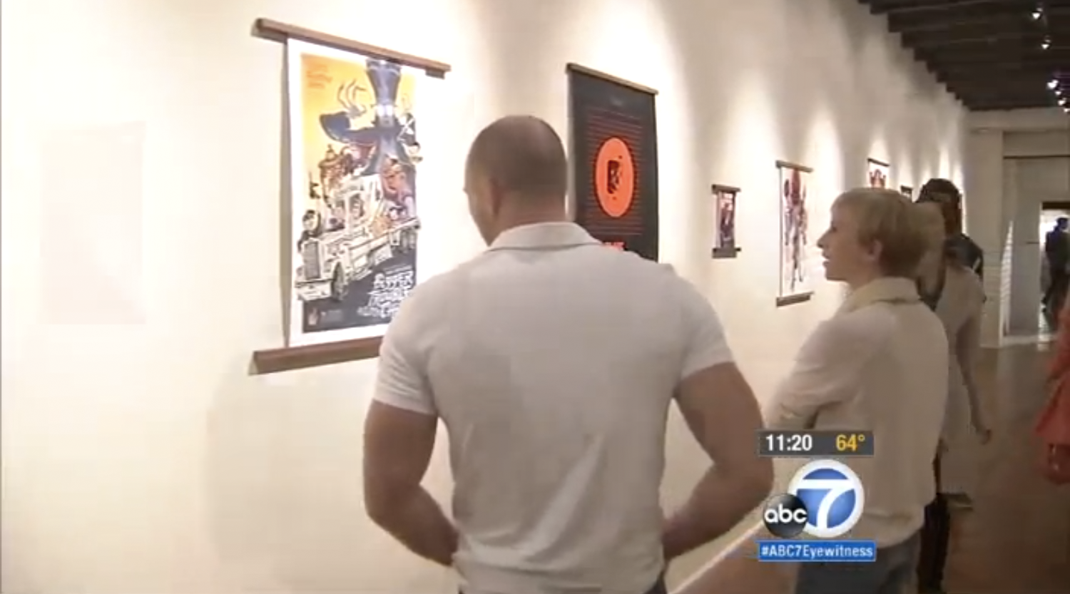
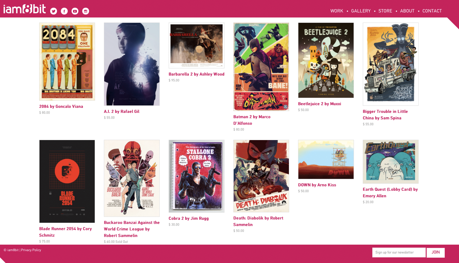
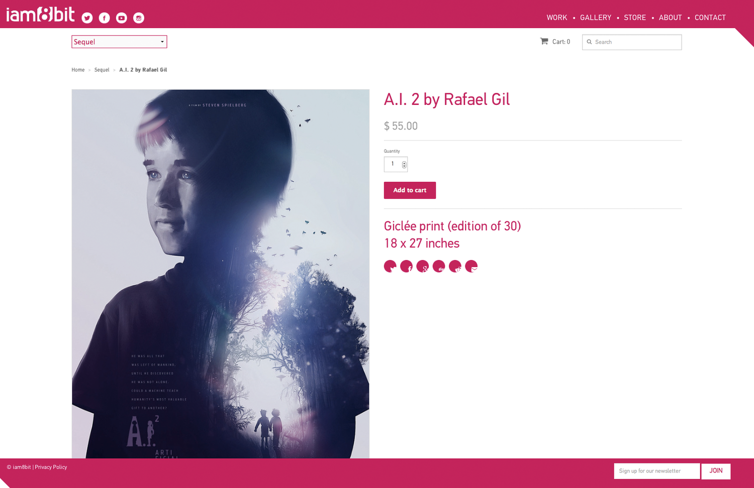
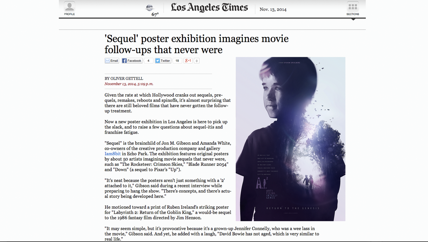
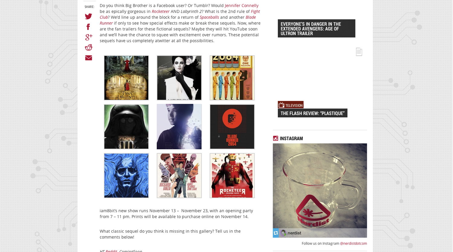
I was one of the invited artists to take part of the exhibition that celebrated the 10th anniversary of the geek art gallery Iam8Bit, in Los Angeles.
The theme was to pay a tribute to the games’ classic characters, which I contributed with Megaman, my favorite.
craft
I merged the vector design, typography and the 3d illustration in order to get the posters’ visual.